Schriftart
Aeroplus Personal Use Schriftart
Beschreibung
- Schriftart: Aeroplus Personal Use
- Gewicht: Regular
- Version: Version Version 1.002;Fontself Maker 3.5.8
- Anzahl der Zeichen:: 184
- Encoding Scheme:
- Wird Pitch: 0
Willkommen auf der Seite Schrift‑Trends – entdecken Sie Fonts, die das aktuelle Design prägen. Ob Marken‑Refresh, Social‑Visuals oder Website‑UI: Wer Trends verfolgt, wirkt frisch und relevant.
Diese Sammlung zeigt die angesagtesten Schriften der Saison, gewählt von Kreativen auf der ganzen Welt. Erwarten Sie elegante Serifs, minimalistische Sans‑Serifs, expressive Displays und handgemachte Scripts, die den Look von 2025 mitbestimmen.
Kombinieren Sie Trend‑Fonts mit zeitlosen Kategorien wie Modern, Serif oder Handwritten für ausgewogene, aufmerksamkeitsstarke Typografie.
-
( Font by Sven Stuber - www.superlooper.de )
A pixelated dot-based font with a modern, digital display style.
 Herunterladen 594 Downloads@WebFont
 -
( Fonts by Fonts of Chaos - www.fontsofchaos.com - check the website before use the fonts! )
A bold, geometric font with a modern, industrial style.
![Trubik77 Regular Frei Schriftart Herunterladen]() Herunterladen 130 Downloads@WebFont
Herunterladen 130 Downloads@WebFont -
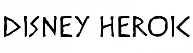
![Disney Heroic Frei Schriftart Herunterladen]() Herunterladen 1725 Downloads@WebFont
Herunterladen 1725 Downloads@WebFont -
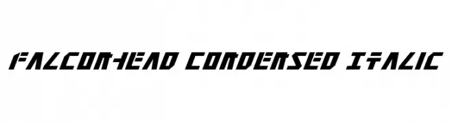
( Fonts by Daniel Zadorozny - www.iconian.com - Free for personal use )
Bold, angular, and italicized font with a futuristic style.
![Falconhead Condensed Italic Frei Schriftart Herunterladen]() Herunterladen 130 Downloads@WebFont
Herunterladen 130 Downloads@WebFont -
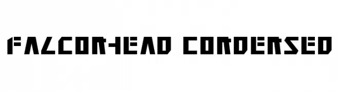
( Fonts by Daniel Zadorozny - www.iconian.com - Free for personal use )
A bold, geometric, and condensed font with a futuristic style.
![Falconhead Condensed Frei Schriftart Herunterladen]() Herunterladen 116 Downloads@WebFont
Herunterladen 116 Downloads@WebFont -
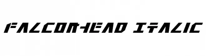
( Fonts by Daniel Zadorozny - www.iconian.com - Free for personal use )
A bold, italic, and geometric font with a futuristic style.
![Falconhead Italic Frei Schriftart Herunterladen]() Herunterladen 134 Downloads@WebFont
Herunterladen 134 Downloads@WebFont -
( Fonts by Emil Bertell - www.fenotype.com )
A bold, geometric outline font with a futuristic and playful style.
![foton torpedo Fenotype Frei Schriftart Herunterladen]() Herunterladen 219 Downloads@WebFont
Herunterladen 219 Downloads@WebFont -
![Squid Caps Frei Schriftart Herunterladen]() Herunterladen 190 Downloads@WebFont
Herunterladen 190 Downloads@WebFont


FAQ – Schrift‑Trends
Was sind die aktuellen Tendenzen?
Im Fokus stehen Einfachheit, Lesbarkeit und Wärme: abgerundete Sans‑Serifs, elegante kontrastreiche Serifs und feine Retro‑Remakes – clean, aber menschlich.
Welche Fonts liegen im Trend?
Beliebt sind u. a. Poppins, Roboto und Montserrat – ein guter Mix aus Modernität und Zeitlosigkeit. Sie funktionieren hervorragend im Web, auf Social‑Grafiken und Verpackungen.
Wie setze ich Trend‑Fonts sinnvoll ein?
Wählen Sie einen markanten Display‑Font für Überschriften und kombinieren Sie ihn mit einer schlichten Sans‑Serif als Fließtext. So entsteht Kontrast ohne Einbußen bei der Lesbarkeit. Prüfen Sie verschiedene Geräte und Medien vor dem Go‑Live.
💡 Tipp: Aktualisieren Sie Kernassets alle paar Monate mit einem Trend‑Font, um Frische und SEO‑Wirkung zu bewahren.