Schriftart
Better Saturday Schriftart
Beschreibung
- Schriftart: Better Saturday
- Gewicht:
- Version:
- Anzahl der Zeichen::
- Encoding Scheme:
- Wird Pitch: 0
Willkommen auf der Seite Schrift‑Trends – entdecken Sie Fonts, die das aktuelle Design prägen. Ob Marken‑Refresh, Social‑Visuals oder Website‑UI: Wer Trends verfolgt, wirkt frisch und relevant.
Diese Sammlung zeigt die angesagtesten Schriften der Saison, gewählt von Kreativen auf der ganzen Welt. Erwarten Sie elegante Serifs, minimalistische Sans‑Serifs, expressive Displays und handgemachte Scripts, die den Look von 2025 mitbestimmen.
Kombinieren Sie Trend‑Fonts mit zeitlosen Kategorien wie Modern, Serif oder Handwritten für ausgewogene, aufmerksamkeitsstarke Typografie.
-
( Fonts by Apostrophic Lab )
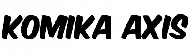
A bold, comic-inspired font with playful, dynamic characters.
 Herunterladen 12850 Downloads@WebFont
 -
( Fonts by Apostrophic Lab )
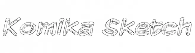
A playful, hand-drawn sketch font with bold, rounded letters and a textured, 3D effect.
![Komika Sketch Frei Schriftart Herunterladen]() Herunterladen 483 Downloads@WebFont
Herunterladen 483 Downloads@WebFont -
( Fonts by Apostrophic Lab )
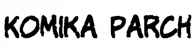
A bold, playful font with a comic book style and hand-drawn feel.
![Komika Parch Frei Schriftart Herunterladen]() Herunterladen 614 Downloads@WebFont
Herunterladen 614 Downloads@WebFont -
( Fonts by Apostrophic Lab )
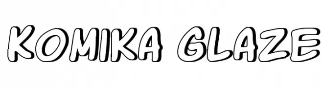
A playful, comic-style font with bold, rounded outlines.
![Komika Glaze Frei Schriftart Herunterladen]() Herunterladen 601 Downloads@WebFont
Herunterladen 601 Downloads@WebFont -
( Fonts by Apostrophic Lab )
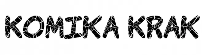
A bold, playful font with a shattered glass effect, perfect for creative projects.
![Komika Krak Frei Schriftart Herunterladen]() Herunterladen 1085 Downloads@WebFont
Herunterladen 1085 Downloads@WebFont -
( Fonts by Apostrophic Lab )
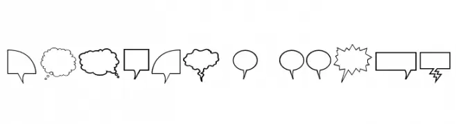
Outlined comic speech and thought bubbles in various shapes.
![Komika Bubbles Frei Schriftart Herunterladen]() Herunterladen 380 Downloads@WebFont
Herunterladen 380 Downloads@WebFont -
( Fonts by Apostrophic Lab )
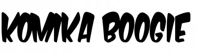
A bold, playful font with thick, rounded strokes and a lively appearance.
![Komika Boogie Frei Schriftart Herunterladen]() Herunterladen 707 Downloads@WebFont
Herunterladen 707 Downloads@WebFont -
( Fonts by Apostrophic Lab )
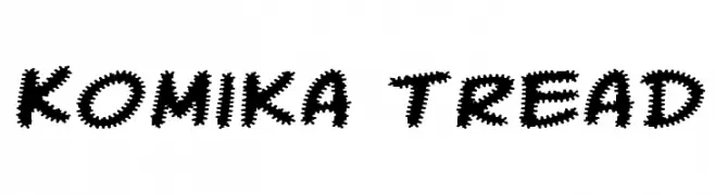
A bold, jagged font with a playful and energetic style.
![Komika Tread Frei Schriftart Herunterladen]() Herunterladen 341 Downloads@WebFont
Herunterladen 341 Downloads@WebFont
FAQ – Schrift‑Trends
Was sind die aktuellen Tendenzen?
Im Fokus stehen Einfachheit, Lesbarkeit und Wärme: abgerundete Sans‑Serifs, elegante kontrastreiche Serifs und feine Retro‑Remakes – clean, aber menschlich.
Welche Fonts liegen im Trend?
Beliebt sind u. a. Poppins, Roboto und Montserrat – ein guter Mix aus Modernität und Zeitlosigkeit. Sie funktionieren hervorragend im Web, auf Social‑Grafiken und Verpackungen.
Wie setze ich Trend‑Fonts sinnvoll ein?
Wählen Sie einen markanten Display‑Font für Überschriften und kombinieren Sie ihn mit einer schlichten Sans‑Serif als Fließtext. So entsteht Kontrast ohne Einbußen bei der Lesbarkeit. Prüfen Sie verschiedene Geräte und Medien vor dem Go‑Live.
💡 Tipp: Aktualisieren Sie Kernassets alle paar Monate mit einem Trend‑Font, um Frische und SEO‑Wirkung zu bewahren.