Schriftart
Capitol City Semi-Straight Schriftart
Beschreibung
- Schriftart: Capitol City Semi-Straight
- Gewicht: Regular
- Version: Version Version 1.0; 2025
- Anzahl der Zeichen:: 222
- Encoding Scheme:
- Wird Pitch: 0
Willkommen auf der Seite Schrift‑Trends – entdecken Sie Fonts, die das aktuelle Design prägen. Ob Marken‑Refresh, Social‑Visuals oder Website‑UI: Wer Trends verfolgt, wirkt frisch und relevant.
Diese Sammlung zeigt die angesagtesten Schriften der Saison, gewählt von Kreativen auf der ganzen Welt. Erwarten Sie elegante Serifs, minimalistische Sans‑Serifs, expressive Displays und handgemachte Scripts, die den Look von 2025 mitbestimmen.
Kombinieren Sie Trend‑Fonts mit zeitlosen Kategorien wie Modern, Serif oder Handwritten für ausgewogene, aufmerksamkeitsstarke Typografie.
-
( Paul Lloyd Fonts )
A bold, decorative font with gothic and medieval influences.
 Herunterladen 1346 Downloads
 -
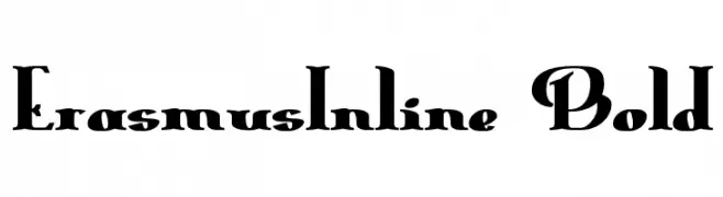
( Paul Lloyd Fonts )
A bold, inline font with a dramatic and elegant style.
![ErasmusInline Bold Frei Schriftart Herunterladen]() Herunterladen 167 Downloads
Herunterladen 167 Downloads -
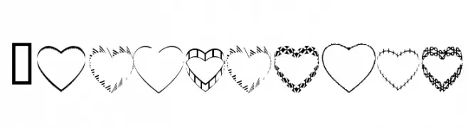
( Fonts by www.4yeo.com )
A playful, heart-themed decorative font with bold rectangular numerals and symbols.
![4YEOhearts Frei Schriftart Herunterladen]() Herunterladen 1902 Downloads@WebFont
Herunterladen 1902 Downloads@WebFont -
( Fonts by www.4yeo.com )
A Halloween-themed decorative font with letters in coffin shapes and skeletons.
![4YEOhalloween Frei Schriftart Herunterladen]() Herunterladen 1110 Downloads@WebFont
Herunterladen 1110 Downloads@WebFont -
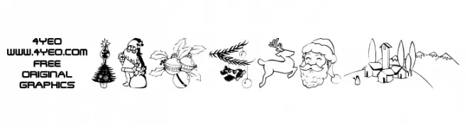
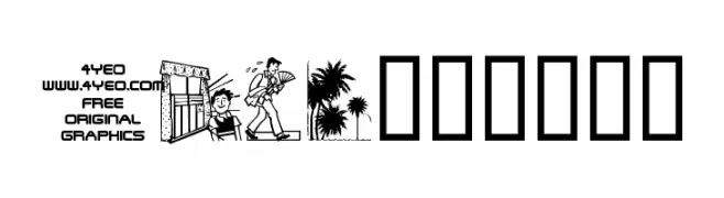
( Fonts by www.4yeo.com )
Hand-drawn holiday-themed decorative illustrations.
![4YEOXMAS Frei Schriftart Herunterladen]() Herunterladen 10498 Downloads@WebFont
Herunterladen 10498 Downloads@WebFont -
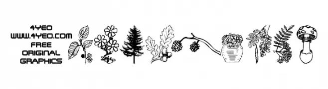
( Fonts by www.4yeo.com )
A bold, geometric display font with garden and nature illustrations.
![4YEOgarden Frei Schriftart Herunterladen]() Herunterladen 4266 Downloads@WebFont
Herunterladen 4266 Downloads@WebFont -
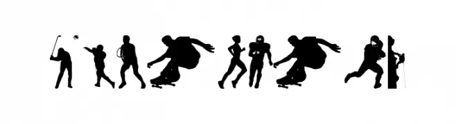
( Fonts by www.4yeo.com )
Silhouette-based display font featuring sports figures.
![4YEOSPORT Frei Schriftart Herunterladen]() Herunterladen 6407 Downloads@WebFont
Herunterladen 6407 Downloads@WebFont -
( Fonts by www.4yeo.com )
Decorative dingbat font with summer and vacation illustrations.
![4YEOsummer Frei Schriftart Herunterladen]() Herunterladen 1677 Downloads@WebFont
Herunterladen 1677 Downloads@WebFont

FAQ – Schrift‑Trends
Was sind die aktuellen Tendenzen?
Im Fokus stehen Einfachheit, Lesbarkeit und Wärme: abgerundete Sans‑Serifs, elegante kontrastreiche Serifs und feine Retro‑Remakes – clean, aber menschlich.
Welche Fonts liegen im Trend?
Beliebt sind u. a. Poppins, Roboto und Montserrat – ein guter Mix aus Modernität und Zeitlosigkeit. Sie funktionieren hervorragend im Web, auf Social‑Grafiken und Verpackungen.
Wie setze ich Trend‑Fonts sinnvoll ein?
Wählen Sie einen markanten Display‑Font für Überschriften und kombinieren Sie ihn mit einer schlichten Sans‑Serif als Fließtext. So entsteht Kontrast ohne Einbußen bei der Lesbarkeit. Prüfen Sie verschiedene Geräte und Medien vor dem Go‑Live.
💡 Tipp: Aktualisieren Sie Kernassets alle paar Monate mit einem Trend‑Font, um Frische und SEO‑Wirkung zu bewahren.