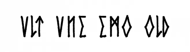
Cvlt Rvne Demo Bold Font
✎ Dingbats
📄 TrueType
🔢 31 Zeichen
⬇ 443
✅ Kostenlos
✅ Web Font
Fonts by Dan Steinbok - Out Of Step Font Company - outofstepfontco.com - Personal-use only. For commercial use please contact owner.
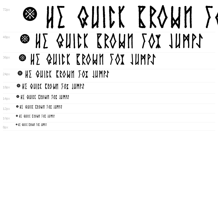
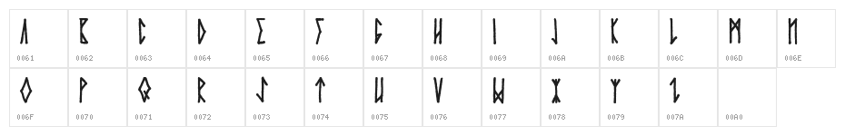
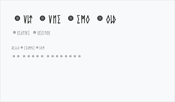
Diese Schriftart enthält 31 Zeichen. Klicken Sie auf ein Zeichen für Details.
Zahlen & Symbole
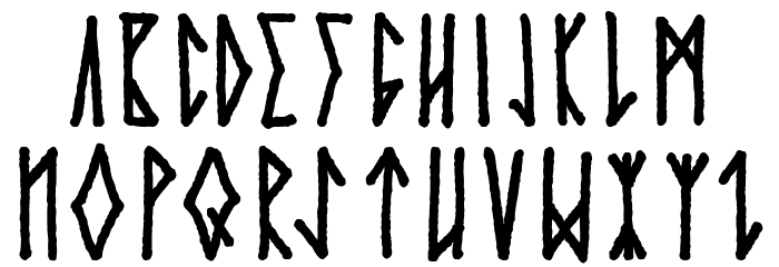
CVLT-RVNE-DEMO-BOLD Groß

CVLT-RVNE-DEMO-BOLD Kleinbuchstaben
CVLT-RVNE-DEMO-BOLD Anderer Schreiben
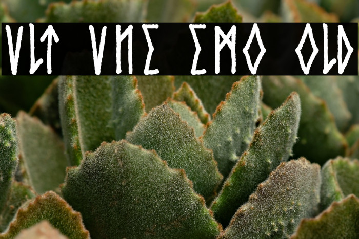
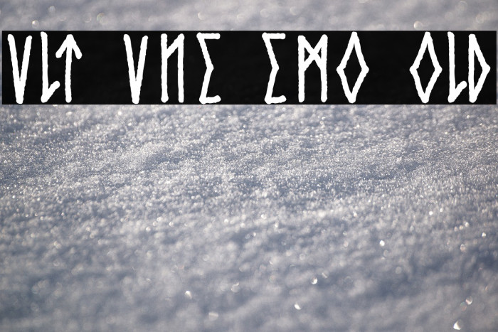
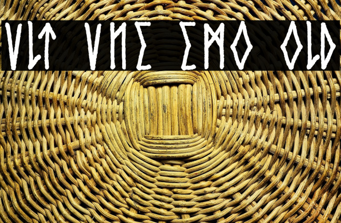
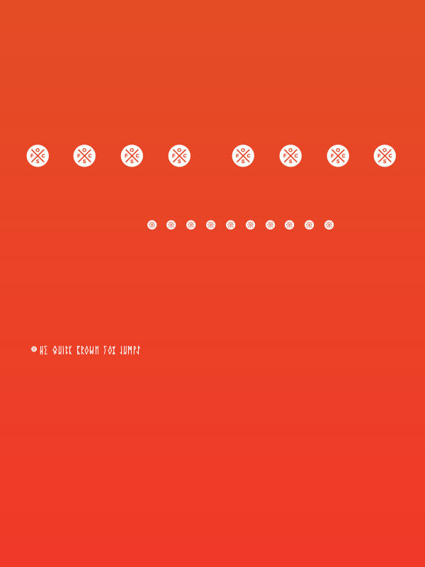
GALERIE-BEISPIELE
Ähnliche kostenlose Schriftarten


Die richtige Schriftart nicht gefunden?
Jede Schriftart aus einem Bild identifizieren
Schriftart identifizieren →Visitenkarte
Social-Media-Header

Logo
Poster
Information
| Name | Cvlt Rvne Demo Bold |
| Schriften Familie | Cvlt Rvne Demo |
| Style | CvltRvneDemo-Bold |
| Format | TrueType (.ttf) |
| Datei | Cvlt-Rvne-Demo-Bold.zip |
| Gewicht | Bold |
| Version | Version Version 1.001 March 23, 2019 |
| Anzahl der Zeichen: | 31 |
| Downloads | 443 |
| Hinzugefügt | 2023-09-12 |
| Aktualisiert | 2024-11-21 |
| Kategorien | Dingbats |
| Fett | Yes |
| Kursiv | No |
| Breite | Normal |
| Zeichenabstand | Monospaced |
| Kontrast | High |
| Gesamtstil | Mystical, Ancient, Decorative |
| Anwendungsfall | Logos, Headlines, Posters |
| Vorgeschlagene Projekte | Ideal for fantasy-themed designs, historical projects, book covers, and game titles. |
| Wird Pitch | No |
| Web Font | Verfügbar |
| Lizenz | Kostenlos für den persönlichen Gebrauch |
Fonts by Dan Steinbok - Out Of Step Font Company - outofstepfontco.com - Personal-use only. For commercial use please contact owner.
Etikette
💻 Windows
- ZIP entpacken
- Rechtsklick .ttf -> Installieren
🍎 macOS
- ZIP entpacken
- Doppelklick .ttf -> Schriftart installieren
Cvlt Rvne Demo Bold
Kostenlos · TrueType
| Name | Cvlt Rvne Demo Bold |
| Typ | TrueType |
| Zeichen | 31 |
| Downloads | 443 |
| Hinzugefügt | 2023-09-12 |
| Web Font | Verfügbar |
| Autor | Fonts by Dan Steinbok - Out Of Step Font Company - outofstepfontco.com - Personal-use only. For commercial use please contact owner. |
| Kategorien | Dingbats |