Schriftart
Gain Circus Schriftart
Beschreibung
- Schriftart: Gain Circus
- Gewicht:
- Version:
- Anzahl der Zeichen::
- Encoding Scheme:
- Wird Pitch: 0
Willkommen auf der Seite Schrift‑Trends – entdecken Sie Fonts, die das aktuelle Design prägen. Ob Marken‑Refresh, Social‑Visuals oder Website‑UI: Wer Trends verfolgt, wirkt frisch und relevant.
Diese Sammlung zeigt die angesagtesten Schriften der Saison, gewählt von Kreativen auf der ganzen Welt. Erwarten Sie elegante Serifs, minimalistische Sans‑Serifs, expressive Displays und handgemachte Scripts, die den Look von 2025 mitbestimmen.
Kombinieren Sie Trend‑Fonts mit zeitlosen Kategorien wie Modern, Serif oder Handwritten für ausgewogene, aufmerksamkeitsstarke Typografie.
-
( Fonts by Masato Shimojima - Personal-use only. For commercial use please contact owner. )
A playful, bold font with thick outlines and a hand-drawn, cartoonish style.
 Herunterladen 331 Downloads@WebFont
 -
( Fonts by Masato Shimojima - Personal-use only. For commercial use please contact owner. )
A bold, playful, and decorative font with thick, rounded strokes and whimsical curves.
![Character Bold Frei Schriftart Herunterladen]() Herunterladen 425 Downloads@WebFont
Herunterladen 425 Downloads@WebFont -
( Fonts by Masato Shimojima - Personal-use only. For commercial use please contact owner. )
A playful, bold font with a distinctive shadow effect and rounded, inflated characters.
![Character Shadow Frei Schriftart Herunterladen]() Herunterladen 400 Downloads@WebFont
Herunterladen 400 Downloads@WebFont -
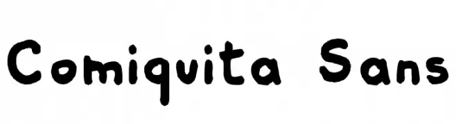
![Comiquita Sans Frei Schriftart Herunterladen]() Herunterladen 1119 Downloads@WebFont
Herunterladen 1119 Downloads@WebFont -
![HirnBold Frei Schriftart Herunterladen]() Herunterladen 684 Downloads@WebFont
Herunterladen 684 Downloads@WebFont -
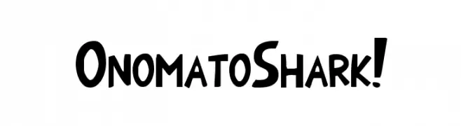
( Fonts by Aryel Filipe )
A playful, bold, and hand-drawn style font with a cartoonish feel.
![OnomatoShark! Frei Schriftart Herunterladen]() Herunterladen 728 Downloads@WebFont
Herunterladen 728 Downloads@WebFont -
( Fonts by Daniel Zadorozny - www.iconian.com - Free for personal use )
A playful, bold font with rounded, slightly slanted characters.
![Kid Cobalt Frei Schriftart Herunterladen]() Herunterladen 1230 Downloads@WebFont
Herunterladen 1230 Downloads@WebFont -
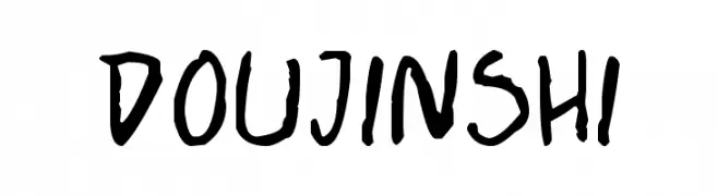
( Fonts by Press Gang Studios - Andeh Pinkard - www.pressgang-studios.com )
A bold, hand-drawn font with a playful and informal style.
![Doujinshi Frei Schriftart Herunterladen]() Herunterladen 1369 Downloads@WebFont
Herunterladen 1369 Downloads@WebFont


FAQ – Schrift‑Trends
Was sind die aktuellen Tendenzen?
Im Fokus stehen Einfachheit, Lesbarkeit und Wärme: abgerundete Sans‑Serifs, elegante kontrastreiche Serifs und feine Retro‑Remakes – clean, aber menschlich.
Welche Fonts liegen im Trend?
Beliebt sind u. a. Poppins, Roboto und Montserrat – ein guter Mix aus Modernität und Zeitlosigkeit. Sie funktionieren hervorragend im Web, auf Social‑Grafiken und Verpackungen.
Wie setze ich Trend‑Fonts sinnvoll ein?
Wählen Sie einen markanten Display‑Font für Überschriften und kombinieren Sie ihn mit einer schlichten Sans‑Serif als Fließtext. So entsteht Kontrast ohne Einbußen bei der Lesbarkeit. Prüfen Sie verschiedene Geräte und Medien vor dem Go‑Live.
💡 Tipp: Aktualisieren Sie Kernassets alle paar Monate mit einem Trend‑Font, um Frische und SEO‑Wirkung zu bewahren.