Schriftart
Gordeliast Schriftart
Beschreibung
- Schriftart: Gordeliast
- Gewicht:
- Version: Version 1.00;August 11, 2023;FontCreator 13.0.0.2683 32-bit
- Anzahl der Zeichen:: 259
- Encoding Scheme:
- Wird Pitch: 0
Willkommen auf der Seite Schrift‑Trends – entdecken Sie Fonts, die das aktuelle Design prägen. Ob Marken‑Refresh, Social‑Visuals oder Website‑UI: Wer Trends verfolgt, wirkt frisch und relevant.
Diese Sammlung zeigt die angesagtesten Schriften der Saison, gewählt von Kreativen auf der ganzen Welt. Erwarten Sie elegante Serifs, minimalistische Sans‑Serifs, expressive Displays und handgemachte Scripts, die den Look von 2025 mitbestimmen.
Kombinieren Sie Trend‑Fonts mit zeitlosen Kategorien wie Modern, Serif oder Handwritten für ausgewogene, aufmerksamkeitsstarke Typografie.
-
( Fonts by Daniel Gauthier )
A bold, fragmented font with a dynamic, distressed style.
 Herunterladen 2129 Downloads@WebFont
 -
![I Ching Frei Schriftart Herunterladen]() Herunterladen 1768 Downloads@WebFont
Herunterladen 1768 Downloads@WebFont -
( Fonts by Daniel Zadorozny - www.iconian.com - Free for personal use )
A bold, angular font with a futuristic shadow effect and dynamic slant.
![Infinity Formula Shadow Ital Frei Schriftart Herunterladen]() Herunterladen 184 Downloads@WebFont
Herunterladen 184 Downloads@WebFont -
![SkullZ Frei Schriftart Herunterladen]() Herunterladen 660 Downloads@WebFont
Herunterladen 660 Downloads@WebFont -
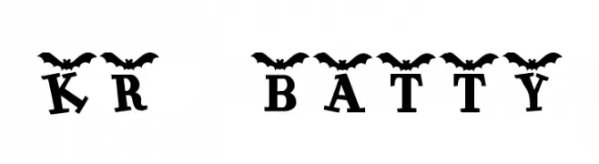
( Fonts by Kat`s Fun Fonts - Personal-use only. For commercial use please contact owner. )
A playful, bat-themed decorative font ideal for Halloween designs.
![KR Batty Frei Schriftart Herunterladen]() Herunterladen 364 Downloads@WebFont
Herunterladen 364 Downloads@WebFont -
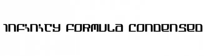
( Fonts by Daniel Zadorozny - www.iconian.com - Free for personal use )
A futuristic, geometric font with bold, angular letterforms and a condensed style.
![Infinity Formula Condensed Frei Schriftart Herunterladen]() Herunterladen 492 Downloads@WebFont
Herunterladen 492 Downloads@WebFont -
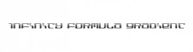
( Fonts by Daniel Zadorozny - www.iconian.com - Free for personal use )
A futuristic, segmented font with a digital and modern aesthetic.
![Infinity Formula Gradient Frei Schriftart Herunterladen]() Herunterladen 185 Downloads@WebFont
Herunterladen 185 Downloads@WebFont -
( Fonts by Daniel Zadorozny - www.iconian.com - Free for personal use )
A bold, italic, and condensed font with a futuristic and dynamic design.
![Infinity Formula Cond Italic Frei Schriftart Herunterladen]() Herunterladen 164 Downloads@WebFont
Herunterladen 164 Downloads@WebFont


FAQ – Schrift‑Trends
Was sind die aktuellen Tendenzen?
Im Fokus stehen Einfachheit, Lesbarkeit und Wärme: abgerundete Sans‑Serifs, elegante kontrastreiche Serifs und feine Retro‑Remakes – clean, aber menschlich.
Welche Fonts liegen im Trend?
Beliebt sind u. a. Poppins, Roboto und Montserrat – ein guter Mix aus Modernität und Zeitlosigkeit. Sie funktionieren hervorragend im Web, auf Social‑Grafiken und Verpackungen.
Wie setze ich Trend‑Fonts sinnvoll ein?
Wählen Sie einen markanten Display‑Font für Überschriften und kombinieren Sie ihn mit einer schlichten Sans‑Serif als Fließtext. So entsteht Kontrast ohne Einbußen bei der Lesbarkeit. Prüfen Sie verschiedene Geräte und Medien vor dem Go‑Live.
💡 Tipp: Aktualisieren Sie Kernassets alle paar Monate mit einem Trend‑Font, um Frische und SEO‑Wirkung zu bewahren.