INTERNATIONAL PERFORMING RELATIONSHIP CENTER FONT Font
✎ Classic
📄 PostScript
🔢 26 Zeichen
⬇ 223
✅ Kostenlos
✅ Web Font

tricky
Schrift von danny91194. Für kommerzielle Nutzung kontaktieren Sie bitte den Eigentümer.
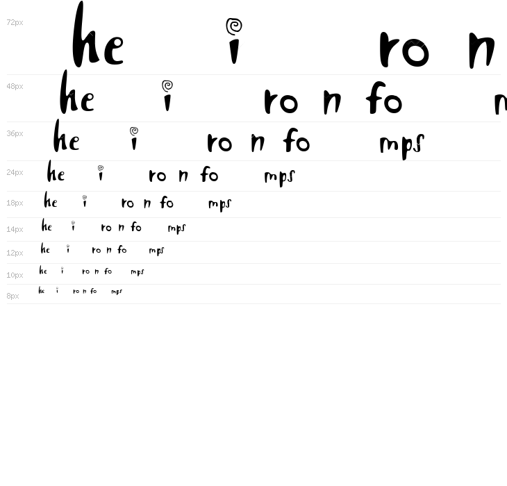
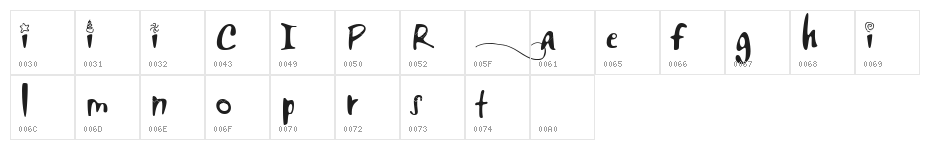
Diese Schriftart enthält 26 Zeichen. Klicken Sie auf ein Zeichen für Details.
Zahlen & Symbole
INTERNATIONAL-PERFORMING-RELATIONSHIP-CENTER-FONT Groß

INTERNATIONAL-PERFORMING-RELATIONSHIP-CENTER-FONT Kleinbuchstaben

INTERNATIONAL-PERFORMING-RELATIONSHIP-CENTER-FONT Anderer Schreiben

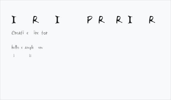
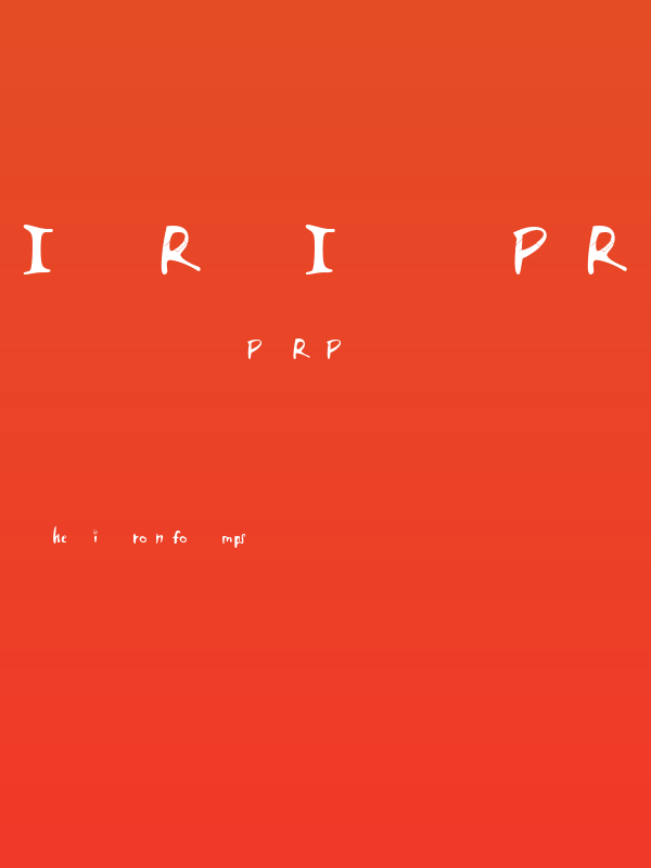
GALERIE-BEISPIELE


Ähnliche kostenlose Schriftarten


Ähnliche kommerzielle Schriftarten


Die richtige Schriftart nicht gefunden?
Jede Schriftart aus einem Bild identifizieren
Schriftart identifizieren →Visitenkarte
Social-Media-Header

Logo
Poster
Information
| Name | INTERNATIONAL PERFORMING RELATIONSHIP CENTER FONT |
| TTF Name | INTERNATIONAL PERFORMING RELATIONSHIP CENTER FONT.ttf |
| Schriften Familie | 1 |
| Style | 1 |
| Format | PostScript (.ttf) |
| Datei | INTERNATIONAL-PERFORMING-RELATIONSHIP-CENTER-FONT.zip |
| Gewicht | Regular |
| Version | Version Version 1.000 |
| Anzahl der Zeichen: | 26 |
| Downloads | 223 |
| Hinzugefügt | 2018-07-24 |
| Aktualisiert | 2024-11-29 |
| Kategorien | Classic |
| Fett | No |
| Kursiv | No |
| Breite | Normal |
| Zeichenabstand | Monospaced |
| Kontrast | Medium |
| Gesamtstil | Playful |
| Anwendungsfall | Logos, Headlines, Creative projects |
| Vorgeschlagene Projekte | Ideal for children's books, playful branding, party invitations, and creative posters. |
| Wird Pitch | No |
| Web Font | Verfügbar |
| Lizenz | Kostenlos für den persönlichen Gebrauch |
tricky
Schrift von danny91194. Für kommerzielle Nutzung kontaktieren Sie bitte den Eigentümer.
Etikette
💻 Windows
- ZIP entpacken
- Rechtsklick .ttf -> Installieren
🍎 macOS
- ZIP entpacken
- Doppelklick .ttf -> Schriftart installieren
INTERNATIONAL PERFORMING RELATIONSHIP CENTER FONT
Kostenlos · PostScript
| Name | INTERNATIONAL PERFORMING RELATIONSHIP CENTER FONT |
| Typ | PostScript |
| Zeichen | 26 |
| Downloads | 223 |
| Hinzugefügt | 2018-07-24 |
| Web Font | Verfügbar |
| Autor | tricky Schrift von danny91194. Für kommerzielle Nutzung kontaktieren Sie bitte den Eigentümer. |
| Kategorien | Classic |