Schriftart
LCDMono2 Ultra Schriftart
Beschreibung
- LCDM2U__.TTF
- Schriftart: LCDMono2 Ultra
- Gewicht: Ultra
- Version: Version Altsys Fontographer 4.0.4 1999/10/30
- Anzahl der Zeichen:: 90
- Encoding Scheme:
- Wird Pitch: 1
Willkommen auf der Seite Schrift‑Trends – entdecken Sie Fonts, die das aktuelle Design prägen. Ob Marken‑Refresh, Social‑Visuals oder Website‑UI: Wer Trends verfolgt, wirkt frisch und relevant.
Diese Sammlung zeigt die angesagtesten Schriften der Saison, gewählt von Kreativen auf der ganzen Welt. Erwarten Sie elegante Serifs, minimalistische Sans‑Serifs, expressive Displays und handgemachte Scripts, die den Look von 2025 mitbestimmen.
Kombinieren Sie Trend‑Fonts mit zeitlosen Kategorien wie Modern, Serif oder Handwritten für ausgewogene, aufmerksamkeitsstarke Typografie.
-
( Fonts by www.aenigmafonts.com )
A bold, outlined decorative font with a playful, geometric style.
 Herunterladen 184 Downloads@WebFont
 -
( Fonts by www.fontalicious.com )
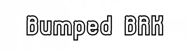
A bold, modern font with thick, block-like letterforms for impactful design.
![Swinger Frei Schriftart Herunterladen]() Herunterladen 605 Downloads@WebFont
Herunterladen 605 Downloads@WebFont -
![Silicon Carne Frei Schriftart Herunterladen]() Herunterladen 432 Downloads@WebFont
Herunterladen 432 Downloads@WebFont -
( Fonts by Manfred Klein. Free for private and charity use. Free for commercial with donation to organizations )
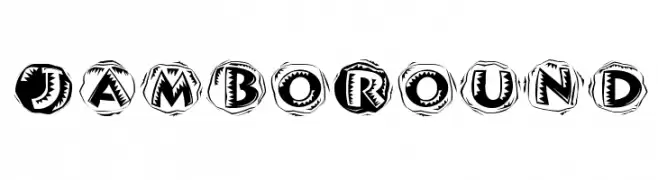
A bold, decorative font with sketch-like, circular backgrounds.
![JamboRound Frei Schriftart Herunterladen]() Herunterladen 172 Downloads@WebFont
Herunterladen 172 Downloads@WebFont -
( Fonts by Dieter Schumacher )
A modern, geometric font with consistent stroke width and slightly rounded corners.
![Rave Frei Schriftart Herunterladen]() Herunterladen 1128 Downloads@WebFont
Herunterladen 1128 Downloads@WebFont -
![Mordred Demi Bold Frei Schriftart Herunterladen]() Herunterladen 746 Downloads
Herunterladen 746 Downloads -
![AlphaElfin Frei Schriftart Herunterladen]() Herunterladen 586 Downloads@WebFont
Herunterladen 586 Downloads@WebFont -
![EleutheriaDisplaySSK Frei Schriftart Herunterladen]() Herunterladen 1511 Downloads@WebFont
Herunterladen 1511 Downloads@WebFont


FAQ – Schrift‑Trends
Was sind die aktuellen Tendenzen?
Im Fokus stehen Einfachheit, Lesbarkeit und Wärme: abgerundete Sans‑Serifs, elegante kontrastreiche Serifs und feine Retro‑Remakes – clean, aber menschlich.
Welche Fonts liegen im Trend?
Beliebt sind u. a. Poppins, Roboto und Montserrat – ein guter Mix aus Modernität und Zeitlosigkeit. Sie funktionieren hervorragend im Web, auf Social‑Grafiken und Verpackungen.
Wie setze ich Trend‑Fonts sinnvoll ein?
Wählen Sie einen markanten Display‑Font für Überschriften und kombinieren Sie ihn mit einer schlichten Sans‑Serif als Fließtext. So entsteht Kontrast ohne Einbußen bei der Lesbarkeit. Prüfen Sie verschiedene Geräte und Medien vor dem Go‑Live.
💡 Tipp: Aktualisieren Sie Kernassets alle paar Monate mit einem Trend‑Font, um Frische und SEO‑Wirkung zu bewahren.