Schriftart
Liberate Normal Schriftart
Beschreibung
- Liben___.ttf
- Schriftart: Liberate Normal
- Gewicht: Normal
- Version: Version Altsys Fontographer 4.1 1/8/95
- Anzahl der Zeichen:: 221
- Encoding Scheme:
- Wird Pitch: 0
Willkommen auf der Seite Schrift‑Trends – entdecken Sie Fonts, die das aktuelle Design prägen. Ob Marken‑Refresh, Social‑Visuals oder Website‑UI: Wer Trends verfolgt, wirkt frisch und relevant.
Diese Sammlung zeigt die angesagtesten Schriften der Saison, gewählt von Kreativen auf der ganzen Welt. Erwarten Sie elegante Serifs, minimalistische Sans‑Serifs, expressive Displays und handgemachte Scripts, die den Look von 2025 mitbestimmen.
Kombinieren Sie Trend‑Fonts mit zeitlosen Kategorien wie Modern, Serif oder Handwritten für ausgewogene, aufmerksamkeitsstarke Typografie.
-
 Herunterladen 754 Downloads
 -
![TBJ Frei Schriftart Herunterladen]() Herunterladen 300 Downloads@WebFont
Herunterladen 300 Downloads@WebFont -
![Vipnagorgialla Frei Schriftart Herunterladen]() Herunterladen 2519 Downloads@WebFont
Herunterladen 2519 Downloads@WebFont -
( Fonts by Paul Reid - tracertong.co.uk )
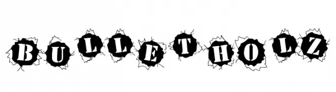
A bold, bullet hole-themed font with high contrast and dramatic impact.
![BulletHolz Frei Schriftart Herunterladen]() Herunterladen 812 Downloads
Herunterladen 812 Downloads -
( Fonts by Mike Hind - Stick Fonts )
A bold, playful font with chunky, rounded letterforms and a whimsical style.
![Fatty Bombatty Frei Schriftart Herunterladen]() Herunterladen 699 Downloads@WebFont
Herunterladen 699 Downloads@WebFont -
( Fonts by www.fugit-tempus.de )
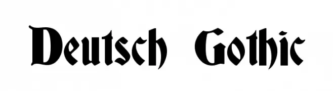
A traditional Gothic font with ornate, angular letterforms and dramatic curves.
![Deutsch Gothic Frei Schriftart Herunterladen]() Herunterladen 4709 Downloads@WebFont
Herunterladen 4709 Downloads@WebFont -
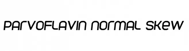
![Parvoflavin Normal Skew Frei Schriftart Herunterladen]() Herunterladen 514 Downloads@WebFont
Herunterladen 514 Downloads@WebFont -
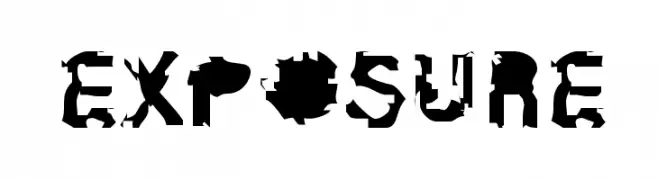
![Exposure Frei Schriftart Herunterladen]() Herunterladen 882 Downloads@WebFont
Herunterladen 882 Downloads@WebFont


FAQ – Schrift‑Trends
Was sind die aktuellen Tendenzen?
Im Fokus stehen Einfachheit, Lesbarkeit und Wärme: abgerundete Sans‑Serifs, elegante kontrastreiche Serifs und feine Retro‑Remakes – clean, aber menschlich.
Welche Fonts liegen im Trend?
Beliebt sind u. a. Poppins, Roboto und Montserrat – ein guter Mix aus Modernität und Zeitlosigkeit. Sie funktionieren hervorragend im Web, auf Social‑Grafiken und Verpackungen.
Wie setze ich Trend‑Fonts sinnvoll ein?
Wählen Sie einen markanten Display‑Font für Überschriften und kombinieren Sie ihn mit einer schlichten Sans‑Serif als Fließtext. So entsteht Kontrast ohne Einbußen bei der Lesbarkeit. Prüfen Sie verschiedene Geräte und Medien vor dem Go‑Live.
💡 Tipp: Aktualisieren Sie Kernassets alle paar Monate mit einem Trend‑Font, um Frische und SEO‑Wirkung zu bewahren.