Schriftart
Maffelyns Free Regular Schriftart
Beschreibung
- Schriftart: Maffelyns Free Regular
- Gewicht: Regular
- Version: Version Version 1.000
- Anzahl der Zeichen:: 106
- Encoding Scheme:
- Wird Pitch: 0
Willkommen auf der Seite Schrift‑Trends – entdecken Sie Fonts, die das aktuelle Design prägen. Ob Marken‑Refresh, Social‑Visuals oder Website‑UI: Wer Trends verfolgt, wirkt frisch und relevant.
Diese Sammlung zeigt die angesagtesten Schriften der Saison, gewählt von Kreativen auf der ganzen Welt. Erwarten Sie elegante Serifs, minimalistische Sans‑Serifs, expressive Displays und handgemachte Scripts, die den Look von 2025 mitbestimmen.
Kombinieren Sie Trend‑Fonts mit zeitlosen Kategorien wie Modern, Serif oder Handwritten für ausgewogene, aufmerksamkeitsstarke Typografie.
-
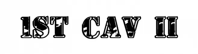
( Fonts by Daniel Zadorozny - www.iconian.com )
A bold, decorative font with a distressed, vintage look.
 Herunterladen 3094 Downloads@WebFont
 -
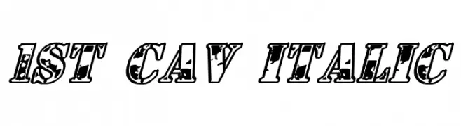
( Fonts by Daniel Zadorozny - www.iconian.com )
A bold, italicized decorative font with a distressed, vintage texture.
![1st Cav Italic Frei Schriftart Herunterladen]() Herunterladen 1497 Downloads@WebFont
Herunterladen 1497 Downloads@WebFont -
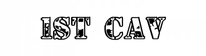
( Fonts by Daniel Zadorozny - www.iconian.com )
A bold, distressed decorative font with a vintage, grunge texture.
![1st Cav Frei Schriftart Herunterladen]() Herunterladen 5534 Downloads@WebFont
Herunterladen 5534 Downloads@WebFont -
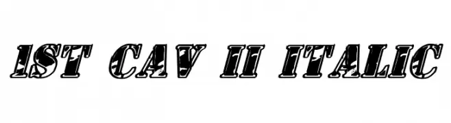
( Fonts by Daniel Zadorozny - www.iconian.com )
A bold, italicized font with thick outlines and a dynamic, retro-modern style.
![1st Cav II Italic Frei Schriftart Herunterladen]() Herunterladen 1490 Downloads@WebFont
Herunterladen 1490 Downloads@WebFont -
( Fonts by Christophe Feray - www.wcfonts.com )
A bold, textured font with a rough, hand-drawn appearance.
![WC Wunderbach Rough Bta Frei Schriftart Herunterladen]() Herunterladen 374 Downloads@WebFont
Herunterladen 374 Downloads@WebFont -
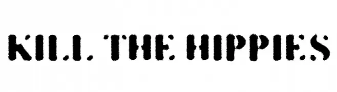
![KILL THE HIPPIES Frei Schriftart Herunterladen]() Herunterladen 633 Downloads@WebFont
Herunterladen 633 Downloads@WebFont -
( Fonts by Fabrika De Typos - Marcio Hirosse - fabrikadetypos.blogspot.com )
A bold, distressed stencil font with a rugged, industrial look.
![CARTAZ Frei Schriftart Herunterladen]() Herunterladen 4507 Downloads@WebFont
Herunterladen 4507 Downloads@WebFont -
( Fonts by www.typodermicfonts.com - Ray Larabie )
A bold, geometric stencil-style font with sharp angles and cut-out sections.
![Octin Stencil Free Frei Schriftart Herunterladen]() Herunterladen 2824 Downloads@WebFont
Herunterladen 2824 Downloads@WebFont


FAQ – Schrift‑Trends
Was sind die aktuellen Tendenzen?
Im Fokus stehen Einfachheit, Lesbarkeit und Wärme: abgerundete Sans‑Serifs, elegante kontrastreiche Serifs und feine Retro‑Remakes – clean, aber menschlich.
Welche Fonts liegen im Trend?
Beliebt sind u. a. Poppins, Roboto und Montserrat – ein guter Mix aus Modernität und Zeitlosigkeit. Sie funktionieren hervorragend im Web, auf Social‑Grafiken und Verpackungen.
Wie setze ich Trend‑Fonts sinnvoll ein?
Wählen Sie einen markanten Display‑Font für Überschriften und kombinieren Sie ihn mit einer schlichten Sans‑Serif als Fließtext. So entsteht Kontrast ohne Einbußen bei der Lesbarkeit. Prüfen Sie verschiedene Geräte und Medien vor dem Go‑Live.
💡 Tipp: Aktualisieren Sie Kernassets alle paar Monate mit einem Trend‑Font, um Frische und SEO‑Wirkung zu bewahren.