Schriftart
Mealtone Schriftart
Beschreibung
- Schriftart: Mealtone
- Gewicht: Regular
- Version: Version Version 1.000
- Anzahl der Zeichen:: 264
- Encoding Scheme:
- Wird Pitch: 0
Willkommen auf der Seite Schrift‑Trends – entdecken Sie Fonts, die das aktuelle Design prägen. Ob Marken‑Refresh, Social‑Visuals oder Website‑UI: Wer Trends verfolgt, wirkt frisch und relevant.
Diese Sammlung zeigt die angesagtesten Schriften der Saison, gewählt von Kreativen auf der ganzen Welt. Erwarten Sie elegante Serifs, minimalistische Sans‑Serifs, expressive Displays und handgemachte Scripts, die den Look von 2025 mitbestimmen.
Kombinieren Sie Trend‑Fonts mit zeitlosen Kategorien wie Modern, Serif oder Handwritten für ausgewogene, aufmerksamkeitsstarke Typografie.
-
( Fonts by Omega Font Labs )
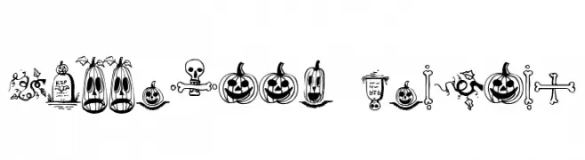
Halloween-themed border font with spooky illustrations.
 Herunterladen 607 Downloads@WebFont
 -
( Fonts by Jeri Ingalls - littlehouse.homestead.com )
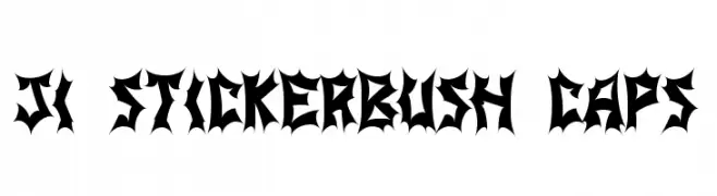
A bold, thorny font with sharp, jagged edges for a striking and aggressive look.
![JI Stickerbush Caps Frei Schriftart Herunterladen]() Herunterladen 176 Downloads@WebFont
Herunterladen 176 Downloads@WebFont -
( Fonts by TarmSaft Font Factory - http://www.aska.nu/tarmsaft/ )
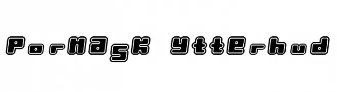
A bold, outlined font with a playful and three-dimensional appearance.
![Pormask Ytterhud Frei Schriftart Herunterladen]() Herunterladen 354 Downloads
Herunterladen 354 Downloads -
( Fonts by ShyFonts )
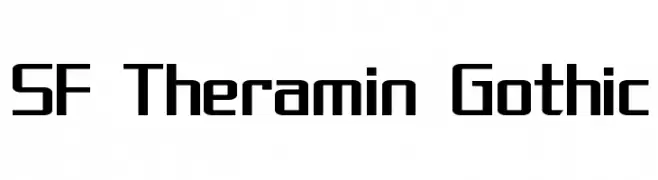
A bold, geometric font with a modern, angular design.
![SF Theramin Gothic Frei Schriftart Herunterladen]() Herunterladen 543 Downloads@WebFont
Herunterladen 543 Downloads@WebFont -
( Fonts by Ryoichi Tsunekawa - www.dharmatype.com )
A bold, distressed font with a hand-painted, calligraphic style.
![Sushitaro Frei Schriftart Herunterladen]() Herunterladen 160 Downloads@WebFont
Herunterladen 160 Downloads@WebFont -
( Fonts by Daniel Zadorozny - www.iconian.com - Free for personal use )
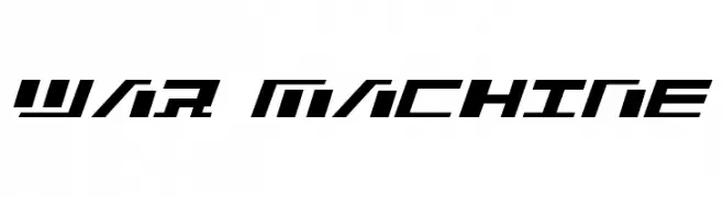
A bold, angular font with a futuristic and dynamic style.
![War Machine Frei Schriftart Herunterladen]() Herunterladen 304 Downloads
Herunterladen 304 Downloads -
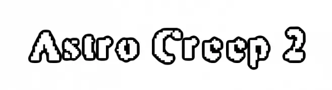
![Astro Creep 2 Frei Schriftart Herunterladen]() Herunterladen 4268 Downloads@WebFont
Herunterladen 4268 Downloads@WebFont -
( Free for non-commercial use. www.johnmartz.com )
A bold, angular font with a futuristic and industrial design.
![Science Project Frei Schriftart Herunterladen]() Herunterladen 1399 Downloads@WebFont
Herunterladen 1399 Downloads@WebFont

FAQ – Schrift‑Trends
Was sind die aktuellen Tendenzen?
Im Fokus stehen Einfachheit, Lesbarkeit und Wärme: abgerundete Sans‑Serifs, elegante kontrastreiche Serifs und feine Retro‑Remakes – clean, aber menschlich.
Welche Fonts liegen im Trend?
Beliebt sind u. a. Poppins, Roboto und Montserrat – ein guter Mix aus Modernität und Zeitlosigkeit. Sie funktionieren hervorragend im Web, auf Social‑Grafiken und Verpackungen.
Wie setze ich Trend‑Fonts sinnvoll ein?
Wählen Sie einen markanten Display‑Font für Überschriften und kombinieren Sie ihn mit einer schlichten Sans‑Serif als Fließtext. So entsteht Kontrast ohne Einbußen bei der Lesbarkeit. Prüfen Sie verschiedene Geräte und Medien vor dem Go‑Live.
💡 Tipp: Aktualisieren Sie Kernassets alle paar Monate mit einem Trend‑Font, um Frische und SEO‑Wirkung zu bewahren.