Schriftart
Ocelot Monowidth Schriftart
Beschreibung
- OCELOT.TTF
- Schriftart: Ocelot Monowidth
- Gewicht: Normal
- Version: Version 1.0 Wed Jul 16 18:15:01 1997
- Anzahl der Zeichen:: 222
- Encoding Scheme:
- Wird Pitch: 1
Willkommen auf der Seite Schrift‑Trends – entdecken Sie Fonts, die das aktuelle Design prägen. Ob Marken‑Refresh, Social‑Visuals oder Website‑UI: Wer Trends verfolgt, wirkt frisch und relevant.
Diese Sammlung zeigt die angesagtesten Schriften der Saison, gewählt von Kreativen auf der ganzen Welt. Erwarten Sie elegante Serifs, minimalistische Sans‑Serifs, expressive Displays und handgemachte Scripts, die den Look von 2025 mitbestimmen.
Kombinieren Sie Trend‑Fonts mit zeitlosen Kategorien wie Modern, Serif oder Handwritten für ausgewogene, aufmerksamkeitsstarke Typografie.
-
 Herunterladen 642 Downloads@WebFont
 -
( Fonts by Levi Halmos )
A rustic, hand-drawn font with uneven strokes and a whimsical touch.
![Lefferts Corners 2 Frei Schriftart Herunterladen]() Herunterladen 438 Downloads@WebFont
Herunterladen 438 Downloads@WebFont -
![Theban Frei Schriftart Herunterladen]() Herunterladen 5168 Downloads@WebFont
Herunterladen 5168 Downloads@WebFont -
![Lombardo Frei Schriftart Herunterladen]() Herunterladen 325 Downloads
Herunterladen 325 Downloads -
![Tabatha Bold Frei Schriftart Herunterladen]() Herunterladen 1210 Downloads
Herunterladen 1210 Downloads -
( Fonts by www.freakyfonts.de )
A pixelated, retro-style font inspired by classic video games.
![Gamegirl Classic Frei Schriftart Herunterladen]() Herunterladen 591 Downloads@WebFont
Herunterladen 591 Downloads@WebFont -
![Calligula Frei Schriftart Herunterladen]() Herunterladen 1316 Downloads@WebFont
Herunterladen 1316 Downloads@WebFont -
( Fonts by Nick Curtis - www.nicksfonts.com )
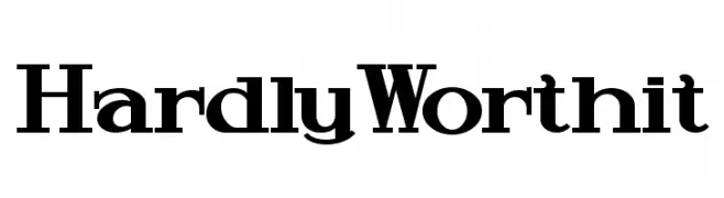
A bold, high-contrast serif font with a classic and authoritative style.
![HardlyWorthit Frei Schriftart Herunterladen]() Herunterladen 638 Downloads@WebFont
Herunterladen 638 Downloads@WebFont


FAQ – Schrift‑Trends
Was sind die aktuellen Tendenzen?
Im Fokus stehen Einfachheit, Lesbarkeit und Wärme: abgerundete Sans‑Serifs, elegante kontrastreiche Serifs und feine Retro‑Remakes – clean, aber menschlich.
Welche Fonts liegen im Trend?
Beliebt sind u. a. Poppins, Roboto und Montserrat – ein guter Mix aus Modernität und Zeitlosigkeit. Sie funktionieren hervorragend im Web, auf Social‑Grafiken und Verpackungen.
Wie setze ich Trend‑Fonts sinnvoll ein?
Wählen Sie einen markanten Display‑Font für Überschriften und kombinieren Sie ihn mit einer schlichten Sans‑Serif als Fließtext. So entsteht Kontrast ohne Einbußen bei der Lesbarkeit. Prüfen Sie verschiedene Geräte und Medien vor dem Go‑Live.
💡 Tipp: Aktualisieren Sie Kernassets alle paar Monate mit einem Trend‑Font, um Frische und SEO‑Wirkung zu bewahren.