Schriftart
Oxlade Demo Schriftart
Beschreibung
- Schriftart: Oxlade Demo
- Gewicht: Regular
- Version: Version
- Anzahl der Zeichen:: 80
- Encoding Scheme:
- Wird Pitch: 0
Willkommen auf der Seite Schrift‑Trends – entdecken Sie Fonts, die das aktuelle Design prägen. Ob Marken‑Refresh, Social‑Visuals oder Website‑UI: Wer Trends verfolgt, wirkt frisch und relevant.
Diese Sammlung zeigt die angesagtesten Schriften der Saison, gewählt von Kreativen auf der ganzen Welt. Erwarten Sie elegante Serifs, minimalistische Sans‑Serifs, expressive Displays und handgemachte Scripts, die den Look von 2025 mitbestimmen.
Kombinieren Sie Trend‑Fonts mit zeitlosen Kategorien wie Modern, Serif oder Handwritten für ausgewogene, aufmerksamkeitsstarke Typografie.
-
( Fonts by Daniel Zadorozny - www.iconian.com )
A bold, geometric font with a futuristic and industrial style.
 Herunterladen 400 Downloads@WebFont
 -
( Fonts by Daniel Zadorozny - www.iconian.com )
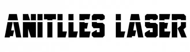
A bold, geometric font with strong, angular shapes ideal for impactful designs.
![Anitlles Frei Schriftart Herunterladen]() Herunterladen 1672 Downloads@WebFont
Herunterladen 1672 Downloads@WebFont -
( Fonts by Daniel Zadorozny - www.iconian.com )
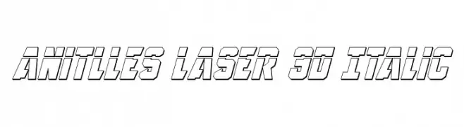
A bold, italicized 3D font with a futuristic and dynamic style.
![Anitlles Laser 3D Italic Frei Schriftart Herunterladen]() Herunterladen 209 Downloads@WebFont
Herunterladen 209 Downloads@WebFont -
( Fonts by Daniel Zadorozny - www.iconian.com )
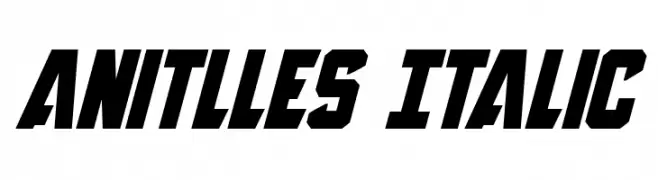
A bold, italic font with a dynamic and angular design, perfect for impactful visuals.
![Anitlles Italic Frei Schriftart Herunterladen]() Herunterladen 1000 Downloads@WebFont
Herunterladen 1000 Downloads@WebFont -
( Fonts by Daniel Zadorozny - www.iconian.com )
A bold, italic, and dynamic font with sharp angles and a modern style.
![Anitlles Expanded Italic Frei Schriftart Herunterladen]() Herunterladen 975 Downloads@WebFont
Herunterladen 975 Downloads@WebFont -
( Fonts by Daniel Zadorozny - www.iconian.com )
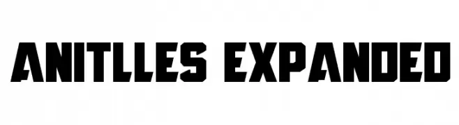
A bold, geometric font with sharp edges and an expanded width.
![Anitlles Expanded Frei Schriftart Herunterladen]() Herunterladen 1514 Downloads@WebFont
Herunterladen 1514 Downloads@WebFont -
( Fonts by Daniel Zadorozny - www.iconian.com )
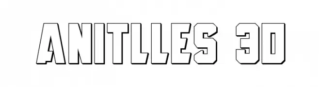
A bold, 3D outlined font with a geometric and angular style.
![Anitlles 3D Frei Schriftart Herunterladen]() Herunterladen 396 Downloads@WebFont
Herunterladen 396 Downloads@WebFont -
( Fonts by Daniel Zadorozny - www.iconian.com )
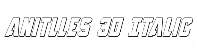
A bold, 3D italic font with a futuristic and dynamic style.
![Anitlles 3D Italic Frei Schriftart Herunterladen]() Herunterladen 309 Downloads@WebFont
Herunterladen 309 Downloads@WebFont


FAQ – Schrift‑Trends
Was sind die aktuellen Tendenzen?
Im Fokus stehen Einfachheit, Lesbarkeit und Wärme: abgerundete Sans‑Serifs, elegante kontrastreiche Serifs und feine Retro‑Remakes – clean, aber menschlich.
Welche Fonts liegen im Trend?
Beliebt sind u. a. Poppins, Roboto und Montserrat – ein guter Mix aus Modernität und Zeitlosigkeit. Sie funktionieren hervorragend im Web, auf Social‑Grafiken und Verpackungen.
Wie setze ich Trend‑Fonts sinnvoll ein?
Wählen Sie einen markanten Display‑Font für Überschriften und kombinieren Sie ihn mit einer schlichten Sans‑Serif als Fließtext. So entsteht Kontrast ohne Einbußen bei der Lesbarkeit. Prüfen Sie verschiedene Geräte und Medien vor dem Go‑Live.
💡 Tipp: Aktualisieren Sie Kernassets alle paar Monate mit einem Trend‑Font, um Frische und SEO‑Wirkung zu bewahren.