Schriftart
PEPminus10 Schriftart
Beschreibung
- pepminus10.ttf
- Schriftart: PEPminus10
- Gewicht:
- Version:
- Anzahl der Zeichen:: 96
- Encoding Scheme:
- Wird Pitch: 0
Willkommen auf der Seite Schrift‑Trends – entdecken Sie Fonts, die das aktuelle Design prägen. Ob Marken‑Refresh, Social‑Visuals oder Website‑UI: Wer Trends verfolgt, wirkt frisch und relevant.
Diese Sammlung zeigt die angesagtesten Schriften der Saison, gewählt von Kreativen auf der ganzen Welt. Erwarten Sie elegante Serifs, minimalistische Sans‑Serifs, expressive Displays und handgemachte Scripts, die den Look von 2025 mitbestimmen.
Kombinieren Sie Trend‑Fonts mit zeitlosen Kategorien wie Modern, Serif oder Handwritten für ausgewogene, aufmerksamkeitsstarke Typografie.
-
( Fonts by Lecter Johnson - doubletwostudios.tumblr.com )
An exotic, bold font with Middle Eastern calligraphic influences.
 Herunterladen 2287 Downloads@WebFont
 -
![tsunami Frei Schriftart Herunterladen]() Herunterladen 691 Downloads@WebFont
Herunterladen 691 Downloads@WebFont -
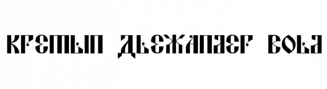
![Kremlin Alexander Bold Frei Schriftart Herunterladen]() Herunterladen 313 Downloads@WebFont
Herunterladen 313 Downloads@WebFont -
![rzrarti Regular Frei Schriftart Herunterladen]() Herunterladen 156 Downloads@WebFont
Herunterladen 156 Downloads@WebFont -
![ChessType Frei Schriftart Herunterladen]() Herunterladen 309 Downloads@WebFont
Herunterladen 309 Downloads@WebFont -
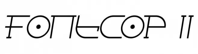
( Fonts by Apostrophic Lab )
A futuristic, geometric font with angular and linear design elements.
![Fontcop II Frei Schriftart Herunterladen]() Herunterladen 193 Downloads@WebFont
Herunterladen 193 Downloads@WebFont -
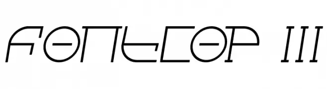
( Fonts by Apostrophic Lab )
A futuristic, geometric font with angular and edgy design elements.
![Fontcop III Frei Schriftart Herunterladen]() Herunterladen 166 Downloads@WebFont
Herunterladen 166 Downloads@WebFont -
( Fonts by Christopher Hansen )
A classic serif font with elegant, sharp serifs and subtle medieval influences.
![Sell Your Soul Frei Schriftart Herunterladen]() Herunterladen 2450 Downloads@WebFont
Herunterladen 2450 Downloads@WebFont


FAQ – Schrift‑Trends
Was sind die aktuellen Tendenzen?
Im Fokus stehen Einfachheit, Lesbarkeit und Wärme: abgerundete Sans‑Serifs, elegante kontrastreiche Serifs und feine Retro‑Remakes – clean, aber menschlich.
Welche Fonts liegen im Trend?
Beliebt sind u. a. Poppins, Roboto und Montserrat – ein guter Mix aus Modernität und Zeitlosigkeit. Sie funktionieren hervorragend im Web, auf Social‑Grafiken und Verpackungen.
Wie setze ich Trend‑Fonts sinnvoll ein?
Wählen Sie einen markanten Display‑Font für Überschriften und kombinieren Sie ihn mit einer schlichten Sans‑Serif als Fließtext. So entsteht Kontrast ohne Einbußen bei der Lesbarkeit. Prüfen Sie verschiedene Geräte und Medien vor dem Go‑Live.
💡 Tipp: Aktualisieren Sie Kernassets alle paar Monate mit einem Trend‑Font, um Frische und SEO‑Wirkung zu bewahren.