Schriftart
Raynoss Swash Schriftart
Beschreibung
- Raynoss Swash.otf
- Schriftart: Raynoss Swash
- Gewicht: Regular
- Version: Version Version 1.00;September 30, 2020;FontCreator 12.0.0.2563 64-bit
- Anzahl der Zeichen:: 9
- Encoding Scheme:
- Wird Pitch: 0
Willkommen auf der Seite Schrift‑Trends – entdecken Sie Fonts, die das aktuelle Design prägen. Ob Marken‑Refresh, Social‑Visuals oder Website‑UI: Wer Trends verfolgt, wirkt frisch und relevant.
Diese Sammlung zeigt die angesagtesten Schriften der Saison, gewählt von Kreativen auf der ganzen Welt. Erwarten Sie elegante Serifs, minimalistische Sans‑Serifs, expressive Displays und handgemachte Scripts, die den Look von 2025 mitbestimmen.
Kombinieren Sie Trend‑Fonts mit zeitlosen Kategorien wie Modern, Serif oder Handwritten für ausgewogene, aufmerksamkeitsstarke Typografie.
-
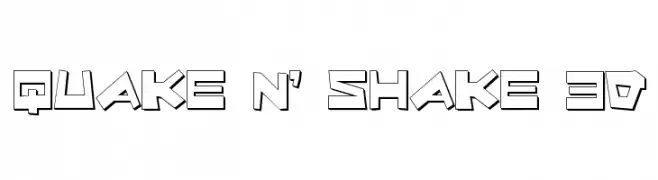
( Fonts by Daniel Zadorozny - www.iconian.com - Free for personal use )
A bold, 3D geometric font with a playful, dynamic style.
 Herunterladen 291 Downloads@WebFont
 -
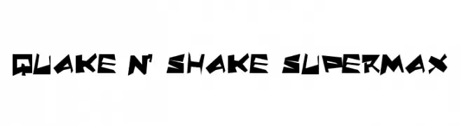
( Fonts by Daniel Zadorozny - www.iconian.com - Free for personal use )
A bold, angular font with a dynamic, geometric style.
![Quake & Shake SuperMax Frei Schriftart Herunterladen]() Herunterladen 183 Downloads@WebFont
Herunterladen 183 Downloads@WebFont -
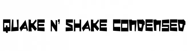
( Fonts by Daniel Zadorozny - www.iconian.com - Free for personal use )
A bold, angular, and geometric font with a condensed width and dynamic style.
![Quake & Shake Condensed Frei Schriftart Herunterladen]() Herunterladen 238 Downloads@WebFont
Herunterladen 238 Downloads@WebFont -
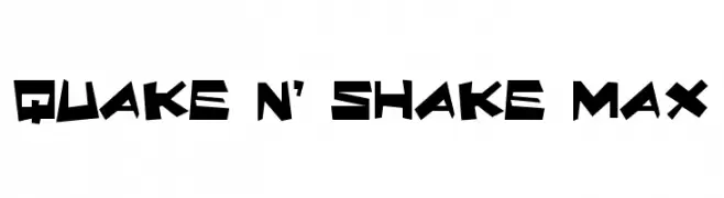
( Fonts by Daniel Zadorozny - www.iconian.com - Free for personal use )
A bold, angular font with a dynamic and energetic style.
![Quake & Shake Max Frei Schriftart Herunterladen]() Herunterladen 329 Downloads@WebFont
Herunterladen 329 Downloads@WebFont -
![Tweaked Frei Schriftart Herunterladen]() Herunterladen 202 Downloads@WebFont
Herunterladen 202 Downloads@WebFont -
( Fonts by Steve Ferrera )
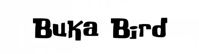
A bold, playful font with a whimsical, hand-drawn style.
![Buka Bird Frei Schriftart Herunterladen]() Herunterladen 3069 Downloads@WebFont
Herunterladen 3069 Downloads@WebFont -
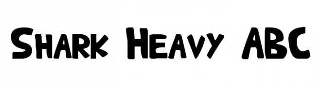
( Fonts by Aryel Filipe )
A bold, playful font with thick, rounded characters and a dynamic style.
![Shark Heavy ABC Frei Schriftart Herunterladen]() Herunterladen 956 Downloads@WebFont
Herunterladen 956 Downloads@WebFont -
( Fonts by Steve Ferrera )
A whimsical, bold font with playful, star-like embellishments.
![Kringle Castle Night Frei Schriftart Herunterladen]() Herunterladen 641 Downloads@WebFont
Herunterladen 641 Downloads@WebFont


FAQ – Schrift‑Trends
Was sind die aktuellen Tendenzen?
Im Fokus stehen Einfachheit, Lesbarkeit und Wärme: abgerundete Sans‑Serifs, elegante kontrastreiche Serifs und feine Retro‑Remakes – clean, aber menschlich.
Welche Fonts liegen im Trend?
Beliebt sind u. a. Poppins, Roboto und Montserrat – ein guter Mix aus Modernität und Zeitlosigkeit. Sie funktionieren hervorragend im Web, auf Social‑Grafiken und Verpackungen.
Wie setze ich Trend‑Fonts sinnvoll ein?
Wählen Sie einen markanten Display‑Font für Überschriften und kombinieren Sie ihn mit einer schlichten Sans‑Serif als Fließtext. So entsteht Kontrast ohne Einbußen bei der Lesbarkeit. Prüfen Sie verschiedene Geräte und Medien vor dem Go‑Live.
💡 Tipp: Aktualisieren Sie Kernassets alle paar Monate mit einem Trend‑Font, um Frische und SEO‑Wirkung zu bewahren.