Schriftart
Scooby Doo Schriftart
Beschreibung
- Scood___.ttf
- Schriftart: Scooby Doo
- Gewicht: Regular
- Version: Version Lauren Ashpole's Scooby Doo
- Anzahl der Zeichen:: 105
- Encoding Scheme:
- Wird Pitch: 0
Willkommen auf der Seite Schrift‑Trends – entdecken Sie Fonts, die das aktuelle Design prägen. Ob Marken‑Refresh, Social‑Visuals oder Website‑UI: Wer Trends verfolgt, wirkt frisch und relevant.
Diese Sammlung zeigt die angesagtesten Schriften der Saison, gewählt von Kreativen auf der ganzen Welt. Erwarten Sie elegante Serifs, minimalistische Sans‑Serifs, expressive Displays und handgemachte Scripts, die den Look von 2025 mitbestimmen.
Kombinieren Sie Trend‑Fonts mit zeitlosen Kategorien wie Modern, Serif oder Handwritten für ausgewogene, aufmerksamkeitsstarke Typografie.
-
 Herunterladen 0 Downloads
 -
( Fonts by Daniel Zadorozny - www.iconian.com - Free for personal use )
A bold, futuristic font with angular and geometric letterforms.
![Sea-Dog Frei Schriftart Herunterladen]() Herunterladen 1819 Downloads@WebFont
Herunterladen 1819 Downloads@WebFont -
( Fonts by Uddi Uddi )
A playful, hand-drawn font with irregular strokes and a whimsical appearance.
![Staggering Bob Frei Schriftart Herunterladen]() Herunterladen 242 Downloads@WebFont
Herunterladen 242 Downloads@WebFont -
( Fonts by Paul Lloyd )
A bold, ornate Blackletter font with dramatic, angular letterforms.
![KilligrewStacatto Frei Schriftart Herunterladen]() Herunterladen 610 Downloads@WebFont
Herunterladen 610 Downloads@WebFont -
( Fonts by Paul Lloyd )
A bold, decorative Blackletter font with high contrast and intricate details.
![Killigrew Frei Schriftart Herunterladen]() Herunterladen 2416 Downloads@WebFont
Herunterladen 2416 Downloads@WebFont -
( Fonts by Daniel Gauthier )
A bold, layered font with a three-dimensional effect and rounded edges.
![BoobToobOpen Frei Schriftart Herunterladen]() Herunterladen 429 Downloads@WebFont
Herunterladen 429 Downloads@WebFont -
( Fonts by Daniel Gauthier )
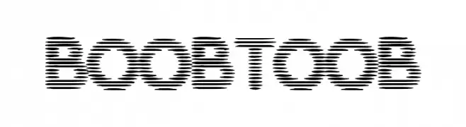
A futuristic, segmented font with a digital glitch effect.
![BoobToob Frei Schriftart Herunterladen]() Herunterladen 409 Downloads@WebFont
Herunterladen 409 Downloads@WebFont -
( Fonts by Daniel Zadorozny - www.iconian.com - Free for personal use )
A bold, geometric font with unique angular cuts and curves.
![Lionheart Bold Frei Schriftart Herunterladen]() Herunterladen 275 Downloads@WebFont
Herunterladen 275 Downloads@WebFont


FAQ – Schrift‑Trends
Was sind die aktuellen Tendenzen?
Im Fokus stehen Einfachheit, Lesbarkeit und Wärme: abgerundete Sans‑Serifs, elegante kontrastreiche Serifs und feine Retro‑Remakes – clean, aber menschlich.
Welche Fonts liegen im Trend?
Beliebt sind u. a. Poppins, Roboto und Montserrat – ein guter Mix aus Modernität und Zeitlosigkeit. Sie funktionieren hervorragend im Web, auf Social‑Grafiken und Verpackungen.
Wie setze ich Trend‑Fonts sinnvoll ein?
Wählen Sie einen markanten Display‑Font für Überschriften und kombinieren Sie ihn mit einer schlichten Sans‑Serif als Fließtext. So entsteht Kontrast ohne Einbußen bei der Lesbarkeit. Prüfen Sie verschiedene Geräte und Medien vor dem Go‑Live.
💡 Tipp: Aktualisieren Sie Kernassets alle paar Monate mit einem Trend‑Font, um Frische und SEO‑Wirkung zu bewahren.