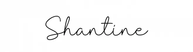
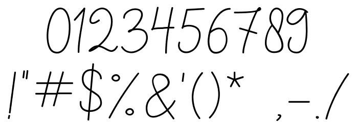
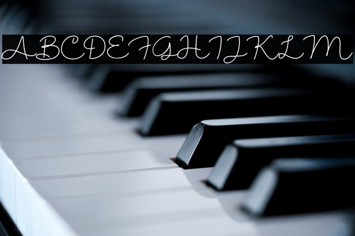
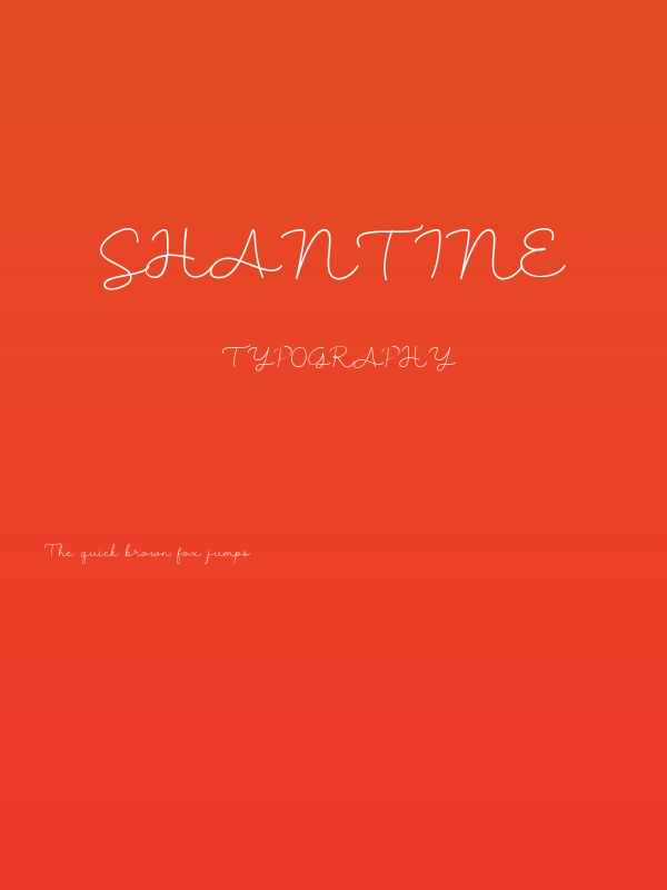
Shantine Font
✎ Handwritten
📄 TrueType
🔢 160 Zeichen
⬇ 192
✅ Kostenlos
✅ Web Font
Fonts by Sibelumpagi - Fajar Abdul Fatah - Personal-use only. For commercial use please contact owner.
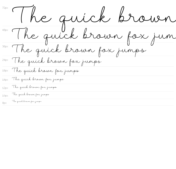
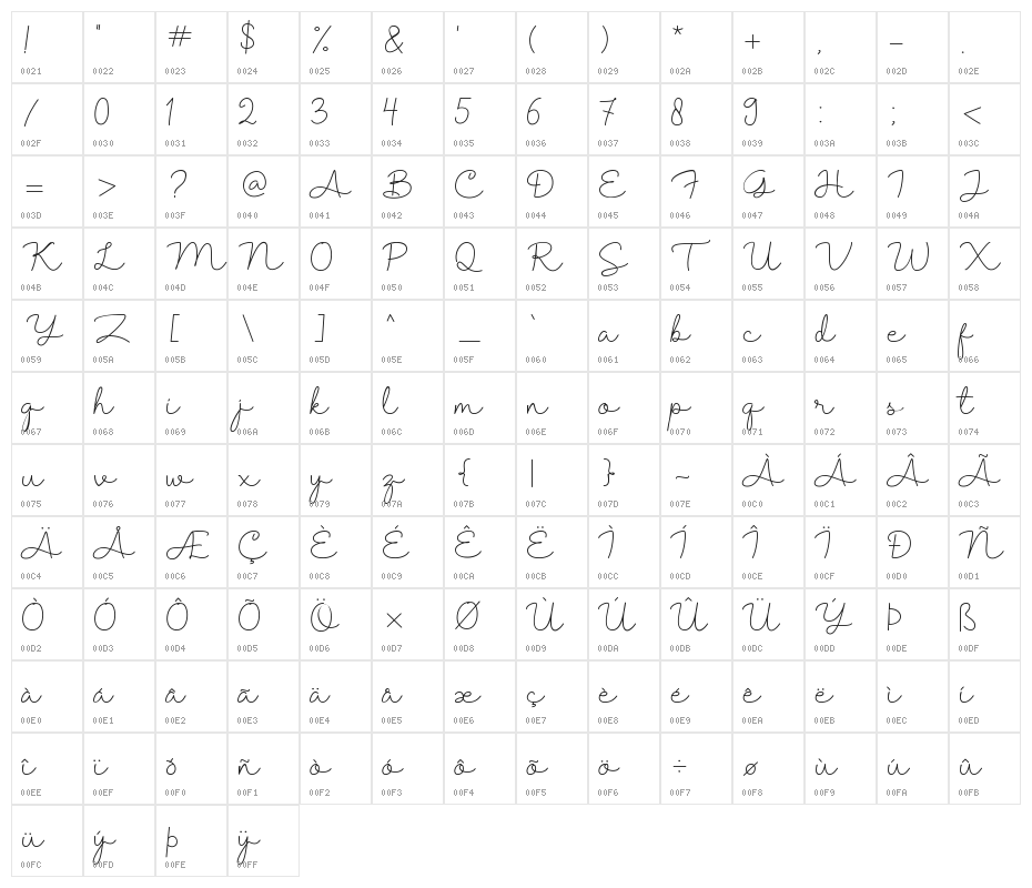
Diese Schriftart enthält 160 Zeichen. Klicken Sie auf ein Zeichen für Details.
Zahlen & Symbole
SHANTINE1 Groß
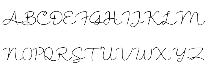
SHANTINE1 Kleinbuchstaben
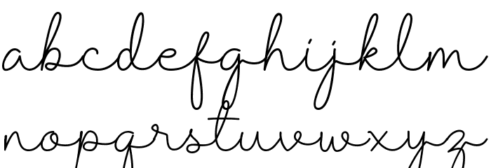
SHANTINE1 Anderer Schreiben
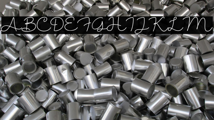
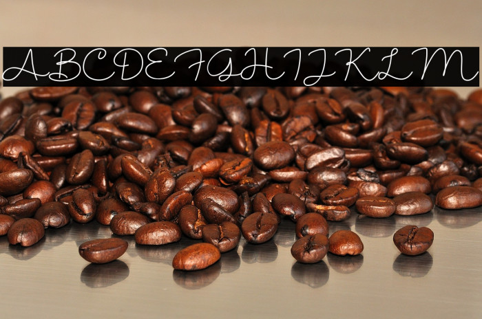
GALERIE-BEISPIELE
Noch keine ähnlichen Schriftarten verfügbar.
Die richtige Schriftart nicht gefunden?
Jede Schriftart aus einem Bild identifizieren
Schriftart identifizieren →Visitenkarte

Social-Media-Header
Logo
Poster
Information
| Name | Shantine |
| Schriften Familie | Shantine |
| Style | Regular |
| Format | TrueType (.ttf) |
| Datei | Shantine1.zip |
| Version | Version 1.0 |
| Anzahl der Zeichen: | 160 |
| Downloads | 192 |
| Hinzugefügt | 2023-06-04 |
| Aktualisiert | 2024-11-21 |
| Kategorien | Handwritten |
| Fett | No |
| Kursiv | No |
| Breite | Normal |
| Zeichenabstand | Monospaced |
| Kontrast | Medium |
| Gesamtstil | Elegant |
| Anwendungsfall | Logos, Invitations, Personal Branding |
| Vorgeschlagene Projekte | Ideal for wedding invitations, greeting cards, personal branding, and elegant packaging designs. |
| Wird Pitch | No |
| Web Font | Verfügbar |
| Lizenz | Kostenlos für den persönlichen Gebrauch |
Fonts by Sibelumpagi - Fajar Abdul Fatah - Personal-use only. For commercial use please contact owner.
Etikette
💻 Windows
- ZIP entpacken
- Rechtsklick .ttf -> Installieren
🍎 macOS
- ZIP entpacken
- Doppelklick .ttf -> Schriftart installieren
Shantine
Kostenlos · TrueType
| Name | Shantine |
| Typ | TrueType |
| Zeichen | 160 |
| Downloads | 192 |
| Hinzugefügt | 2023-06-04 |
| Web Font | Verfügbar |
| Autor | Fonts by Sibelumpagi - Fajar Abdul Fatah - Personal-use only. For commercial use please contact owner. |
| Kategorien | Handwritten |