Schriftart
Stay Chill Regular Schriftart
Beschreibung
- Schriftart: Stay Chill Regular
- Gewicht: Regular
- Version: Version Version 1.00;April 15, 2024;FontCreator 11.5.0.2430 64-bit
- Anzahl der Zeichen:: 207
- Encoding Scheme:
- Wird Pitch: 0
Willkommen auf der Seite Schrift‑Trends – entdecken Sie Fonts, die das aktuelle Design prägen. Ob Marken‑Refresh, Social‑Visuals oder Website‑UI: Wer Trends verfolgt, wirkt frisch und relevant.
Diese Sammlung zeigt die angesagtesten Schriften der Saison, gewählt von Kreativen auf der ganzen Welt. Erwarten Sie elegante Serifs, minimalistische Sans‑Serifs, expressive Displays und handgemachte Scripts, die den Look von 2025 mitbestimmen.
Kombinieren Sie Trend‑Fonts mit zeitlosen Kategorien wie Modern, Serif oder Handwritten für ausgewogene, aufmerksamkeitsstarke Typografie.
-
( THESE ARE SHAREWARE FONTS ! NOT FREEWARE ! PLEASE VISIT www.fuelfonts.com )
A bold, rounded, and italic font with a modern and playful style.
 Herunterladen 1546 Downloads@WebFont
 -
( Fonts by Apostrophic Lab )
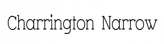
A narrow, elegant serif font with moderate contrast and refined style.
![Charrington Narrow Frei Schriftart Herunterladen]() Herunterladen 754 Downloads@WebFont
Herunterladen 754 Downloads@WebFont -
( Fonts by www.koenhachmang.com - Glitch )
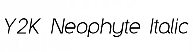
A sleek, modern italic sans-serif font with smooth curves and consistent strokes.
![Y2K Neophyte Italic Frei Schriftart Herunterladen]() Herunterladen 963 Downloads@WebFont
Herunterladen 963 Downloads@WebFont -
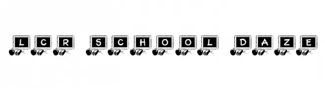
![LCR School Daze Frei Schriftart Herunterladen]() Herunterladen 414 Downloads@WebFont
Herunterladen 414 Downloads@WebFont -
( Fonts by Daniel Zadorozny - www.iconian.com )
A bold, dynamic font with a three-dimensional, outlined style.
![Whiskey Bravo Victor Pro Frei Schriftart Herunterladen]() Herunterladen 428 Downloads@WebFont
Herunterladen 428 Downloads@WebFont -
( Fonts by Iconian Fonts - Daniel Zadorozny )
A bold, 3D geometric font with a futuristic and dynamic style.
![Whiskey Bravo Victor Laser3D Frei Schriftart Herunterladen]() Herunterladen 576 Downloads@WebFont
Herunterladen 576 Downloads@WebFont -
( Fonts by Daniel Zadorozny - www.iconian.com )
A bold, angular font with a dynamic slant and strong visual impact.
![Whiskey Bravo Victor Bold Frei Schriftart Herunterladen]() Herunterladen 463 Downloads@WebFont
Herunterladen 463 Downloads@WebFont -
( Fonts by Daniel Zadorozny - www.iconian.com )
A bold, angular font with a futuristic and dynamic style.
![Whiskey Bravo Victor Laser Frei Schriftart Herunterladen]() Herunterladen 291 Downloads@WebFont
Herunterladen 291 Downloads@WebFont


FAQ – Schrift‑Trends
Was sind die aktuellen Tendenzen?
Im Fokus stehen Einfachheit, Lesbarkeit und Wärme: abgerundete Sans‑Serifs, elegante kontrastreiche Serifs und feine Retro‑Remakes – clean, aber menschlich.
Welche Fonts liegen im Trend?
Beliebt sind u. a. Poppins, Roboto und Montserrat – ein guter Mix aus Modernität und Zeitlosigkeit. Sie funktionieren hervorragend im Web, auf Social‑Grafiken und Verpackungen.
Wie setze ich Trend‑Fonts sinnvoll ein?
Wählen Sie einen markanten Display‑Font für Überschriften und kombinieren Sie ihn mit einer schlichten Sans‑Serif als Fließtext. So entsteht Kontrast ohne Einbußen bei der Lesbarkeit. Prüfen Sie verschiedene Geräte und Medien vor dem Go‑Live.
💡 Tipp: Aktualisieren Sie Kernassets alle paar Monate mit einem Trend‑Font, um Frische und SEO‑Wirkung zu bewahren.