Schriftart
Subterranean Dylan Regular Schriftart
Beschreibung
- SB.ttf
- Schriftart: Subterranean Dylan Regular
- Gewicht: Regular
- Version: Version Version 1.000
- Anzahl der Zeichen:: 107
- Encoding Scheme:
- Wird Pitch: 0
Willkommen auf der Seite Schrift‑Trends – entdecken Sie Fonts, die das aktuelle Design prägen. Ob Marken‑Refresh, Social‑Visuals oder Website‑UI: Wer Trends verfolgt, wirkt frisch und relevant.
Diese Sammlung zeigt die angesagtesten Schriften der Saison, gewählt von Kreativen auf der ganzen Welt. Erwarten Sie elegante Serifs, minimalistische Sans‑Serifs, expressive Displays und handgemachte Scripts, die den Look von 2025 mitbestimmen.
Kombinieren Sie Trend‑Fonts mit zeitlosen Kategorien wie Modern, Serif oder Handwritten für ausgewogene, aufmerksamkeitsstarke Typografie.
-
 Herunterladen 1868 Downloads@WebFont
 -
( Fonts by Small Voice Studio - smallvoice.studio/typefaces - Personal-use only. For commercial use please contact owner. )
A playful, hand-drawn font with irregular shapes and dynamic strokes.
![DodgenburnA Frei Schriftart Herunterladen]() Herunterladen 621 Downloads@WebFont
Herunterladen 621 Downloads@WebFont -
![Eurostar Black Extended Frei Schriftart Herunterladen]() Herunterladen 43976 Downloads@WebFont
Herunterladen 43976 Downloads@WebFont -
( Fonts by Omega Font Labs )
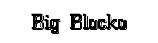
A bold, blocky font with a shadow effect, perfect for impactful headlines.
![Big Blocko Frei Schriftart Herunterladen]() Herunterladen 2928 Downloads@WebFont
Herunterladen 2928 Downloads@WebFont -
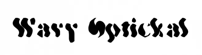
![Wavy Optickal Frei Schriftart Herunterladen]() Herunterladen 262 Downloads@WebFont
Herunterladen 262 Downloads@WebFont -
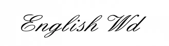
![English Wd Frei Schriftart Herunterladen]() Herunterladen 15269 Downloads@WebFont
Herunterladen 15269 Downloads@WebFont -
![oktober Frei Schriftart Herunterladen]() Herunterladen 599 Downloads@WebFont
Herunterladen 599 Downloads@WebFont -
![Oregon-Wet Frei Schriftart Herunterladen]() Herunterladen 632 Downloads
Herunterladen 632 Downloads


FAQ – Schrift‑Trends
Was sind die aktuellen Tendenzen?
Im Fokus stehen Einfachheit, Lesbarkeit und Wärme: abgerundete Sans‑Serifs, elegante kontrastreiche Serifs und feine Retro‑Remakes – clean, aber menschlich.
Welche Fonts liegen im Trend?
Beliebt sind u. a. Poppins, Roboto und Montserrat – ein guter Mix aus Modernität und Zeitlosigkeit. Sie funktionieren hervorragend im Web, auf Social‑Grafiken und Verpackungen.
Wie setze ich Trend‑Fonts sinnvoll ein?
Wählen Sie einen markanten Display‑Font für Überschriften und kombinieren Sie ihn mit einer schlichten Sans‑Serif als Fließtext. So entsteht Kontrast ohne Einbußen bei der Lesbarkeit. Prüfen Sie verschiedene Geräte und Medien vor dem Go‑Live.
💡 Tipp: Aktualisieren Sie Kernassets alle paar Monate mit einem Trend‑Font, um Frische und SEO‑Wirkung zu bewahren.