Schriftart
Sweet Candies Schriftart
Beschreibung
- Schriftart: Sweet Candies
- Gewicht:
- Version:
- Anzahl der Zeichen::
- Encoding Scheme:
- Wird Pitch: 0
Willkommen auf der Seite Schrift‑Trends – entdecken Sie Fonts, die das aktuelle Design prägen. Ob Marken‑Refresh, Social‑Visuals oder Website‑UI: Wer Trends verfolgt, wirkt frisch und relevant.
Diese Sammlung zeigt die angesagtesten Schriften der Saison, gewählt von Kreativen auf der ganzen Welt. Erwarten Sie elegante Serifs, minimalistische Sans‑Serifs, expressive Displays und handgemachte Scripts, die den Look von 2025 mitbestimmen.
Kombinieren Sie Trend‑Fonts mit zeitlosen Kategorien wie Modern, Serif oder Handwritten für ausgewogene, aufmerksamkeitsstarke Typografie.
-
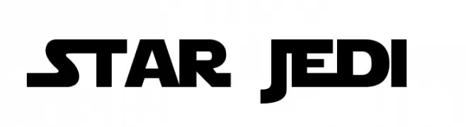
( Fonts by Boba Fonts )
A bold, futuristic font with sharp angles and a sci-fi aesthetic.
 Herunterladen 6471 Downloads@WebFont
 -
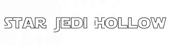
( Fonts by Boba Fonts )
A futuristic, geometric font with hollow, outlined letterforms.
![Star Jedi Hollow Frei Schriftart Herunterladen]() Herunterladen 4982 Downloads@WebFont
Herunterladen 4982 Downloads@WebFont -
( Fonts by www.fontalicious.com )
A playful, bold font with bubble-like, three-dimensional letters.
![Billo Frei Schriftart Herunterladen]() Herunterladen 7312 Downloads@WebFont
Herunterladen 7312 Downloads@WebFont -
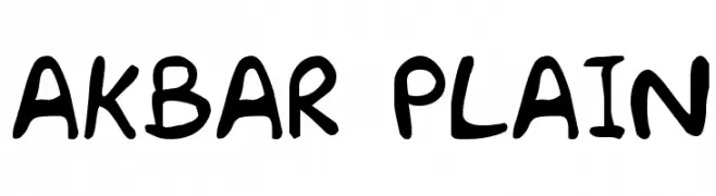
( Fonts by Dennis Ludlow - Sharkshock )
A playful, bold handwritten font with a whimsical and casual style.
![Akbar Plain Frei Schriftart Herunterladen]() Herunterladen 7129 Downloads@WebFont
Herunterladen 7129 Downloads@WebFont -
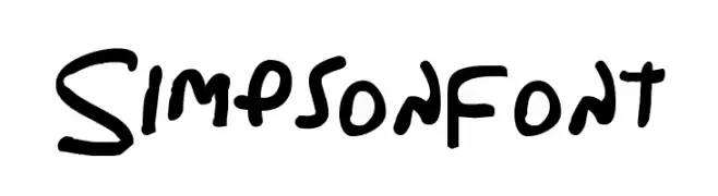
( Fonts by Dennis Ludlow - Sharkshock )
A playful, handwritten font with bold, rounded strokes and a casual style.
![Simpsonfont Frei Schriftart Herunterladen]() Herunterladen 5592 Downloads@WebFont
Herunterladen 5592 Downloads@WebFont -
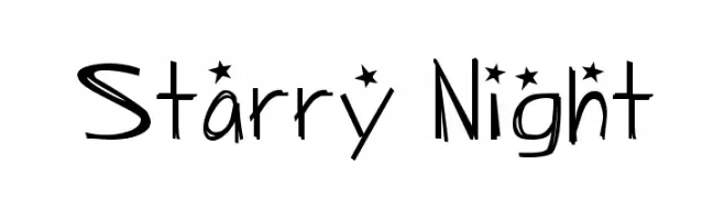
![Starry Night Frei Schriftart Herunterladen]() Herunterladen 1558 Downloads@WebFont
Herunterladen 1558 Downloads@WebFont -
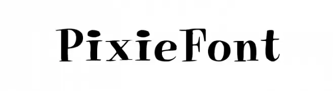
( Fonts by David Rakowski )
A whimsical and decorative serif font with playful serifs and dynamic strokes.
![PixieFont Frei Schriftart Herunterladen]() Herunterladen 986 Downloads
Herunterladen 986 Downloads -
( Fonts by Nick Curtis - www.nicksfonts.com )
A bold, geometric font with strong, striking characters.
![East Market NF Frei Schriftart Herunterladen]() Herunterladen 2308 Downloads@WebFont
Herunterladen 2308 Downloads@WebFont


FAQ – Schrift‑Trends
Was sind die aktuellen Tendenzen?
Im Fokus stehen Einfachheit, Lesbarkeit und Wärme: abgerundete Sans‑Serifs, elegante kontrastreiche Serifs und feine Retro‑Remakes – clean, aber menschlich.
Welche Fonts liegen im Trend?
Beliebt sind u. a. Poppins, Roboto und Montserrat – ein guter Mix aus Modernität und Zeitlosigkeit. Sie funktionieren hervorragend im Web, auf Social‑Grafiken und Verpackungen.
Wie setze ich Trend‑Fonts sinnvoll ein?
Wählen Sie einen markanten Display‑Font für Überschriften und kombinieren Sie ihn mit einer schlichten Sans‑Serif als Fließtext. So entsteht Kontrast ohne Einbußen bei der Lesbarkeit. Prüfen Sie verschiedene Geräte und Medien vor dem Go‑Live.
💡 Tipp: Aktualisieren Sie Kernassets alle paar Monate mit einem Trend‑Font, um Frische und SEO‑Wirkung zu bewahren.