Schriftart
The Wild Hammers Demo Schriftart
Beschreibung
- The Wild Hammers Demo.ttf
- Schriftart: The Wild Hammers Demo
- Gewicht: Regular
- Version: Version Version 1.000
- Anzahl der Zeichen:: 67
- Encoding Scheme:
- Wird Pitch: 0
Willkommen auf der Seite Schrift‑Trends – entdecken Sie Fonts, die das aktuelle Design prägen. Ob Marken‑Refresh, Social‑Visuals oder Website‑UI: Wer Trends verfolgt, wirkt frisch und relevant.
Diese Sammlung zeigt die angesagtesten Schriften der Saison, gewählt von Kreativen auf der ganzen Welt. Erwarten Sie elegante Serifs, minimalistische Sans‑Serifs, expressive Displays und handgemachte Scripts, die den Look von 2025 mitbestimmen.
Kombinieren Sie Trend‑Fonts mit zeitlosen Kategorien wie Modern, Serif oder Handwritten für ausgewogene, aufmerksamkeitsstarke Typografie.
-
( Frogii`s Fonts )
A geometric, decorative font with a modern, abstract style.
 Herunterladen 182 Downloads@WebFont
 -
![Quill Frei Schriftart Herunterladen]() Herunterladen 17093 Downloads@WebFont
Herunterladen 17093 Downloads@WebFont -
( Fonts by www.DigitalDreamDesign.net )
A pixelated, retro-style font with a digital, blocky appearance.
![D3 LiteBitMapism Selif Frei Schriftart Herunterladen]() Herunterladen 301 Downloads@WebFont
Herunterladen 301 Downloads@WebFont -
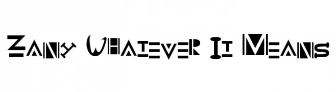
![Zany Whatever It Means Frei Schriftart Herunterladen]() Herunterladen 339 Downloads@WebFont
Herunterladen 339 Downloads@WebFont -
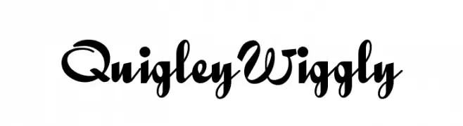
( Fonts by Nick Curtis - www.nicksfonts.com )
A playful, whimsical font with flowing, cursive-like strokes and decorative flair.
![QuigleyWiggly Frei Schriftart Herunterladen]() Herunterladen 1674 Downloads@WebFont
Herunterladen 1674 Downloads@WebFont -
![GlOrY BoLd Frei Schriftart Herunterladen]() Herunterladen 895 Downloads@WebFont
Herunterladen 895 Downloads@WebFont -
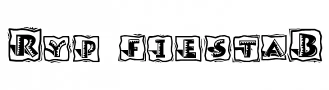
![Ryp fiestaB Frei Schriftart Herunterladen]() Herunterladen 215 Downloads@WebFont
Herunterladen 215 Downloads@WebFont -
![Dromon Frei Schriftart Herunterladen]() Herunterladen 844 Downloads@WebFont
Herunterladen 844 Downloads@WebFont


FAQ – Schrift‑Trends
Was sind die aktuellen Tendenzen?
Im Fokus stehen Einfachheit, Lesbarkeit und Wärme: abgerundete Sans‑Serifs, elegante kontrastreiche Serifs und feine Retro‑Remakes – clean, aber menschlich.
Welche Fonts liegen im Trend?
Beliebt sind u. a. Poppins, Roboto und Montserrat – ein guter Mix aus Modernität und Zeitlosigkeit. Sie funktionieren hervorragend im Web, auf Social‑Grafiken und Verpackungen.
Wie setze ich Trend‑Fonts sinnvoll ein?
Wählen Sie einen markanten Display‑Font für Überschriften und kombinieren Sie ihn mit einer schlichten Sans‑Serif als Fließtext. So entsteht Kontrast ohne Einbußen bei der Lesbarkeit. Prüfen Sie verschiedene Geräte und Medien vor dem Go‑Live.
💡 Tipp: Aktualisieren Sie Kernassets alle paar Monate mit einem Trend‑Font, um Frische und SEO‑Wirkung zu bewahren.