Schriftart
Vinque Schriftart
Beschreibung
- vinque.ttf
- Schriftart: Vinque
- Gewicht: Regular
- Version: Version Version 2.0; 2002; initial release
- Anzahl der Zeichen:: 229
- Encoding Scheme:
- Wird Pitch: 0
Willkommen auf der Seite Schrift‑Trends – entdecken Sie Fonts, die das aktuelle Design prägen. Ob Marken‑Refresh, Social‑Visuals oder Website‑UI: Wer Trends verfolgt, wirkt frisch und relevant.
Diese Sammlung zeigt die angesagtesten Schriften der Saison, gewählt von Kreativen auf der ganzen Welt. Erwarten Sie elegante Serifs, minimalistische Sans‑Serifs, expressive Displays und handgemachte Scripts, die den Look von 2025 mitbestimmen.
Kombinieren Sie Trend‑Fonts mit zeitlosen Kategorien wie Modern, Serif oder Handwritten für ausgewogene, aufmerksamkeitsstarke Typografie.
-
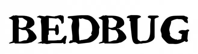
( Fonts by Jacob Fisher - www.pizzadude.dk )
A bold, textured font with a vintage, handcrafted feel.
 Herunterladen 678 Downloads@WebFont
 -
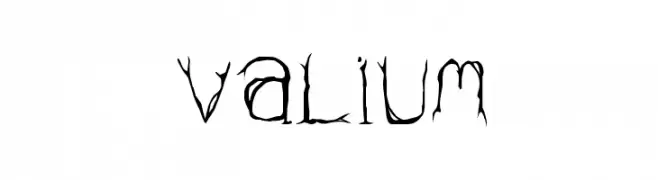
( Fonts by Divide By Zero! - fonts.tom7.com )
An edgy, thorn-like font with jagged, organic letterforms and bold, rectangular numbers.
![Valium Frei Schriftart Herunterladen]() Herunterladen 1260 Downloads@WebFont
Herunterladen 1260 Downloads@WebFont -
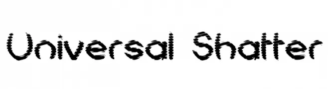
( Fonts by Graham Meade - GemFonts )
A bold, shattered-effect font with a dynamic and fragmented appearance.
![Universal Shatter Frei Schriftart Herunterladen]() Herunterladen 446 Downloads@WebFont
Herunterladen 446 Downloads@WebFont -
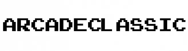
( Fonts by Jacob Fisher - www.pizzadude.dk )
A pixelated font inspired by retro arcade games, featuring blocky, grid-like characters.
![ArcadeClassic Frei Schriftart Herunterladen]() Herunterladen 1253 Downloads@WebFont
Herunterladen 1253 Downloads@WebFont -
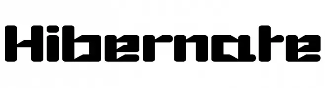
( Fonts by Levi Halmos )
A bold, geometric font with a futuristic and modern design.
![Hibernate Frei Schriftart Herunterladen]() Herunterladen 651 Downloads@WebFont
Herunterladen 651 Downloads@WebFont -
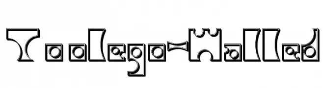
![Toolego-Walled Frei Schriftart Herunterladen]() Herunterladen 228 Downloads@WebFont
Herunterladen 228 Downloads@WebFont -
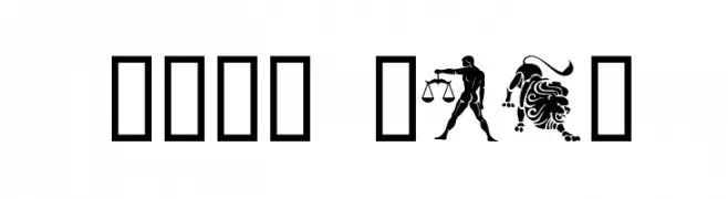
( Fonts by www.houseoflime.com )
Zodiac symbols depicted in circular emblems.
![Your Sign Frei Schriftart Herunterladen]() Herunterladen 440 Downloads@WebFont
Herunterladen 440 Downloads@WebFont -
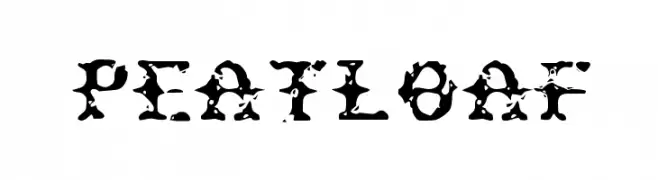
![Peatloaf Frei Schriftart Herunterladen]() Herunterladen 245 Downloads@WebFont
Herunterladen 245 Downloads@WebFont
FAQ – Schrift‑Trends
Was sind die aktuellen Tendenzen?
Im Fokus stehen Einfachheit, Lesbarkeit und Wärme: abgerundete Sans‑Serifs, elegante kontrastreiche Serifs und feine Retro‑Remakes – clean, aber menschlich.
Welche Fonts liegen im Trend?
Beliebt sind u. a. Poppins, Roboto und Montserrat – ein guter Mix aus Modernität und Zeitlosigkeit. Sie funktionieren hervorragend im Web, auf Social‑Grafiken und Verpackungen.
Wie setze ich Trend‑Fonts sinnvoll ein?
Wählen Sie einen markanten Display‑Font für Überschriften und kombinieren Sie ihn mit einer schlichten Sans‑Serif als Fließtext. So entsteht Kontrast ohne Einbußen bei der Lesbarkeit. Prüfen Sie verschiedene Geräte und Medien vor dem Go‑Live.
💡 Tipp: Aktualisieren Sie Kernassets alle paar Monate mit einem Trend‑Font, um Frische und SEO‑Wirkung zu bewahren.