Schriftart
Wizzard Schriftart
Beschreibung
- WIZZARD.TTF
- Schriftart: Wizzard
- Gewicht: Regular
- Version: Version Converted from C:TRUETYPEWIZZARD.TF1 by ALLTYPE
- Anzahl der Zeichen:: 400
- Encoding Scheme:
- Wird Pitch: 0
Willkommen auf der Seite Schrift‑Trends – entdecken Sie Fonts, die das aktuelle Design prägen. Ob Marken‑Refresh, Social‑Visuals oder Website‑UI: Wer Trends verfolgt, wirkt frisch und relevant.
Diese Sammlung zeigt die angesagtesten Schriften der Saison, gewählt von Kreativen auf der ganzen Welt. Erwarten Sie elegante Serifs, minimalistische Sans‑Serifs, expressive Displays und handgemachte Scripts, die den Look von 2025 mitbestimmen.
Kombinieren Sie Trend‑Fonts mit zeitlosen Kategorien wie Modern, Serif oder Handwritten für ausgewogene, aufmerksamkeitsstarke Typografie.
-
( Fonts by Uddi Uddi )
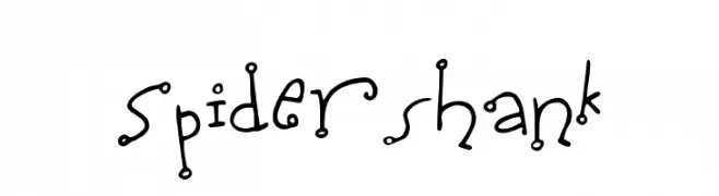
A playful, whimsical font with irregular strokes and dot embellishments.
 Herunterladen 280 Downloads@WebFont
 -
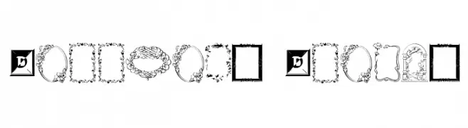
![Darrians Frames Frei Schriftart Herunterladen]() Herunterladen 849 Downloads@WebFont
Herunterladen 849 Downloads@WebFont -
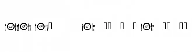
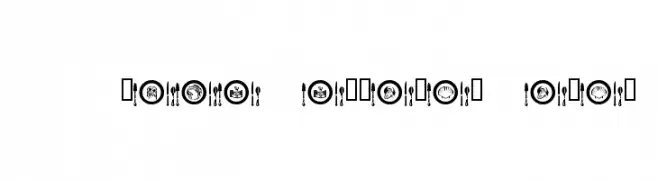
![AL Place Settings Letters Frei Schriftart Herunterladen]() Herunterladen 427 Downloads@WebFont
Herunterladen 427 Downloads@WebFont -
( Fonts by Daniel Gauthier )
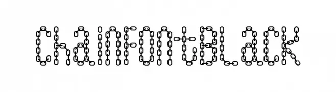
A decorative font with characters made of interconnected chain links.
![ChainFontBlack Frei Schriftart Herunterladen]() Herunterladen 701 Downloads@WebFont
Herunterladen 701 Downloads@WebFont -
( Fonts by Daniel Gauthier )
A decorative font with characters designed as chain links, offering a bold and industrial look.
![ChainFontOpen Frei Schriftart Herunterladen]() Herunterladen 1027 Downloads@WebFont
Herunterladen 1027 Downloads@WebFont -
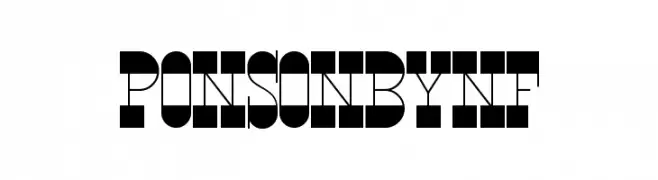
( Fonts by Nick Curtis - www.nicksfonts.com )
A bold, geometric font with high contrast and a striking, modern design.
![PonsonbyNF Frei Schriftart Herunterladen]() Herunterladen 509 Downloads@WebFont
Herunterladen 509 Downloads@WebFont -
![AL Place Settings Dings Frei Schriftart Herunterladen]() Herunterladen 286 Downloads@WebFont
Herunterladen 286 Downloads@WebFont -
![Gossip Frei Schriftart Herunterladen]() Herunterladen 1356 Downloads@WebFont
Herunterladen 1356 Downloads@WebFont


FAQ – Schrift‑Trends
Was sind die aktuellen Tendenzen?
Im Fokus stehen Einfachheit, Lesbarkeit und Wärme: abgerundete Sans‑Serifs, elegante kontrastreiche Serifs und feine Retro‑Remakes – clean, aber menschlich.
Welche Fonts liegen im Trend?
Beliebt sind u. a. Poppins, Roboto und Montserrat – ein guter Mix aus Modernität und Zeitlosigkeit. Sie funktionieren hervorragend im Web, auf Social‑Grafiken und Verpackungen.
Wie setze ich Trend‑Fonts sinnvoll ein?
Wählen Sie einen markanten Display‑Font für Überschriften und kombinieren Sie ihn mit einer schlichten Sans‑Serif als Fließtext. So entsteht Kontrast ohne Einbußen bei der Lesbarkeit. Prüfen Sie verschiedene Geräte und Medien vor dem Go‑Live.
💡 Tipp: Aktualisieren Sie Kernassets alle paar Monate mit einem Trend‑Font, um Frische und SEO‑Wirkung zu bewahren.