Schriftart
ZXSpectrum Schriftart
Beschreibung
- zxspectr.ttf
- Schriftart: ZXSpectrum
- Gewicht: Regular
- Version: Version Macromedia Fontographer 4.1.2 16/4/98
- Anzahl der Zeichen:: 72
- Encoding Scheme:
- Wird Pitch: 0
Willkommen auf der Seite Schrift‑Trends – entdecken Sie Fonts, die das aktuelle Design prägen. Ob Marken‑Refresh, Social‑Visuals oder Website‑UI: Wer Trends verfolgt, wirkt frisch und relevant.
Diese Sammlung zeigt die angesagtesten Schriften der Saison, gewählt von Kreativen auf der ganzen Welt. Erwarten Sie elegante Serifs, minimalistische Sans‑Serifs, expressive Displays und handgemachte Scripts, die den Look von 2025 mitbestimmen.
Kombinieren Sie Trend‑Fonts mit zeitlosen Kategorien wie Modern, Serif oder Handwritten für ausgewogene, aufmerksamkeitsstarke Typografie.
-
( Fonts by TarmSaft Font Factory - http://www.aska.nu/tarmsaft/ )
A bold, futuristic font with rounded geometric shapes and a cohesive design.
 Herunterladen 194 Downloads@WebFont
 -
![TommyGun Frei Schriftart Herunterladen]() Herunterladen 213 Downloads@WebFont
Herunterladen 213 Downloads@WebFont -
![UltraSonic Frei Schriftart Herunterladen]() Herunterladen 361 Downloads@WebFont
Herunterladen 361 Downloads@WebFont -
![Hathor Frei Schriftart Herunterladen]() Herunterladen 225 Downloads@WebFont
Herunterladen 225 Downloads@WebFont -
( Fonts by Jacob Fisher - www.pizzadude.dk )
A modern, dot-based font with a digital and futuristic aesthetic.
![Anger is a gift Frei Schriftart Herunterladen]() Herunterladen 1584 Downloads@WebFont
Herunterladen 1584 Downloads@WebFont -
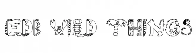
( Fonts by uatype.faithweb.com - UnAuthorized Type )
A whimsical and decorative font with imaginative, creature-inspired designs.
![EDB Wild Things Frei Schriftart Herunterladen]() Herunterladen 577 Downloads@WebFont
Herunterladen 577 Downloads@WebFont -
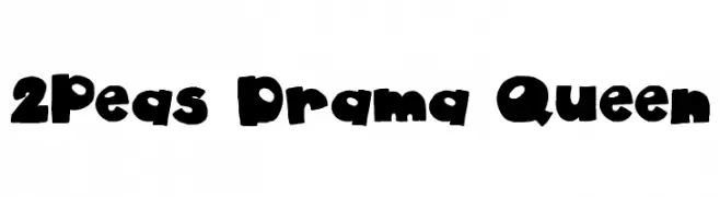
( Fonts by www.twopeasinabucket.com )
A playful, bold display font with a whimsical, hand-drawn style.
![2Peas Drama Queen Frei Schriftart Herunterladen]() Herunterladen 1887 Downloads@WebFont
Herunterladen 1887 Downloads@WebFont -
![Circle black&white Frei Schriftart Herunterladen]() Herunterladen 345 Downloads@WebFont
Herunterladen 345 Downloads@WebFont

FAQ – Schrift‑Trends
Was sind die aktuellen Tendenzen?
Im Fokus stehen Einfachheit, Lesbarkeit und Wärme: abgerundete Sans‑Serifs, elegante kontrastreiche Serifs und feine Retro‑Remakes – clean, aber menschlich.
Welche Fonts liegen im Trend?
Beliebt sind u. a. Poppins, Roboto und Montserrat – ein guter Mix aus Modernität und Zeitlosigkeit. Sie funktionieren hervorragend im Web, auf Social‑Grafiken und Verpackungen.
Wie setze ich Trend‑Fonts sinnvoll ein?
Wählen Sie einen markanten Display‑Font für Überschriften und kombinieren Sie ihn mit einer schlichten Sans‑Serif als Fließtext. So entsteht Kontrast ohne Einbußen bei der Lesbarkeit. Prüfen Sie verschiedene Geräte und Medien vor dem Go‑Live.
💡 Tipp: Aktualisieren Sie Kernassets alle paar Monate mit einem Trend‑Font, um Frische und SEO‑Wirkung zu bewahren.