Schriftart
&_NearSighted Normal Schriftart
Beschreibung
- nears21.ttf
- Schriftart: &_NearSighted Normal
- Gewicht: Normal
- Version: Version 001.003
- Anzahl der Zeichen:: 81
- Encoding Scheme:
- Wird Pitch: 0
Willkommen auf der Seite Schrift‑Trends – entdecken Sie Fonts, die das aktuelle Design prägen. Ob Marken‑Refresh, Social‑Visuals oder Website‑UI: Wer Trends verfolgt, wirkt frisch und relevant.
Diese Sammlung zeigt die angesagtesten Schriften der Saison, gewählt von Kreativen auf der ganzen Welt. Erwarten Sie elegante Serifs, minimalistische Sans‑Serifs, expressive Displays und handgemachte Scripts, die den Look von 2025 mitbestimmen.
Kombinieren Sie Trend‑Fonts mit zeitlosen Kategorien wie Modern, Serif oder Handwritten für ausgewogene, aufmerksamkeitsstarke Typografie.
-
( Fonts by Daniel Midgley )
A bold, italicized sans-serif font with a modern and dynamic style.
 Herunterladen 1268 Downloads@WebFont
 -
( Fonts by Daniel Midgley )
A bold, italicized sans-serif font with a modern and dynamic style.
![Perspective Sans Black Italic Frei Schriftart Herunterladen]() Herunterladen 1460 Downloads@WebFont
Herunterladen 1460 Downloads@WebFont -
( Fonts by Daniel Midgley )
A bold, modern sans-serif font with geometric shapes and even spacing.
![Perspective Sans Bold Frei Schriftart Herunterladen]() Herunterladen 3216 Downloads@WebFont
Herunterladen 3216 Downloads@WebFont -
( Fonts by Daniel Midgley )
A bold, modern sans-serif font with clean, geometric lines.
![Perspective Sans Black Frei Schriftart Herunterladen]() Herunterladen 2563 Downloads@WebFont
Herunterladen 2563 Downloads@WebFont -
( Fonts by Daniel Midgley )
A modern sans-serif italic font with smooth curves and consistent stroke width.
![Perspective Sans Italic Frei Schriftart Herunterladen]() Herunterladen 1126 Downloads@WebFont
Herunterladen 1126 Downloads@WebFont -
![Volt Frei Schriftart Herunterladen]() Herunterladen 1916 Downloads@WebFont
Herunterladen 1916 Downloads@WebFont -
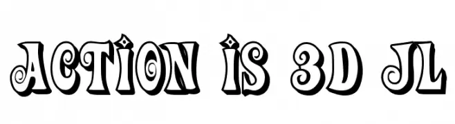
![Action Is 3D JL Frei Schriftart Herunterladen]() Herunterladen 3156 Downloads@WebFont
Herunterladen 3156 Downloads@WebFont -
( Fonts by www.fontalicious.com )
A playful, bold font with slightly condensed letterforms and a cohesive design.
![Smilage Frei Schriftart Herunterladen]() Herunterladen 1441 Downloads@WebFont
Herunterladen 1441 Downloads@WebFont


FAQ – Schrift‑Trends
Was sind die aktuellen Tendenzen?
Im Fokus stehen Einfachheit, Lesbarkeit und Wärme: abgerundete Sans‑Serifs, elegante kontrastreiche Serifs und feine Retro‑Remakes – clean, aber menschlich.
Welche Fonts liegen im Trend?
Beliebt sind u. a. Poppins, Roboto und Montserrat – ein guter Mix aus Modernität und Zeitlosigkeit. Sie funktionieren hervorragend im Web, auf Social‑Grafiken und Verpackungen.
Wie setze ich Trend‑Fonts sinnvoll ein?
Wählen Sie einen markanten Display‑Font für Überschriften und kombinieren Sie ihn mit einer schlichten Sans‑Serif als Fließtext. So entsteht Kontrast ohne Einbußen bei der Lesbarkeit. Prüfen Sie verschiedene Geräte und Medien vor dem Go‑Live.
💡 Tipp: Aktualisieren Sie Kernassets alle paar Monate mit einem Trend‑Font, um Frische und SEO‑Wirkung zu bewahren.