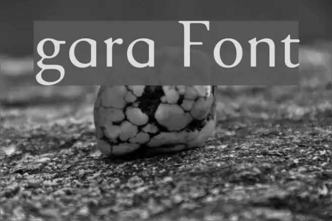
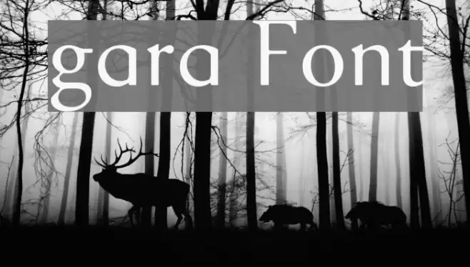
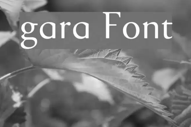
gara Font
✎ Serif
📄 PostScript
🔢 234 Zeichen
⬇ 3,984
✅ Kostenlos
✅ Web Font

Font by Inaki Marquinez
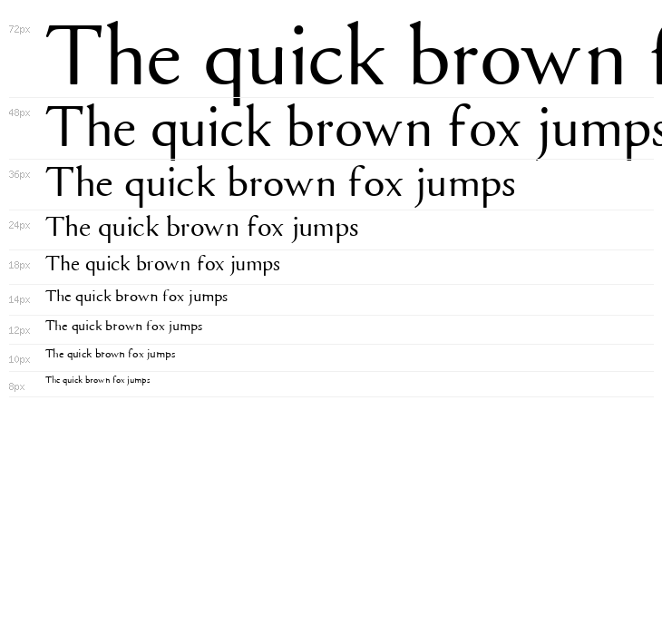

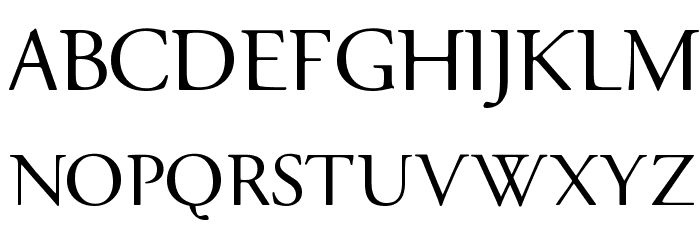
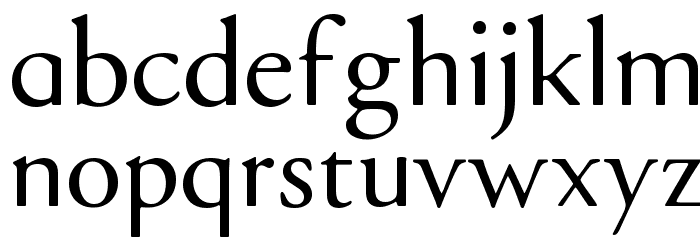
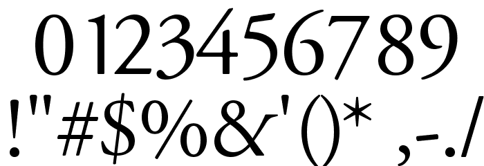
Diese Schriftart enthält 234 Zeichen. Klicken Sie auf ein Zeichen für Details.
Zahlen & Symbole
GARA Groß
GARA Kleinbuchstaben
GARA Anderer Schreiben
GALERIE-BEISPIELE
Ähnliche kostenlose Schriftarten

Ähnliche kommerzielle Schriftarten


Die richtige Schriftart nicht gefunden?
Jede Schriftart aus einem Bild identifizieren
Schriftart identifizieren →Visitenkarte

Social-Media-Header

Logo
Poster

Information
| Name | gara |
| TTF Name | GARARG__.TTF |
| Schriften Familie | 1 |
| Style | 1 |
| Format | PostScript (.ttf) |
| Datei | gara.zip |
| Gewicht | Regular |
| Version | Version io grafix: 26/01/98 |
| Anzahl der Zeichen: | 234 |
| Downloads | 3,984 |
| Hinzugefügt | 2010-03-31 |
| Aktualisiert | 2024-12-05 |
| Kategorien | Serif |
| Fett | No |
| Kursiv | No |
| Breite | Normal |
| Zeichenabstand | Monospaced |
| Kontrast | Medium |
| Gesamtstil | Classic |
| Anwendungsfall | Headlines, Body text, Logos |
| Vorgeschlagene Projekte | Ideal for editorial design, book covers, formal invitations, and branding projects that require a touch of elegance and tradition. |
| Wird Pitch | No |
| Web Font | Verfügbar |
| Lizenz | Kostenlos für den persönlichen Gebrauch |
Font by Inaki Marquinez
Etikette
💻 Windows
- ZIP entpacken
- Rechtsklick .ttf -> Installieren
🍎 macOS
- ZIP entpacken
- Doppelklick .ttf -> Schriftart installieren
gara
Kostenlos · PostScript
| Name | gara |
| Typ | PostScript |
| Zeichen | 234 |
| Downloads | 3,984 |
| Hinzugefügt | 2010-03-31 |
| Web Font | Verfügbar |
| Autor | Font by Inaki Marquinez |
| Kategorien | Serif |