Willkommen bei den Top‑Schriften – hier treffen Beliebtheit und Qualität aufeinander. Das sind die in diesem Jahr am häufigsten heruntergeladenen und genutzten Fonts. Wenn Sie sichere Optionen für Logo, Web oder Social suchen, starten Sie hier.
Jeder Top‑Font überzeugt durch Balance, Lesbarkeit und Vielseitigkeit. Sie finden moderne Sans‑Serifs, elegante Scripts, Vintage‑Serifs und minimalistische Displays.
-
 Herunterladen 521 Downloads@WebFont
 -
( Copyright 2017, The Mozilla Foundation )
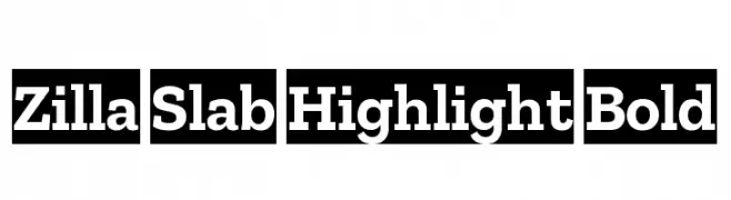
A bold, slab serif font with strong geometric shapes and a robust presence.
![Zilla Slab Highlight Bold Frei Schriftart Herunterladen]() Herunterladen 521 Downloads@WebFont
Herunterladen 521 Downloads@WebFont -
( Free for a personal use. For a commercial use please visit www.kevinandamanda.com )
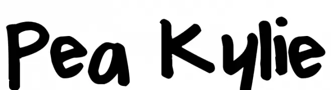
A bold, playful handwritten font with a casual and friendly style.
![Pea Kylie Frei Schriftart Herunterladen]() Herunterladen 521 Downloads@WebFont
Herunterladen 521 Downloads@WebFont -
Schriftart von fontsnthings. For commercial use please contact the owner.
![AlphaShapes gravestones 3 Frei Schriftart Herunterladen]() Herunterladen 521 Downloads@WebFont
Herunterladen 521 Downloads@WebFont -
( Fonts by Castcraft Software - opti.netii.net - check the website before use )
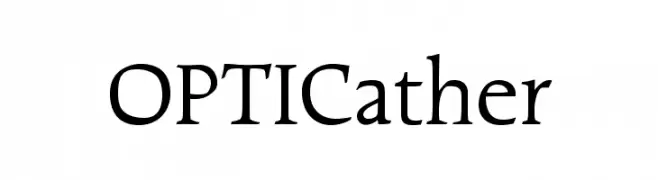
A classic serif font with elegant strokes and refined details.
![OPTICather Frei Schriftart Herunterladen]() Herunterladen 521 Downloads@WebFont
Herunterladen 521 Downloads@WebFont -
( Fonts by Daniel Zadorozny - www.iconian.com - Free for personal use )
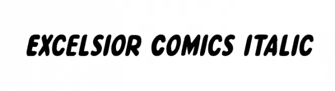
A bold, playful, and slightly italic font with rounded characters.
![Excelsior Comics Italic Frei Schriftart Herunterladen]() Herunterladen 521 Downloads@WebFont
Herunterladen 521 Downloads@WebFont -
( Fonts by Steve Ferrera )
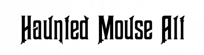
A spooky, decorative font with jagged edges and eerie cutouts, perfect for Halloween themes.
![Haunted Mouse Alt Frei Schriftart Herunterladen]() Herunterladen 521 Downloads@WebFont
Herunterladen 521 Downloads@WebFont -
( Fonts by www.gliphmaker.com. Personal-use only. For commercial use please contact owner. )
A playful, decorative font with bold, hand-drawn characters and whimsical flourishes.
![Cleopatra Frei Schriftart Herunterladen]() Herunterladen 521 Downloads@WebFont
Herunterladen 521 Downloads@WebFont -
( weknow - Wino S Kadir - www.creativefabrica.com/designer/weknow/ )
A bold, rounded font with a futuristic and modern style.
![FUTURE Bold Frei Schriftart Herunterladen]() Herunterladen 521 Downloads@WebFont
Herunterladen 521 Downloads@WebFont -
( Fonts by Apostrophic Lab )
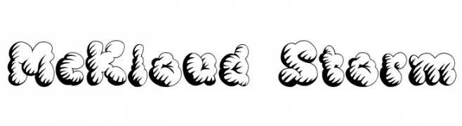
A playful, cloud-like font with bold, rounded characters and three-dimensional shading.
![McKloud Storm Frei Schriftart Herunterladen]() Herunterladen 521 Downloads@WebFont
Herunterladen 521 Downloads@WebFont -
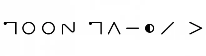
![Moon Maths x Frei Schriftart Herunterladen]() Herunterladen 521 Downloads@WebFont
Herunterladen 521 Downloads@WebFont -
( Free for personal use - Fonts by Markus Schroppel. For commercial license please donate to http://www.die-gute-schrift.de/donation.html )
A bold, playful font with rounded edges and a friendly appearance.
![LLCharlotte Frei Schriftart Herunterladen]() Herunterladen 521 Downloads@WebFont
Herunterladen 521 Downloads@WebFont -
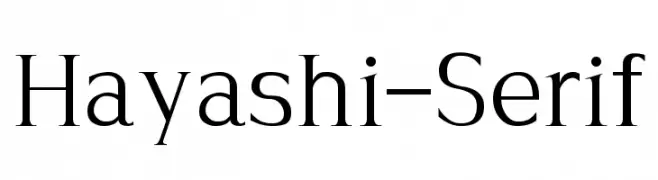
![Hayashi-Serif Frei Schriftart Herunterladen]() Herunterladen 521 Downloads@WebFont
Herunterladen 521 Downloads@WebFont -
Schriftart von Pabasar. For commercial use please contact the owner.
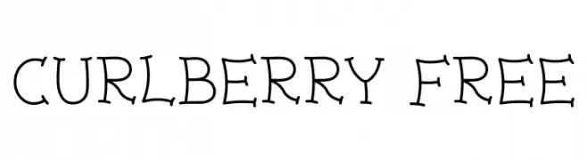
( Curlberry Free )
A whimsical font with playful curls and consistent stroke width.
![Curlberry Free Frei Schriftart Herunterladen]() Herunterladen 521 Downloads@WebFont
Herunterladen 521 Downloads@WebFont -
( Fonts by OSP-foundry - http://ospublish.constantvzw.org/foundry/ - Personal-use only. For commercial use please contact owner. )
A bold, modern sans-serif font with geometric lines and high contrast.
![Polsku Frei Schriftart Herunterladen]() Herunterladen 521 Downloads@WebFont
Herunterladen 521 Downloads@WebFont -
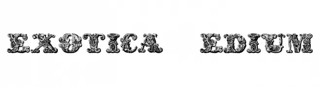
![exotica Medium Frei Schriftart Herunterladen]() Herunterladen 521 Downloads@WebFont
Herunterladen 521 Downloads@WebFont -
( Fonts by BLKBK - https://blkbk.ink - Personal-use only. For commercial use please contact owner. Sponsoren Schriftart )
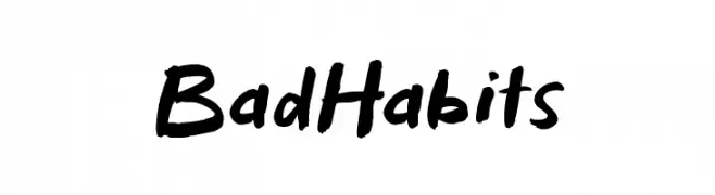
A bold, brush-style font with a casual and energetic vibe.
![Bad Habits Frei Schriftart Herunterladen]() Herunterladen 521 Downloads
Herunterladen 521 Downloads -
( Fonts by Nadine Dickmann )
A playful, casual handwritten font with consistent stroke width and informal style.
![NB Frei Schriftart Herunterladen]() Herunterladen 521 Downloads@WebFont
Herunterladen 521 Downloads@WebFont -
![Piccolo Frei Schriftart Herunterladen]() Herunterladen 521 Downloads@WebFont
Herunterladen 521 Downloads@WebFont -
( Fonts by SnailFonts )
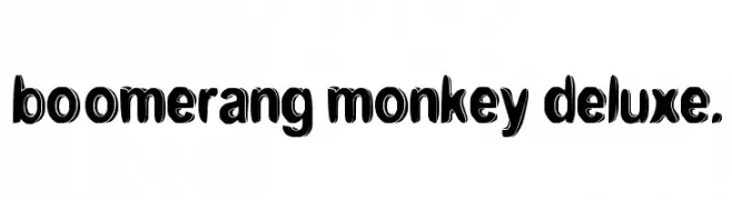
A playful, bold font with a bubbly, three-dimensional design.
![boomerang monkey deluxe. Frei Schriftart Herunterladen]() Herunterladen 521 Downloads@WebFont
Herunterladen 521 Downloads@WebFont -
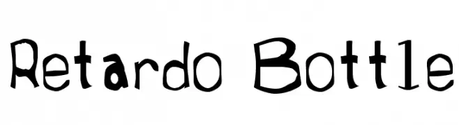
![Retardo Bottle Frei Schriftart Herunterladen]() Herunterladen 521 Downloads@WebFont
Herunterladen 521 Downloads@WebFont -
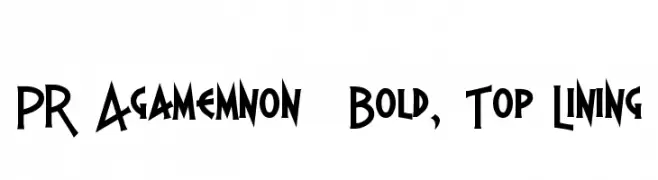
( Fonts by Peter Rempel - www.prfonts.com )
A bold, angular font with sharp lines and a geometric style.
![PR Agamemnon Bold, Top Lining Frei Schriftart Herunterladen]() Herunterladen 521 Downloads@WebFont
Herunterladen 521 Downloads@WebFont -
( Free for a personal use. For a commercial use please visit www.kevinandamanda.com )
A casual, handwritten font with bold strokes and balanced spacing.
![kevinandamanda.com Frei Schriftart Herunterladen]() Herunterladen 520 Downloads@WebFont
Herunterladen 520 Downloads@WebFont -
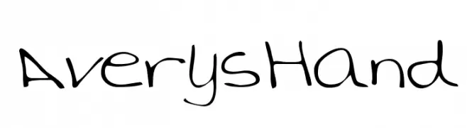
![AverysHand Frei Schriftart Herunterladen]() Herunterladen 520 Downloads
Herunterladen 520 Downloads -
( Fonts by Stefie Justprince )
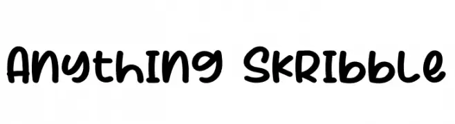
A bold, handwritten font with a playful and casual style.
![Anything Skribble Frei Schriftart Herunterladen]() Herunterladen 520 Downloads@WebFont
Herunterladen 520 Downloads@WebFont -
( Darrell Flood )
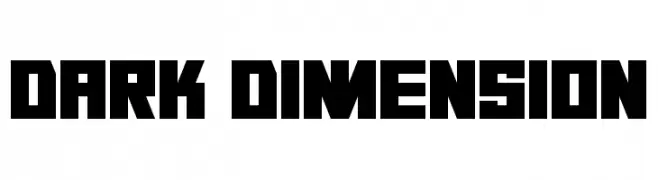
A bold, geometric font with sharp edges and a modern style.
![Dark Dimension Frei Schriftart Herunterladen]() Herunterladen 520 Downloads@WebFont
Herunterladen 520 Downloads@WebFont -
( Fonts by www.aenigmafonts.com )
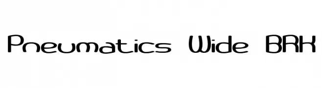
A modern, wide, and rounded font with a futuristic appeal.
![Pneumatics Wide BRK Frei Schriftart Herunterladen]() Herunterladen 520 Downloads@WebFont
Herunterladen 520 Downloads@WebFont -
( Fonts by Dieter Steffmann )
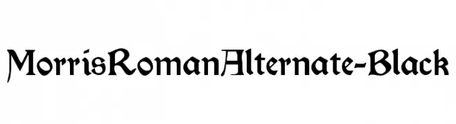
A bold, blackletter-inspired font with a medieval and decorative style.
![MorrisRomanAlternate-Black Frei Schriftart Herunterladen]() Herunterladen 520 Downloads@WebFont
Herunterladen 520 Downloads@WebFont -
( Fonts by Tn2 - TOM )
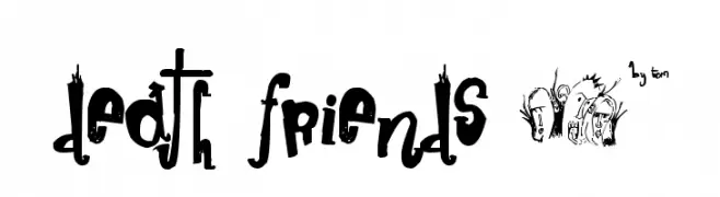
A playful, artistic display font with a chaotic, hand-drawn style.
![death friends µ* Frei Schriftart Herunterladen]() Herunterladen 520 Downloads@WebFont
Herunterladen 520 Downloads@WebFont -
( Fonts by Sealoung )
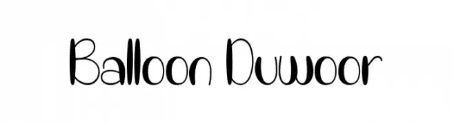
A playful, balloon-like font with rounded and elongated letterforms.
![Balloon Duwoor Frei Schriftart Herunterladen]() Herunterladen 520 Downloads@WebFont
Herunterladen 520 Downloads@WebFont -
( Fonts by ShyFonts )
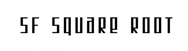
A geometric, modern font with a square-like structure and sharp angles.
![SF Square Root Frei Schriftart Herunterladen]() Herunterladen 520 Downloads@WebFont
Herunterladen 520 Downloads@WebFont -
( Fonts by Daniel Zadorozny - www.iconian.com )
A bold, expanded, and italic futuristic font with a dynamic and modern style.
![Gunship Expanded Italic Frei Schriftart Herunterladen]() Herunterladen 520 Downloads@WebFont
Herunterladen 520 Downloads@WebFont -
![Shalom-Light Frei Schriftart Herunterladen]() Herunterladen 520 Downloads
Herunterladen 520 Downloads -
![GetVoIPGrotesque-Italic Frei Schriftart Herunterladen]() Herunterladen 520 Downloads@WebFont
Herunterladen 520 Downloads@WebFont -
( Fonts by or from www.graffitifonts.net )
A bold, playful font with thick, rounded strokes and a hand-drawn feel.
![GF Matilda bold Frei Schriftart Herunterladen]() Herunterladen 520 Downloads@WebFont
Herunterladen 520 Downloads@WebFont


Welche Schriften sind gerade am populärsten?
Poppins, Roboto, Montserrat, Open Sans und Lato sind wegen ihrer klaren Formen und breiten Einsetzbarkeit sehr gefragt – von Markenauftritt über Landingpages bis hin zu Postern.
Welche Fonts eignen sich für Logos?
Geometrische Sans‑Serifs (z. B. Poppins, Familien im Gotham‑Stil) sind ein häufiger Griff für sauberes, skalierbares Branding. Für eine persönlichere Note bleiben Scripts und Handschrift‑Stile beliebt. Kombinieren Sie einen prägnanten Headline‑Font mit einer neutralen Brotschrift für Wiedererkennung und Harmonie.
Wie oft wird die Top‑Liste aktualisiert?
Regelmäßig – basierend auf realen Downloads und Interaktionen. Schauen Sie öfter vorbei, um aufstrebende Favoriten früh zu entdecken.
💡 Tipp: Seite bookmarken – Trends wechseln schnell, und heutige Top‑Schriften inspirieren morgen vielleicht das Rebranding.