Willkommen bei den Top‑Schriften – hier treffen Beliebtheit und Qualität aufeinander. Das sind die in diesem Jahr am häufigsten heruntergeladenen und genutzten Fonts. Wenn Sie sichere Optionen für Logo, Web oder Social suchen, starten Sie hier.
Jeder Top‑Font überzeugt durch Balance, Lesbarkeit und Vielseitigkeit. Sie finden moderne Sans‑Serifs, elegante Scripts, Vintage‑Serifs und minimalistische Displays.
-
 Herunterladen 514 Downloads@WebFont
 -
( Kids Fonts - kidsfonts.mivox.com/ )
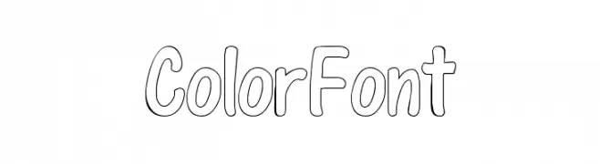
A playful, hand-drawn font with rounded, bubbly characters and an outline style.
![ColorFont Frei Schriftart Herunterladen]() Herunterladen 514 Downloads@WebFont
Herunterladen 514 Downloads@WebFont -
( Fonts by Billy Argel Fonts - www.billyargel.com - Personal-use only. For commercial use please contact owner. )
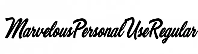
A bold, cursive font with elegant curves and decorative flourishes.
![Worldwide Frei Schriftart Herunterladen]() Herunterladen 514 Downloads@WebFont
Herunterladen 514 Downloads@WebFont -
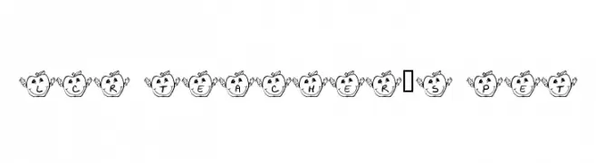
![LCR Teacher's Pet Frei Schriftart Herunterladen]() Herunterladen 514 Downloads@WebFont
Herunterladen 514 Downloads@WebFont -
( Fonts by www.DigitalDreamDesign.net )
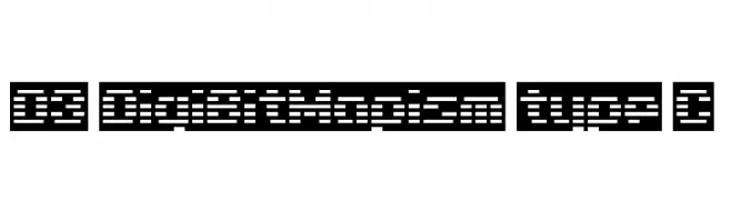
A pixelated, digital-style font with a structured, grid-like appearance.
![D3 DigiBitMapism type C Frei Schriftart Herunterladen]() Herunterladen 514 Downloads@WebFont
Herunterladen 514 Downloads@WebFont -
![Marvelous Personal Use Regular Frei Schriftart Herunterladen]() Herunterladen 514 Downloads@WebFont
Herunterladen 514 Downloads@WebFont -
( Fonts by a Max Infeld - XEROGRAPHER FONTS - xerographer.blogspot.com . Personal-use only. For commercial use please contact owner. )
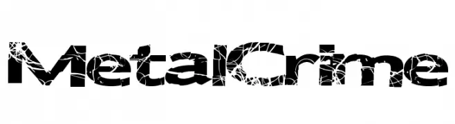
A bold, distressed font with a cracked texture for a rebellious look.
![MetalCrime Frei Schriftart Herunterladen]() Herunterladen 514 Downloads@WebFont
Herunterladen 514 Downloads@WebFont -
( Fonts by Mocha Frappuccino - Personal-use only. For commercial use please contact owner. )
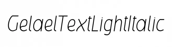
A sleek, modern, light italic font with smooth, consistent strokes.
![GelaelTextLightItalic Frei Schriftart Herunterladen]() Herunterladen 514 Downloads@WebFont
Herunterladen 514 Downloads@WebFont -
![Grafiteg free Frei Schriftart Herunterladen]() Herunterladen 514 Downloads@WebFont
Herunterladen 514 Downloads@WebFont -
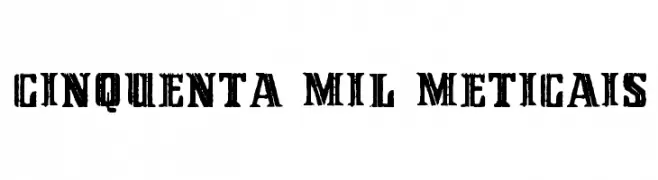
![Cinquenta Mil Meticais Frei Schriftart Herunterladen]() Herunterladen 514 Downloads@WebFont
Herunterladen 514 Downloads@WebFont -
( Fonts by Iconian Fonts - Daniel Zadorozny - Personal-use only. For commercial use please contact owner. )
A bold, condensed, and italicized font with strong visual impact.
![Punch Condensed Italic Frei Schriftart Herunterladen]() Herunterladen 514 Downloads@WebFont
Herunterladen 514 Downloads@WebFont -
( Fonts by Rony Koch - Personal-use only. For commercial use please contact owner. )
A bold, playful font with exaggerated curves and a quirky style.
![Karantina Regular Frei Schriftart Herunterladen]() Herunterladen 514 Downloads
Herunterladen 514 Downloads -
![SF WADIM GIANT ITALIC Frei Schriftart Herunterladen]() Herunterladen 514 Downloads@WebFont
Herunterladen 514 Downloads@WebFont -
![Kelvinch Bold Italic Frei Schriftart Herunterladen]() Herunterladen 514 Downloads@WebFont
Herunterladen 514 Downloads@WebFont -
( Hendra Pratama )
An elegant, flowing script font with smooth, continuous strokes.
![LazyRidePersonalUse-Regular Frei Schriftart Herunterladen]() Herunterladen 514 Downloads@WebFont
Herunterladen 514 Downloads@WebFont -
( Fonts by Rodrigo Fuenzalida )
A bold, rounded typeface with a playful and robust appearance.
![Titan One Frei Schriftart Herunterladen]() Herunterladen 514 Downloads@WebFont
Herunterladen 514 Downloads@WebFont -
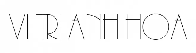
![VI Tri Anh Hoa Frei Schriftart Herunterladen]() Herunterladen 514 Downloads@WebFont
Herunterladen 514 Downloads@WebFont -
( Fonts by a Neale Davidson - www.pixelsagas.com. Personal-use only. For commercial use please contact owner. )
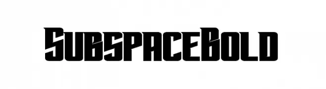
A bold, geometric font with a futuristic and angular design.
![Subspace Bold Frei Schriftart Herunterladen]() Herunterladen 514 Downloads@WebFont
Herunterladen 514 Downloads@WebFont -
![Jaggy Fries Frei Schriftart Herunterladen]() Herunterladen 514 Downloads@WebFont
Herunterladen 514 Downloads@WebFont -
( Fonts by Bluestype Studio )
A playful, hand-drawn font with rounded, bold characters.
![Wonderkids Frei Schriftart Herunterladen]() Herunterladen 514 Downloads@WebFont
Herunterladen 514 Downloads@WebFont -
( Fonts by PutraCetol Studio )
A bold, geometric font with a cracked, fragmented design.
![Rock Pile Crack Frei Schriftart Herunterladen]() Herunterladen 514 Downloads@WebFont
Herunterladen 514 Downloads@WebFont -
( Fonts by The Scriptorium - Dave Nalle )
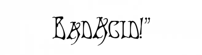
A bold, gothic-inspired font with sharp, angular edges and dramatic flourishes.
![BadAcid!]() Herunterladen 514 Downloads@WebFont
Herunterladen 514 Downloads@WebFont -
( Fonts by Alice Savoie - Personal-use only. For commercial use please contact owner. )
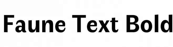
A bold, modern font with strong, confident letterforms and excellent readability.
![Faune Text Bold Frei Schriftart Herunterladen]() Herunterladen 514 Downloads@WebFont
Herunterladen 514 Downloads@WebFont -
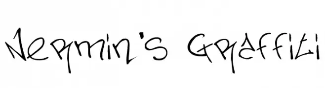
Schriftart von Nermin99. For commercial use please contact the owner.
![Nermin's Graffiti Frei Schriftart Herunterladen]() Herunterladen 514 Downloads@WebFont
Herunterladen 514 Downloads@WebFont -
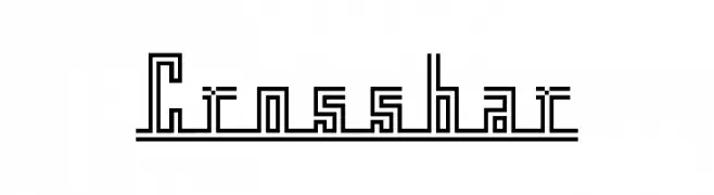
( Fonts by Masato Shimojima - Personal-use only. For commercial use please contact owner. )
A geometric, linear font with a maze-like, digital aesthetic.
![Crossbar Frei Schriftart Herunterladen]() Herunterladen 514 Downloads@WebFont
Herunterladen 514 Downloads@WebFont -
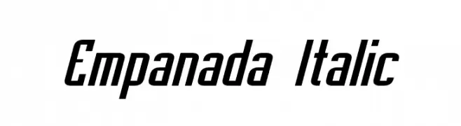
( Fonts by a Neale Davidson - www.pixelsagas.com. Personal-use only. For commercial use please contact owner. )
A bold, italic font with elongated, slanted letterforms and consistent stroke thickness.
![Empanada Italic Frei Schriftart Herunterladen]() Herunterladen 514 Downloads@WebFont
Herunterladen 514 Downloads@WebFont -
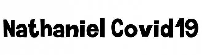
( Fonts by Adam Jedrzejewski )
A bold, playful, hand-drawn font with a whimsical charm.
![Nathaniel Covid-19 Frei Schriftart Herunterladen]() Herunterladen 514 Downloads@WebFont
Herunterladen 514 Downloads@WebFont -
![Little City 2000 Frei Schriftart Herunterladen]() Herunterladen 514 Downloads@WebFont
Herunterladen 514 Downloads@WebFont -
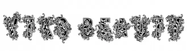
( Fonts by Douglas Vitkauskas - www.vtksdesign.com. Personal-use only. For commercial use please contact owner. )
An ornate, decorative font with intricate floral embellishments.
![VTKS BEAUTY Frei Schriftart Herunterladen]() Herunterladen 514 Downloads@WebFont
Herunterladen 514 Downloads@WebFont -
( Fonts by EssentialsStudio - Personal-use only. For commercial use please contact owner. )
An elegant script font with flowing, cursive lines and refined curves.
![Calligrapher Frei Schriftart Herunterladen]() Herunterladen 514 Downloads@WebFont
Herunterladen 514 Downloads@WebFont -
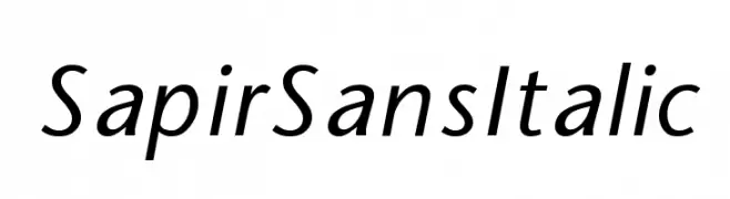
![SapirSansItalic Frei Schriftart Herunterladen]() Herunterladen 514 Downloads
Herunterladen 514 Downloads -
( Fonts by Syaf Rizal - www.creativefabrica.com/ref/53/ - Personal-use only. For commercial use please contact owner. )
A bold, expressive handwritten font with dynamic brush-like strokes.
![Tuckers Frei Schriftart Herunterladen]() Herunterladen 514 Downloads@WebFont
Herunterladen 514 Downloads@WebFont -
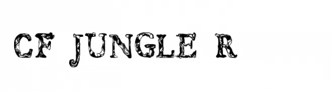
( www.cloutierfontes.ca/ )
A decorative, nature-inspired font with intricate leaf patterns.
![CF JUNGLE Regular Frei Schriftart Herunterladen]() Herunterladen 514 Downloads@WebFont
Herunterladen 514 Downloads@WebFont -
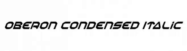
( Fonts by Daniel Zadorozny - www.iconian.com )
A bold, italic, and condensed font with a modern, angular design.
![Oberon Condensed Italic Frei Schriftart Herunterladen]() Herunterladen 514 Downloads@WebFont
Herunterladen 514 Downloads@WebFont -
( Fonts by HENRIavecunK. Personal-use only. For commercial use please contact owner. )
A playful, hand-drawn style with rounded, uniform strokes.
![Jollysight Sans Regular Frei Schriftart Herunterladen]() Herunterladen 514 Downloads@WebFont
Herunterladen 514 Downloads@WebFont


Welche Schriften sind gerade am populärsten?
Poppins, Roboto, Montserrat, Open Sans und Lato sind wegen ihrer klaren Formen und breiten Einsetzbarkeit sehr gefragt – von Markenauftritt über Landingpages bis hin zu Postern.
Welche Fonts eignen sich für Logos?
Geometrische Sans‑Serifs (z. B. Poppins, Familien im Gotham‑Stil) sind ein häufiger Griff für sauberes, skalierbares Branding. Für eine persönlichere Note bleiben Scripts und Handschrift‑Stile beliebt. Kombinieren Sie einen prägnanten Headline‑Font mit einer neutralen Brotschrift für Wiedererkennung und Harmonie.
Wie oft wird die Top‑Liste aktualisiert?
Regelmäßig – basierend auf realen Downloads und Interaktionen. Schauen Sie öfter vorbei, um aufstrebende Favoriten früh zu entdecken.
💡 Tipp: Seite bookmarken – Trends wechseln schnell, und heutige Top‑Schriften inspirieren morgen vielleicht das Rebranding.