Willkommen bei den Top‑Schriften – hier treffen Beliebtheit und Qualität aufeinander. Das sind die in diesem Jahr am häufigsten heruntergeladenen und genutzten Fonts. Wenn Sie sichere Optionen für Logo, Web oder Social suchen, starten Sie hier.
Jeder Top‑Font überzeugt durch Balance, Lesbarkeit und Vielseitigkeit. Sie finden moderne Sans‑Serifs, elegante Scripts, Vintage‑Serifs und minimalistische Displays.
-
( Fonts by Febryl Arully - Personal-use only. For commercial use please contact owner. )
A fluid and elegant script font with a handwritten style.
 Herunterladen 511 Downloads@WebFont
 -
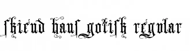
![Skjend Hans Gotisk Regular Frei Schriftart Herunterladen]() Herunterladen 511 Downloads@WebFont
Herunterladen 511 Downloads@WebFont -
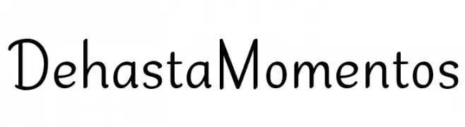
( Fonts by Situjuh Nazara - 7ntypes.com - Personal-use only. For commercial use please contact owner. )
A playful, handwritten font with smooth curves and a casual style.
![Dehasta Momentos Frei Schriftart Herunterladen]() Herunterladen 511 Downloads@WebFont
Herunterladen 511 Downloads@WebFont -
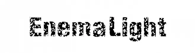
![EnemaLight Frei Schriftart Herunterladen]() Herunterladen 511 Downloads@WebFont
Herunterladen 511 Downloads@WebFont -
![HOSTIAS1.1 Normal Frei Schriftart Herunterladen]() Herunterladen 511 Downloads@WebFont
Herunterladen 511 Downloads@WebFont -
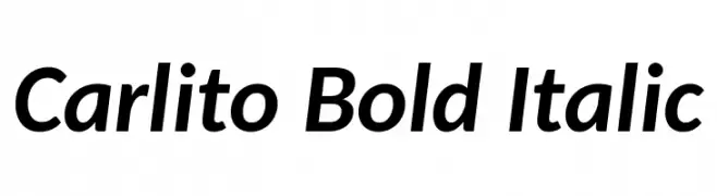
( Fonts by Lukasz Dziedzic - Personal-use only. For commercial use please contact owner. )
A bold, italicized font with a modern and dynamic style.
![Carlito Bold Italic Frei Schriftart Herunterladen]() Herunterladen 511 Downloads@WebFont
Herunterladen 511 Downloads@WebFont -
![Booze Frei Schriftart Herunterladen]() Herunterladen 511 Downloads@WebFont
Herunterladen 511 Downloads@WebFont -
( Fonts by Roland Huse - rolandhuse.com )
An elegant script font with flowing, cursive letters and decorative flourishes.
![Kikelet Frei Schriftart Herunterladen]() Herunterladen 511 Downloads@WebFont
Herunterladen 511 Downloads@WebFont -
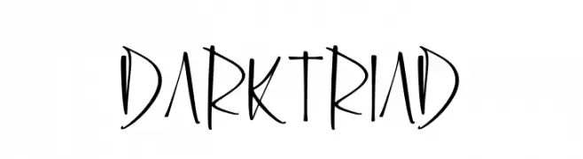
( Fonts by Perspectype Studio - Letterena.com - Personal-use only. For commercial use please contact owner. )
A dynamic, handwritten-style font with elongated, expressive characters.
![Dark Triad Frei Schriftart Herunterladen]() Herunterladen 511 Downloads@WebFont
Herunterladen 511 Downloads@WebFont -
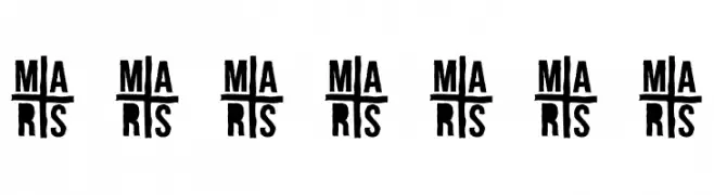
( Fonts by Ariq Sya - marsnev.com )
A bold, stencil-like font with a modern, industrial feel.
![A-FOR-A Frei Schriftart Herunterladen]() Herunterladen 511 Downloads@WebFont
Herunterladen 511 Downloads@WebFont -
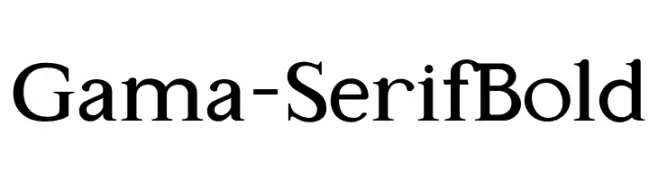
( Fonts by Universitas Gadjah Mada Yogyakarta - Personal-use only. For commercial use please contact owner. )
A bold serif font with high contrast and sharp serifs, exuding classic elegance.
![Gama-Serif Bold Frei Schriftart Herunterladen]() Herunterladen 511 Downloads@WebFont
Herunterladen 511 Downloads@WebFont -
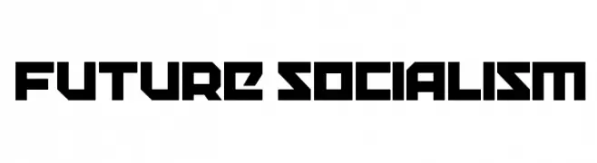
( Fonts by www.woodcutter.es - woodcutter Manero - Personal-use only. For commercial use please contact owner. )
A bold, geometric font with a futuristic and industrial design.
![Future Socialism Frei Schriftart Herunterladen]() Herunterladen 511 Downloads@WebFont
Herunterladen 511 Downloads@WebFont -
( Fonts by Izabela de Lima - elfadophotoscape.blogspot.com.br )
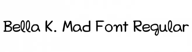
A playful, hand-drawn font with rounded edges and a whimsical style.
![Bella K. Mad Font Regular Frei Schriftart Herunterladen]() Herunterladen 511 Downloads@WebFont
Herunterladen 511 Downloads@WebFont -
( Fonts by Typodermic Fonts )
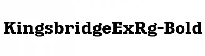
A bold serif font with strong strokes and pronounced serifs, ideal for impactful designs.
![KingsbridgeExRg-Bold Frei Schriftart Herunterladen]() Herunterladen 511 Downloads@WebFont
Herunterladen 511 Downloads@WebFont -
( Fonts by Steve Cloutier - www.cloutierfontes.ca )
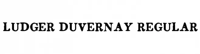
A bold serif font with a classic and authoritative style.
![Ludger Duvernay Regular Frei Schriftart Herunterladen]() Herunterladen 511 Downloads@WebFont
Herunterladen 511 Downloads@WebFont -
( Fonts by www.floodfonts.com )
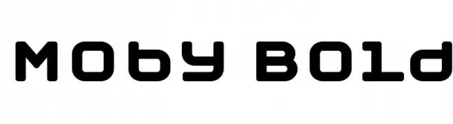
A bold, rounded font with a modern and playful style.
![Moby Bold Frei Schriftart Herunterladen]() Herunterladen 511 Downloads@WebFont
Herunterladen 511 Downloads@WebFont -
![VI Hong Mai Hoa Frei Schriftart Herunterladen]() Herunterladen 511 Downloads@WebFont
Herunterladen 511 Downloads@WebFont -
( Fonts by Press Gang Studios - Andeh Pinkard - www.pressgang-studios.com )
A bold, hand-drawn font with sharp, angular strokes and a dynamic, graffiti-like style.
![dark entries Frei Schriftart Herunterladen]() Herunterladen 511 Downloads@WebFont
Herunterladen 511 Downloads@WebFont -
![ParadisoVintageDemo Frei Schriftart Herunterladen]() Herunterladen 511 Downloads@WebFont
Herunterladen 511 Downloads@WebFont -
( Fonts by Christophe Feray - www.wcfonts.com )
An abstract, ink-splatter inspired decorative font with a chaotic and artistic style.
![WC Rhesus C 1Bta Frei Schriftart Herunterladen]() Herunterladen 511 Downloads@WebFont
Herunterladen 511 Downloads@WebFont -
( Fonts by a Neale Davidson - www.pixelsagas.com. Personal-use only. For commercial use please contact owner. )
A bold, italicized font with a modern, dynamic style.
![Maximize Bold Italic Frei Schriftart Herunterladen]() Herunterladen 511 Downloads@WebFont
Herunterladen 511 Downloads@WebFont -
( Fonts by Behnam - Personal-use only. For commercial use please contact owner. )
A modern sans-serif italic font with clean lines and balanced proportions.
![XW Zar Italic Frei Schriftart Herunterladen]() Herunterladen 511 Downloads@WebFont
Herunterladen 511 Downloads@WebFont -
( Fonts by Nick Curtis - www.nicksfonts.com )
A bold, playful font with rounded, tilted characters.
![Pleasingly Plump NF Frei Schriftart Herunterladen]() Herunterladen 511 Downloads@WebFont
Herunterladen 511 Downloads@WebFont -
( Download for Personal Use. For Commercial: http://www.k-type.com )
A modern, geometric sans-serif font with clean lines and uniform stroke width.
![Modulario Frei Schriftart Herunterladen]() Herunterladen 511 Downloads@WebFont
Herunterladen 511 Downloads@WebFont -
![Helvetidoodle Outlines by Ed T Frei Schriftart Herunterladen]() Herunterladen 511 Downloads@WebFont
Herunterladen 511 Downloads@WebFont -
( Fonts by Chris Vile - fontmonger.com - Personal-use only. For commercial use please contact owner. )
A bold, distressed Gothic font with intricate detailing and a textured, vintage appearance.
![Sovereign-Regular Frei Schriftart Herunterladen]() Herunterladen 511 Downloads@WebFont
Herunterladen 511 Downloads@WebFont -
( Fonts by Galdino Otten - galdinootten.com )
A bold, playful font with rounded edges and a chunky, modern-retro style.
![Nickel Bumpy Frei Schriftart Herunterladen]() Herunterladen 511 Downloads@WebFont
Herunterladen 511 Downloads@WebFont -
![Battlecry Regular Frei Schriftart Herunterladen]() Herunterladen 511 Downloads@WebFont
Herunterladen 511 Downloads@WebFont -
( Fonts by Gyom Seguin - last-soundtrack.daportfolio.com )
A bold, distressed font with a grunge aesthetic and geometric shapes.
![extravaganza- Frei Schriftart Herunterladen]() Herunterladen 511 Downloads@WebFont
Herunterladen 511 Downloads@WebFont -
![F'Earth Frei Schriftart Herunterladen]() Herunterladen 511 Downloads@WebFont
Herunterladen 511 Downloads@WebFont -
( Fonts by Typhoon Type - Suthi Srisopha - www.typhoontype.net - Personal-use only. For commercial use please contact owner. )
A playful, handwritten font with smooth, flowing lines and decorative elements.
![Sweet Hipster Frei Schriftart Herunterladen]() Herunterladen 511 Downloads@WebFont
Herunterladen 511 Downloads@WebFont -
( Fonts by Daniel Zadorozny - www.iconian.com )
A bold, semi-italic font with a modern, dynamic style.
![Gemina 2 Semi-Italic Frei Schriftart Herunterladen]() Herunterladen 511 Downloads@WebFont
Herunterladen 511 Downloads@WebFont -
( Fonts by junkohanhero )
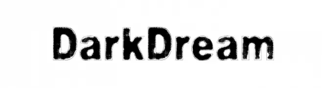
A bold, distressed font with a rugged, vintage aesthetic.
![Dark Dream Frei Schriftart Herunterladen]() Herunterladen 511 Downloads@WebFont
Herunterladen 511 Downloads@WebFont -
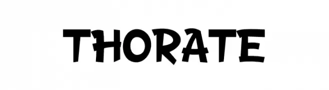
( Fonts by Murozakul Akhsan )
A playful, bold font with whimsical, cartoon-like characters.
![THORATE Frei Schriftart Herunterladen]() Herunterladen 511 Downloads@WebFont
Herunterladen 511 Downloads@WebFont -
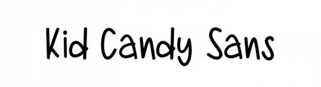
( Fonts by Zeenesia Studio )
A playful, hand-drawn font with rounded, smooth letters and a whimsical style.
![Kid Candy Sans Frei Schriftart Herunterladen]() Herunterladen 510 Downloads@WebFont
Herunterladen 510 Downloads@WebFont


Welche Schriften sind gerade am populärsten?
Poppins, Roboto, Montserrat, Open Sans und Lato sind wegen ihrer klaren Formen und breiten Einsetzbarkeit sehr gefragt – von Markenauftritt über Landingpages bis hin zu Postern.
Welche Fonts eignen sich für Logos?
Geometrische Sans‑Serifs (z. B. Poppins, Familien im Gotham‑Stil) sind ein häufiger Griff für sauberes, skalierbares Branding. Für eine persönlichere Note bleiben Scripts und Handschrift‑Stile beliebt. Kombinieren Sie einen prägnanten Headline‑Font mit einer neutralen Brotschrift für Wiedererkennung und Harmonie.
Wie oft wird die Top‑Liste aktualisiert?
Regelmäßig – basierend auf realen Downloads und Interaktionen. Schauen Sie öfter vorbei, um aufstrebende Favoriten früh zu entdecken.
💡 Tipp: Seite bookmarken – Trends wechseln schnell, und heutige Top‑Schriften inspirieren morgen vielleicht das Rebranding.