Willkommen bei den Top‑Schriften – hier treffen Beliebtheit und Qualität aufeinander. Das sind die in diesem Jahr am häufigsten heruntergeladenen und genutzten Fonts. Wenn Sie sichere Optionen für Logo, Web oder Social suchen, starten Sie hier.
Jeder Top‑Font überzeugt durch Balance, Lesbarkeit und Vielseitigkeit. Sie finden moderne Sans‑Serifs, elegante Scripts, Vintage‑Serifs und minimalistische Displays.
-
 Herunterladen 96 Downloads@WebFont
 -
( Fonts by PiPi Creative )
A playful, handwritten script font with elegant loops and curves.
![Wipes Frei Schriftart Herunterladen]() Herunterladen 96 Downloads@WebFont
Herunterladen 96 Downloads@WebFont -
( Fonts by Eko Bimantara - Personal-use only. For commercial use please contact owner. )
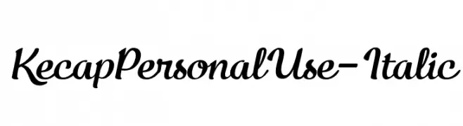
A flowing, cursive italic font with interconnected characters and smooth curves.
![KecapPersonalUse-Italic Frei Schriftart Herunterladen]() Herunterladen 96 Downloads@WebFont
Herunterladen 96 Downloads@WebFont -
( Fonts by www.woodcutter.es - woodcutter Manero - Personal-use only. For commercial use please contact owner. )
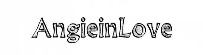
A playful, hand-drawn font with bold outlines and dotted interiors.
![Angie in Love Frei Schriftart Herunterladen]() Herunterladen 96 Downloads@WebFont
Herunterladen 96 Downloads@WebFont -
( Fonts by vilogsign - Nur Kholis - Personal-use only. For commercial use please contact owner. )
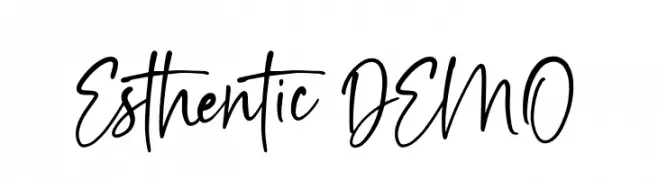
A lively handwritten font with fluid and dynamic strokes.
![Esthentic DEMO Frei Schriftart Herunterladen]() Herunterladen 96 Downloads@WebFont
Herunterladen 96 Downloads@WebFont -
-
( Fonts by Manfred Klein. Free for private and charity use. Free for commercial with donation to organizations )
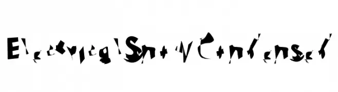
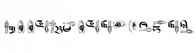
A decorative font combining Gothic style with artistic illustrations.
![LookBrokenTypes Frei Schriftart Herunterladen]() Herunterladen 96 Downloads@WebFont
Herunterladen 96 Downloads@WebFont -
( Fonts by Sharkshock )
A bold, hand-drawn font with a strong and impactful style.
![Stupid Meeting Frei Schriftart Herunterladen]() Herunterladen 96 Downloads@WebFont
Herunterladen 96 Downloads@WebFont -
( Fonts by junkohanhero )
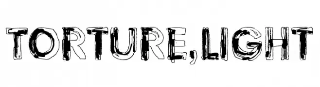
A decorative, distressed font with a hand-drawn, chaotic style.
![Torture, Light Frei Schriftart Herunterladen]() Herunterladen 96 Downloads@WebFont
Herunterladen 96 Downloads@WebFont -
( aldedesign - Alde Saputro - creativemarket.com/aldedesign?u=aldedesign )
A graceful and flowing script font with elegant curves and loops.
![Annisa Frei Schriftart Herunterladen]() Herunterladen 96 Downloads@WebFont
Herunterladen 96 Downloads@WebFont -
( Personal-use only. For commercial use please contact owner. )
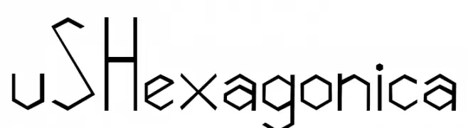
A geometric, angular font with hexagonal shapes and consistent line thickness.
![vSHexagonica Frei Schriftart Herunterladen]() Herunterladen 96 Downloads@WebFont
Herunterladen 96 Downloads@WebFont


Welche Schriften sind gerade am populärsten?
Poppins, Roboto, Montserrat, Open Sans und Lato sind wegen ihrer klaren Formen und breiten Einsetzbarkeit sehr gefragt – von Markenauftritt über Landingpages bis hin zu Postern.
Welche Fonts eignen sich für Logos?
Geometrische Sans‑Serifs (z. B. Poppins, Familien im Gotham‑Stil) sind ein häufiger Griff für sauberes, skalierbares Branding. Für eine persönlichere Note bleiben Scripts und Handschrift‑Stile beliebt. Kombinieren Sie einen prägnanten Headline‑Font mit einer neutralen Brotschrift für Wiedererkennung und Harmonie.
Wie oft wird die Top‑Liste aktualisiert?
Regelmäßig – basierend auf realen Downloads und Interaktionen. Schauen Sie öfter vorbei, um aufstrebende Favoriten früh zu entdecken.
💡 Tipp: Seite bookmarken – Trends wechseln schnell, und heutige Top‑Schriften inspirieren morgen vielleicht das Rebranding.