Willkommen bei den Top‑Schriften – hier treffen Beliebtheit und Qualität aufeinander. Das sind die in diesem Jahr am häufigsten heruntergeladenen und genutzten Fonts. Wenn Sie sichere Optionen für Logo, Web oder Social suchen, starten Sie hier.
Jeder Top‑Font überzeugt durch Balance, Lesbarkeit und Vielseitigkeit. Sie finden moderne Sans‑Serifs, elegante Scripts, Vintage‑Serifs und minimalistische Displays.
-
( Fonts by Khurasan )
A playful, bold font with rounded edges and a cartoonish style.
 Herunterladen 505 Downloads@WebFont
 -
( Fonts by Apostrophic Lab )
A bold, playful font with a handwritten style and wide, rounded letters.
![Komika Display Kaps Wide Frei Schriftart Herunterladen]() Herunterladen 505 Downloads@WebFont
Herunterladen 505 Downloads@WebFont -
( Fonts by David Rakowski )
A bold, medieval-inspired serif font with high contrast and sharp, angular features.
![Lilith-Heavy Frei Schriftart Herunterladen]() Herunterladen 505 Downloads
Herunterladen 505 Downloads -
( imagex - www.imagex-fonts.com )
A bold, distressed font with a textured, vintage appearance.
![Arabica Export Frei Schriftart Herunterladen]() Herunterladen 505 Downloads@WebFont
Herunterladen 505 Downloads@WebFont -
( Copyright (c) 2015, Cadson Demak (info@cadsondemak.com) )
A bold, italic serif font with high contrast and elegant style.
![Trirong Black Italic Frei Schriftart Herunterladen]() Herunterladen 505 Downloads@WebFont
Herunterladen 505 Downloads@WebFont -
( Fonts by Nur Solikh )
A bold, playful script font with a handwritten feel.
![Gembulla Frei Schriftart Herunterladen]() Herunterladen 505 Downloads@WebFont
Herunterladen 505 Downloads@WebFont -
( Fonts by a Situjuh Nazara - c7n1.wordpress.com. Personal-use only. For commercial use please contact owner. )
A playful and whimsical script font with ornate uppercase and flowing lowercase letters.
![Theodista Decally Frei Schriftart Herunterladen]() Herunterladen 505 Downloads@WebFont
Herunterladen 505 Downloads@WebFont -
( Fonts by billyargel.blogspot.com - Billy Argel )
A bold, gothic-inspired font with sharp, angular lines and intricate detailing.
![VATOS Frei Schriftart Herunterladen]() Herunterladen 505 Downloads@WebFont
Herunterladen 505 Downloads@WebFont -
![LYNA KETY Frei Schriftart Herunterladen]() Herunterladen 505 Downloads@WebFont
Herunterladen 505 Downloads@WebFont -
![BacktoCool Frei Schriftart Herunterladen]() Herunterladen 505 Downloads@WebFont
Herunterladen 505 Downloads@WebFont -
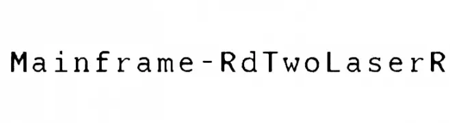
( Fonts by Castcraft Software - opti.netii.net - check the website before use )
A retro, typewriter-style font with a vintage, worn look.
![Mainframe-RdTwoLaserR Frei Schriftart Herunterladen]() Herunterladen 505 Downloads@WebFont
Herunterladen 505 Downloads@WebFont -
![Sinister-Plot Frei Schriftart Herunterladen]() Herunterladen 505 Downloads@WebFont
Herunterladen 505 Downloads@WebFont -
( Fonts by www.studiotypo.com - Personal-use only. For commercial use please contact owner. )
A modern, bold, and italic font with a sleek and dynamic design.
![A-Space Demo Bold Italic Frei Schriftart Herunterladen]() Herunterladen 505 Downloads@WebFont
Herunterladen 505 Downloads@WebFont -
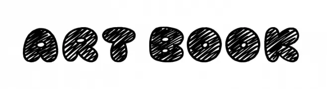
( Fonts by Jonathan S. Harris )
A bold, hand-drawn font with a playful, scribbled texture.
![Art Book Frei Schriftart Herunterladen]() Herunterladen 505 Downloads@WebFont
Herunterladen 505 Downloads@WebFont -
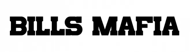
( Fonts by Jayde Garrow - Personal-use only. For commercial use please contact owner. )
A bold, block-like typeface with a strong, impactful presence.
![Bills Mafia Frei Schriftart Herunterladen]() Herunterladen 505 Downloads@WebFont
Herunterladen 505 Downloads@WebFont -
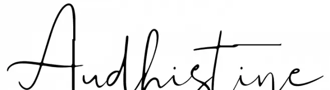
( Lettersiro Studio - Muhammad Sirojuddin - creativemarket.com/Lettersiro )
A modern, handwritten script font with a casual and flowing style.
![Audhistine Frei Schriftart Herunterladen]() Herunterladen 505 Downloads@WebFont
Herunterladen 505 Downloads@WebFont -
( Zetafonts - www.zetafonts.com )
A modern, thin sans-serif font with a sleek and minimalist design.
![Heading Pro Trial Thin Frei Schriftart Herunterladen]() Herunterladen 505 Downloads@WebFont
Herunterladen 505 Downloads@WebFont -
![Sgt Peppers Outline Frei Schriftart Herunterladen]() Herunterladen 505 Downloads@WebFont
Herunterladen 505 Downloads@WebFont -
( Fonts by Iqbal Habibi - Personal-use only. For commercial use please contact owner. )
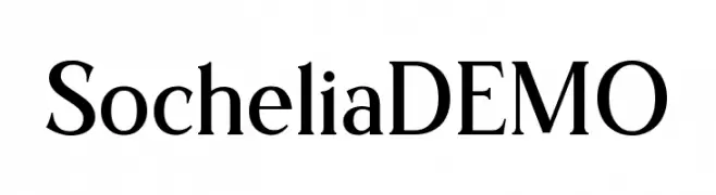
A classic serif font with elegant strokes and medium contrast.
![SocheliaDEMO Frei Schriftart Herunterladen]() Herunterladen 505 Downloads@WebFont
Herunterladen 505 Downloads@WebFont -
( Fonts by www.chank.com. Personal-use only. For commercial use please contact owner. )
A modern sans-serif font with geometric influences and consistent stroke widths.
![Panefresco 750wt Regular Frei Schriftart Herunterladen]() Herunterladen 505 Downloads@WebFont
Herunterladen 505 Downloads@WebFont -
( THESE ARE SHAREWARE FONTS ! NOT FREEWARE ! PLEASE VISIT www.fuelfonts.com )
A modern, geometric font with bold, rounded characters and consistent structure.
![Fishsoup Frei Schriftart Herunterladen]() Herunterladen 505 Downloads@WebFont
Herunterladen 505 Downloads@WebFont -
( Fonts by Denise Bentulan - douxiegirl.com. Personal-use only. For commercial use please contact owner. )
A playful, handwritten font with fluid, interconnected strokes and a whimsical charm.
![All Hail Julia Frei Schriftart Herunterladen]() Herunterladen 505 Downloads@WebFont
Herunterladen 505 Downloads@WebFont -
( Fonts by Bumbayo Font Fabrik )
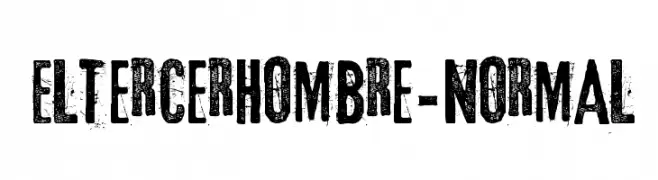
A bold, distressed font with a vintage, rugged appearance.
![Eltercerhombre-Normal Frei Schriftart Herunterladen]() Herunterladen 505 Downloads@WebFont
Herunterladen 505 Downloads@WebFont -
![AME- Frei Schriftart Herunterladen]() Herunterladen 505 Downloads@WebFont
Herunterladen 505 Downloads@WebFont -
( Fonts by Steve Cloutier - www.cloutierfontes.ca )
A hand-drawn, casual font with thin, wavy lines and low contrast.
![CF Disappointed Regular Frei Schriftart Herunterladen]() Herunterladen 505 Downloads@WebFont
Herunterladen 505 Downloads@WebFont -
( Fonts by Dieter Steffmann )
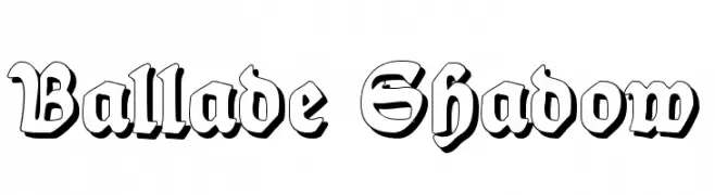
A bold, shadowed blackletter-style font with a dramatic, three-dimensional effect.
![Ballade Shadow Frei Schriftart Herunterladen]() Herunterladen 505 Downloads@WebFont
Herunterladen 505 Downloads@WebFont -
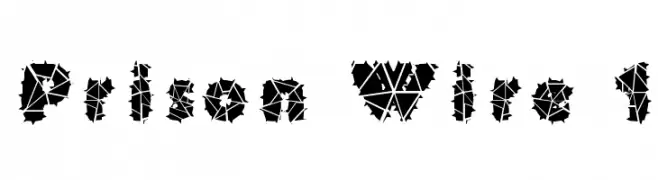
![Prison Wire 1 Frei Schriftart Herunterladen]() Herunterladen 505 Downloads
Herunterladen 505 Downloads -
![Malifaux Rodent Edition Normal Frei Schriftart Herunterladen]() Herunterladen 505 Downloads@WebFont
Herunterladen 505 Downloads@WebFont -
( Fonts by Vladimir Nikolic - www.creativefabrica.com/designer/vladimirnikolic/ - Personal-use only. For commercial use please contact owner. )
A bold, high-contrast serif font with dramatic strokes.
![Broken Hearts Heavy Frei Schriftart Herunterladen]() Herunterladen 505 Downloads@WebFont
Herunterladen 505 Downloads@WebFont -
( Fonts by Andreas Hofeld - www.fontgrube.de )
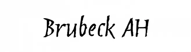
A dynamic, expressive handwritten font with irregular, organic strokes.
![Brubeck AH Frei Schriftart Herunterladen]() Herunterladen 505 Downloads@WebFont
Herunterladen 505 Downloads@WebFont -
( Fonts by Graham Meade - GemFonts )
A modern, hollow font with a decorative and three-dimensional appearance.
![AlphaRev Hollow Frei Schriftart Herunterladen]() Herunterladen 505 Downloads@WebFont
Herunterladen 505 Downloads@WebFont -
![Magnificent Supernatural Frei Schriftart Herunterladen]() Herunterladen 505 Downloads@WebFont
Herunterladen 505 Downloads@WebFont -
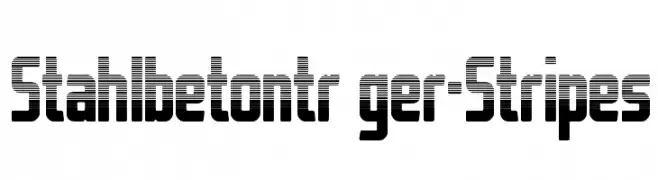
![StahlbetontrŠger-Stripes Frei Schriftart Herunterladen]() Herunterladen 505 Downloads@WebFont
Herunterladen 505 Downloads@WebFont -
( Fonts by Tom Waterhouse )
A bold, hand-drawn font with dynamic, slightly slanted characters.
![SkyScrappers Frei Schriftart Herunterladen]() Herunterladen 505 Downloads@WebFont
Herunterladen 505 Downloads@WebFont -
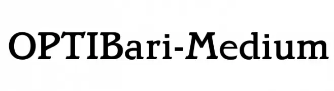
( Fonts by Castcraft Software - opti.netii.net - check the website before use )
A classic serif font with medium weight and moderate contrast, offering elegance and readability.
![OPTIBari-Medium Frei Schriftart Herunterladen]() Herunterladen 505 Downloads@WebFont
Herunterladen 505 Downloads@WebFont


Welche Schriften sind gerade am populärsten?
Poppins, Roboto, Montserrat, Open Sans und Lato sind wegen ihrer klaren Formen und breiten Einsetzbarkeit sehr gefragt – von Markenauftritt über Landingpages bis hin zu Postern.
Welche Fonts eignen sich für Logos?
Geometrische Sans‑Serifs (z. B. Poppins, Familien im Gotham‑Stil) sind ein häufiger Griff für sauberes, skalierbares Branding. Für eine persönlichere Note bleiben Scripts und Handschrift‑Stile beliebt. Kombinieren Sie einen prägnanten Headline‑Font mit einer neutralen Brotschrift für Wiedererkennung und Harmonie.
Wie oft wird die Top‑Liste aktualisiert?
Regelmäßig – basierend auf realen Downloads und Interaktionen. Schauen Sie öfter vorbei, um aufstrebende Favoriten früh zu entdecken.
💡 Tipp: Seite bookmarken – Trends wechseln schnell, und heutige Top‑Schriften inspirieren morgen vielleicht das Rebranding.