Willkommen bei den Top‑Schriften – hier treffen Beliebtheit und Qualität aufeinander. Das sind die in diesem Jahr am häufigsten heruntergeladenen und genutzten Fonts. Wenn Sie sichere Optionen für Logo, Web oder Social suchen, starten Sie hier.
Jeder Top‑Font überzeugt durch Balance, Lesbarkeit und Vielseitigkeit. Sie finden moderne Sans‑Serifs, elegante Scripts, Vintage‑Serifs und minimalistische Displays.
-
 Herunterladen 502 Downloads@WebFont
 -
( Fonts by www.studiotypo.com - Personal-use only. For commercial use please contact owner. )
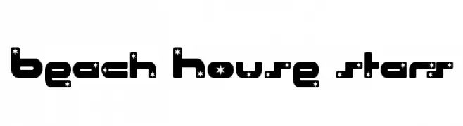
A modern, bold, and italic font with a sleek and dynamic design.
![A-Space Demo Bold Italic Frei Schriftart Herunterladen]() Herunterladen 502 Downloads@WebFont
Herunterladen 502 Downloads@WebFont -
( Fonts by Jonathan S. Harris )
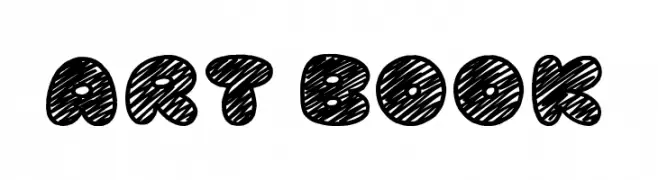
A bold, hand-drawn font with a playful, scribbled texture.
![Art Book Frei Schriftart Herunterladen]() Herunterladen 502 Downloads@WebFont
Herunterladen 502 Downloads@WebFont -
( Fonts by wep )
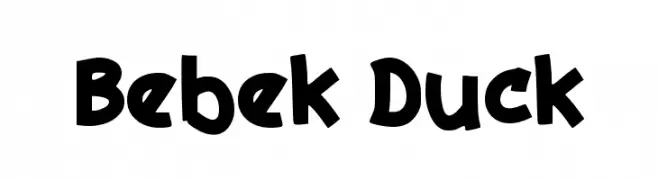
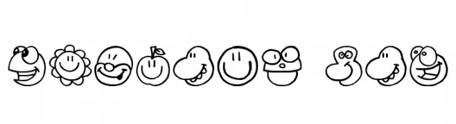
A playful, bold font with a cartoonish, whimsical style.
![Bebek Duck Frei Schriftart Herunterladen]() Herunterladen 502 Downloads@WebFont
Herunterladen 502 Downloads@WebFont -
( Fonts by RaisProject )
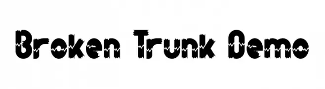
A bold, jagged font with a unique, edgy appearance.
![Broken Trunk Demo Frei Schriftart Herunterladen]() Herunterladen 502 Downloads@WebFont
Herunterladen 502 Downloads@WebFont -
( Fonts by Hubert & Fischer - Personal-use only. For commercial use please contact owner. )
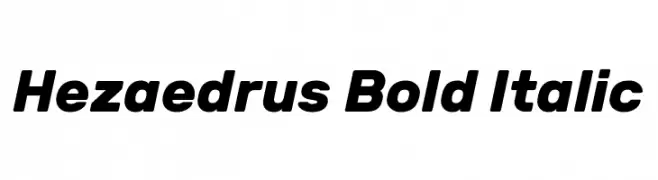
A bold, italicized font with a modern and dynamic style.
![Hezaedrus Bold Italic Frei Schriftart Herunterladen]() Herunterladen 502 Downloads@WebFont
Herunterladen 502 Downloads@WebFont -
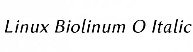
![Linux Biolinum O Italic Frei Schriftart Herunterladen]() Herunterladen 502 Downloads@WebFont
Herunterladen 502 Downloads@WebFont -
( Fonts by www.chank.com. Personal-use only. For commercial use please contact owner. )
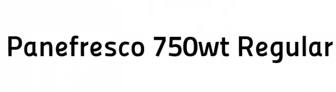
A modern sans-serif font with geometric influences and consistent stroke widths.
![Panefresco 750wt Regular Frei Schriftart Herunterladen]() Herunterladen 502 Downloads@WebFont
Herunterladen 502 Downloads@WebFont -
( THESE ARE SHAREWARE FONTS ! NOT FREEWARE ! PLEASE VISIT www.fuelfonts.com )
A modern, geometric font with bold, rounded characters and consistent structure.
![Fishsoup Frei Schriftart Herunterladen]() Herunterladen 502 Downloads@WebFont
Herunterladen 502 Downloads@WebFont -
( Fonts by Fabien Despinoy - Personal-use only. For commercial use please contact owner. )
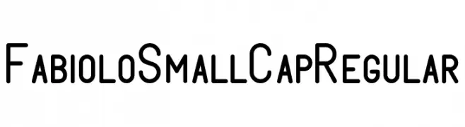
A modern, rounded sans-serif font with a clean and approachable design.
![FabioloSmallCap Regular Frei Schriftart Herunterladen]() Herunterladen 502 Downloads@WebFont
Herunterladen 502 Downloads@WebFont -
![Kennon Regular Frei Schriftart Herunterladen]() Herunterladen 502 Downloads@WebFont
Herunterladen 502 Downloads@WebFont -
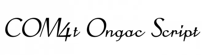
( Fonts by Hideki Katayama - com4t-fff.seesaa.net )
A modern, elegant script font with flowing lines and a dynamic slant.
![COM4t Ongac Script Frei Schriftart Herunterladen]() Herunterladen 502 Downloads@WebFont
Herunterladen 502 Downloads@WebFont -
( Fonts by a Max Infeld - XEROGRAPHER FONTS - xerographer.blogspot.com . Personal-use only. For commercial use please contact owner. )
A bold, distressed font with a grunge texture and splattered ink effect.
![ArtBang Frei Schriftart Herunterladen]() Herunterladen 502 Downloads@WebFont
Herunterladen 502 Downloads@WebFont -
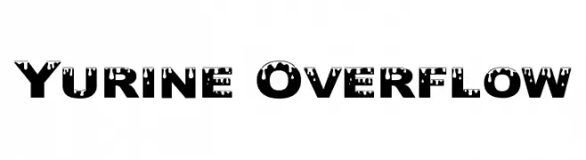
( Fonts by Graham Meade - GemFonts )
A bold, decorative font with a dripping effect for a playful and edgy look.
![Yurine Overflow Frei Schriftart Herunterladen]() Herunterladen 502 Downloads@WebFont
Herunterladen 502 Downloads@WebFont -
![Meybi Frei Schriftart Herunterladen]() Herunterladen 502 Downloads@WebFont
Herunterladen 502 Downloads@WebFont -
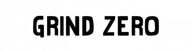
( Free for personal use - www.pressgang-studios.com )
A bold, modern font with a geometric and impactful design.
![Grind Zero Frei Schriftart Herunterladen]() Herunterladen 502 Downloads@WebFont
Herunterladen 502 Downloads@WebFont -
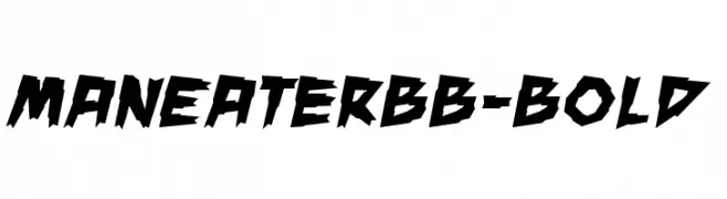
( Fonts by www.blambot.com )
A bold, jagged font with sharp, angular edges and an aggressive style.
![ManEaterBB-Bold Frei Schriftart Herunterladen]() Herunterladen 502 Downloads@WebFont
Herunterladen 502 Downloads@WebFont -
![Document Two Frei Schriftart Herunterladen]() Herunterladen 502 Downloads@WebFont
Herunterladen 502 Downloads@WebFont -
( Fonts by Sentinel Type - James Arboghast )
A bold slab serif font with a vintage yet modern appeal.
![DeLouisvilleSmallCaps Frei Schriftart Herunterladen]() Herunterladen 502 Downloads@WebFont
Herunterladen 502 Downloads@WebFont -
( Fonts by Daniel Zadorozny - www.iconian.com - Free for personal use )
A bold, futuristic italic font with sharp angles and a dynamic style.
![Federal Escort Laser Italic Frei Schriftart Herunterladen]() Herunterladen 502 Downloads@WebFont
Herunterladen 502 Downloads@WebFont -
( Fonts by CannotIntoSpaceFonts - KineticPlasma Fonts - Personal-use only. For commercial use please contact owner. )
A sleek, narrow, and italicized modern font with a dynamic feel.
![Asimov Narrow Italic Frei Schriftart Herunterladen]() Herunterladen 502 Downloads@WebFont
Herunterladen 502 Downloads@WebFont -
( Fonts by Tom Waterhouse )
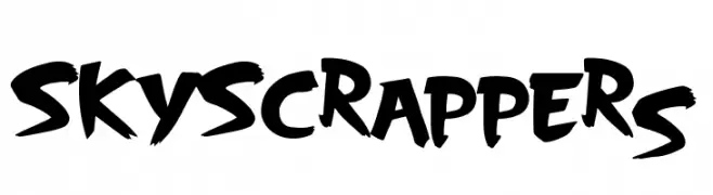
A bold, hand-drawn font with dynamic, slightly slanted characters.
![SkyScrappers Frei Schriftart Herunterladen]() Herunterladen 502 Downloads@WebFont
Herunterladen 502 Downloads@WebFont -
( Artmaker - www.behance.net/artmaker )
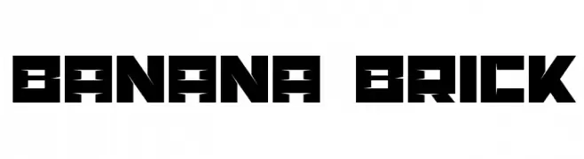
A bold, geometric font with a blocky, industrial style.
![Banana Brick Frei Schriftart Herunterladen]() Herunterladen 502 Downloads@WebFont
Herunterladen 502 Downloads@WebFont -
( Fonts by Andi Moz )
A decorative script font with elegant, flowing strokes and artistic loops.
![Chart Frei Schriftart Herunterladen]() Herunterladen 502 Downloads@WebFont
Herunterladen 502 Downloads@WebFont -
( Fonts by Divide By Zero! - fonts.tom7.com )
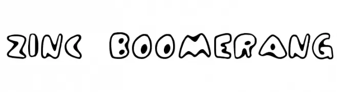
A playful, hand-drawn font with bold, wavy outlines and a whimsical style.
![Zinc Boomerang Frei Schriftart Herunterladen]() Herunterladen 502 Downloads@WebFont
Herunterladen 502 Downloads@WebFont -
![ChN1 Regular Frei Schriftart Herunterladen]() Herunterladen 502 Downloads@WebFont
Herunterladen 502 Downloads@WebFont -
( Fonts by Wino S Kadir - weknow - www.revolge.com/shop/weknow/ - Personal-use only. For commercial use please contact owner. )
A bold, rounded, and playful font with a chunky appearance.
![WELCOME TO THE JUNGLE Frei Schriftart Herunterladen]() Herunterladen 502 Downloads@WebFont
Herunterladen 502 Downloads@WebFont -
( Fonts by Almeera Studio - Rinto Dwi Nugroho - Personal-use only. For commercial use please contact owner. )
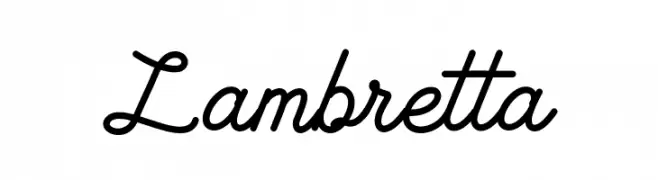
A flowing, cursive font with elegant loops and classic calligraphy style.
![Lambretta Frei Schriftart Herunterladen]() Herunterladen 502 Downloads@WebFont
Herunterladen 502 Downloads@WebFont -
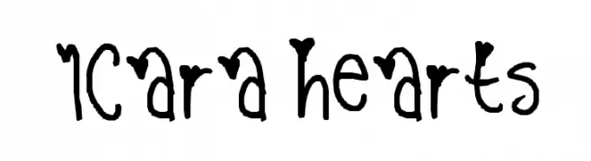
![1cara hearts Frei Schriftart Herunterladen]() Herunterladen 502 Downloads@WebFont
Herunterladen 502 Downloads@WebFont -
( Fonts by Daniel Zadorozny - www.iconian.com )
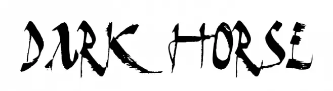
A bold, brush-style font with dynamic, flowing strokes and artistic flair.
![Dark Horse Frei Schriftart Herunterladen]() Herunterladen 502 Downloads@WebFont
Herunterladen 502 Downloads@WebFont -
![Hijinx Normal Frei Schriftart Herunterladen]() Herunterladen 502 Downloads@WebFont
Herunterladen 502 Downloads@WebFont -
( Fonts by www.gliphmaker.com. Personal-use only. For commercial use please contact owner. )
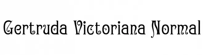
An ornate, Victorian-style font with decorative elements and elegant flourishes.
![Gertruda Victoriana Normal Frei Schriftart Herunterladen]() Herunterladen 502 Downloads@WebFont
Herunterladen 502 Downloads@WebFont -
( Fonts by Jacob Fisher - www.pizzadude.dk )
Hand-drawn, playful display font with a cartoonish vibe.
![Fazings one Frei Schriftart Herunterladen]() Herunterladen 502 Downloads@WebFont
Herunterladen 502 Downloads@WebFont -
( Fonts by Siwox Core LineType )
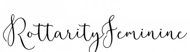
An elegant and flowing script font with graceful curves and loops.
![RottarityFeminine Frei Schriftart Herunterladen]() Herunterladen 502 Downloads@WebFont
Herunterladen 502 Downloads@WebFont -
( www.redbubble.com/people/anfa/portfolio )
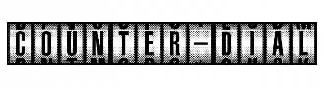
A bold, mechanical font with a vintage counter dial aesthetic.
![Counter-Dial Frei Schriftart Herunterladen]() Herunterladen 502 Downloads@WebFont
Herunterladen 502 Downloads@WebFont


Welche Schriften sind gerade am populärsten?
Poppins, Roboto, Montserrat, Open Sans und Lato sind wegen ihrer klaren Formen und breiten Einsetzbarkeit sehr gefragt – von Markenauftritt über Landingpages bis hin zu Postern.
Welche Fonts eignen sich für Logos?
Geometrische Sans‑Serifs (z. B. Poppins, Familien im Gotham‑Stil) sind ein häufiger Griff für sauberes, skalierbares Branding. Für eine persönlichere Note bleiben Scripts und Handschrift‑Stile beliebt. Kombinieren Sie einen prägnanten Headline‑Font mit einer neutralen Brotschrift für Wiedererkennung und Harmonie.
Wie oft wird die Top‑Liste aktualisiert?
Regelmäßig – basierend auf realen Downloads und Interaktionen. Schauen Sie öfter vorbei, um aufstrebende Favoriten früh zu entdecken.
💡 Tipp: Seite bookmarken – Trends wechseln schnell, und heutige Top‑Schriften inspirieren morgen vielleicht das Rebranding.