Willkommen bei den Top‑Schriften – hier treffen Beliebtheit und Qualität aufeinander. Das sind die in diesem Jahr am häufigsten heruntergeladenen und genutzten Fonts. Wenn Sie sichere Optionen für Logo, Web oder Social suchen, starten Sie hier.
Jeder Top‑Font überzeugt durch Balance, Lesbarkeit und Vielseitigkeit. Sie finden moderne Sans‑Serifs, elegante Scripts, Vintage‑Serifs und minimalistische Displays.
-
 Herunterladen 483 Downloads@WebFont
 -
( JOEBOB graphics - Joe vanderHam - www.joebob.nl )
A casual, handwritten script font with smooth, flowing strokes.
![DearJoe5CASUAL Frei Schriftart Herunterladen]() Herunterladen 483 Downloads@WebFont
Herunterladen 483 Downloads@WebFont -
![Porosa Frei Schriftart Herunterladen]() Herunterladen 483 Downloads@WebFont
Herunterladen 483 Downloads@WebFont -
![Exciter Tour 2 Frei Schriftart Herunterladen]() Herunterladen 483 Downloads@WebFont
Herunterladen 483 Downloads@WebFont -
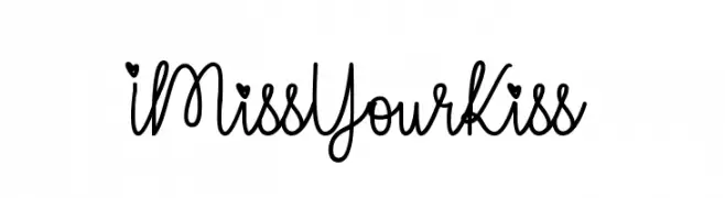
( Fonts by Misti`s Fonts - mistifonts.com - Personal-use only. For commercial use please contact owner. )
A playful, handwritten script font with charming, romantic details.
![IMissYourKiss Frei Schriftart Herunterladen]() Herunterladen 483 Downloads@WebFont
Herunterladen 483 Downloads@WebFont -
-
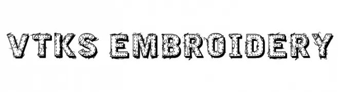
( Fonts by Douglas Vitkauskas - www.vtksdesign.com. Personal-use only. For commercial use please contact owner. )
A textured, embroidery-inspired font with a bold, handcrafted look.
![VTKS EMBROIDERY Frei Schriftart Herunterladen]() Herunterladen 483 Downloads@WebFont
Herunterladen 483 Downloads@WebFont -
( Fonts by www.junkohanhero.com - Personal-use only. For commercial use please contact owner. )
A hand-drawn, rustic font with bold, textured strokes and a condensed style.
![Kube Vertiko Frei Schriftart Herunterladen]() Herunterladen 483 Downloads@WebFont
Herunterladen 483 Downloads@WebFont -
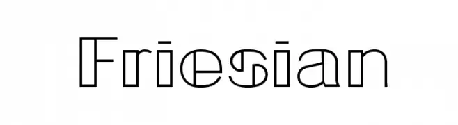
![Friesian Frei Schriftart Herunterladen]() Herunterladen 483 Downloads@WebFont
Herunterladen 483 Downloads@WebFont -
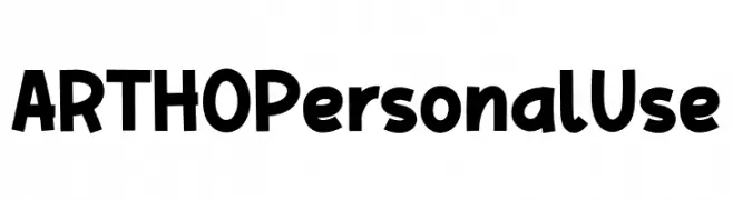
( Fonts by twinletter )
A playful, bold font with a hand-drawn, whimsical style.
![ARTHO Personal Use Frei Schriftart Herunterladen]() Herunterladen 483 Downloads@WebFont
Herunterladen 483 Downloads@WebFont -
( Fonts by Andrew McCluskey - nalgames.com. Personal-use only. For commercial use please contact owner. )
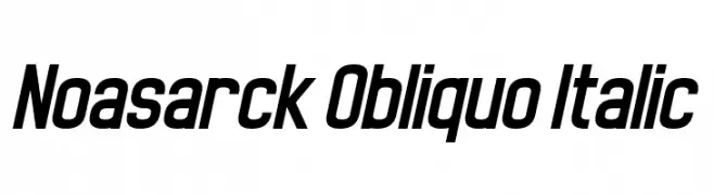
A modern, bold italic font with a dynamic and energetic style.
![Noasarck Obliquo Italic Frei Schriftart Herunterladen]() Herunterladen 483 Downloads@WebFont
Herunterladen 483 Downloads@WebFont -
( Fonts by Typography in Decay )
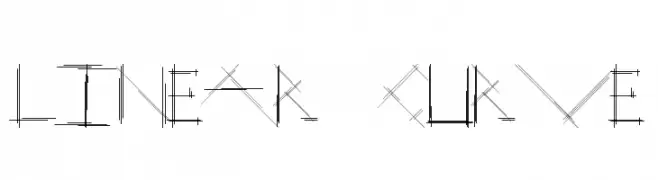
A geometric, linear font with intersecting lines and boxed numerals.
![Linear Curve Frei Schriftart Herunterladen]() Herunterladen 483 Downloads@WebFont
Herunterladen 483 Downloads@WebFont -
![Triumph wheels rough Frei Schriftart Herunterladen]() Herunterladen 483 Downloads@WebFont
Herunterladen 483 Downloads@WebFont -
( Fonts by David Espinosa [Type Sailor] - www.facebook.com/typesailor - Personal-use only. For commercial use please contact owner. )
A bold, vintage-inspired serif typeface with strong, thick strokes.
![Joyeux Bold Frei Schriftart Herunterladen]() Herunterladen 483 Downloads@WebFont
Herunterladen 483 Downloads@WebFont -
![Davy Francis Frei Schriftart Herunterladen]() Herunterladen 483 Downloads@WebFont
Herunterladen 483 Downloads@WebFont -
( Fonts by Haksen Letters )
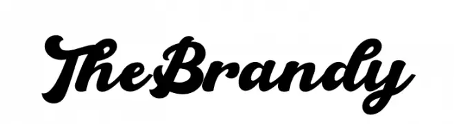
A bold, cursive font with interconnected characters and elegant curves.
![The Brandy Frei Schriftart Herunterladen]() Herunterladen 483 Downloads@WebFont
Herunterladen 483 Downloads@WebFont -
( Free )
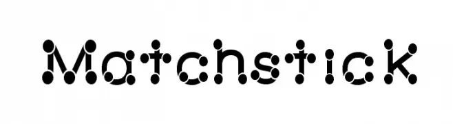
A playful, geometric font with dotted and linear matchstick-like elements.
![Matchstick Frei Schriftart Herunterladen]() Herunterladen 483 Downloads@WebFont
Herunterladen 483 Downloads@WebFont -
( Iconian Fonts - Daniel Zadorozny - www.iconian.com )
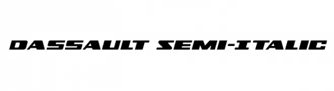
A bold, italicized font with a dynamic, futuristic style.
![Dassault Semi-Italic Frei Schriftart Herunterladen]() Herunterladen 483 Downloads@WebFont
Herunterladen 483 Downloads@WebFont -
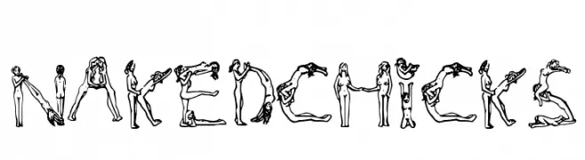
![NakedChicks Frei Schriftart Herunterladen]() Herunterladen 483 Downloads@WebFont
Herunterladen 483 Downloads@WebFont -
( Fonts by Apostrophic Lab )
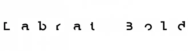
A bold, geometric font with sharp angles and unique cutouts.
![Labrat Bold Frei Schriftart Herunterladen]() Herunterladen 483 Downloads@WebFont
Herunterladen 483 Downloads@WebFont -
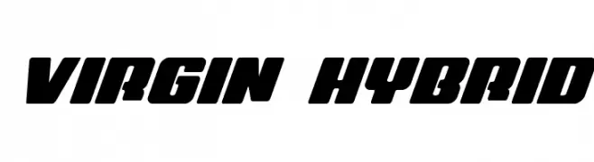
( Fonts by Daniel Zadorozny - www.iconian.com - Free for personal use )
A bold, dynamic font with a slanted, energetic style.
![Virgin Hybrid Frei Schriftart Herunterladen]() Herunterladen 483 Downloads@WebFont
Herunterladen 483 Downloads@WebFont -
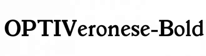
( Fonts by Castcraft Software - OPTI Fonts Archive - opti.netii.net - Personal-use only. For commercial use please contact owner. )
A bold, classic serif font with strong, pronounced strokes and excellent readability.
![OPTIVeronese-Bold Frei Schriftart Herunterladen]() Herunterladen 483 Downloads@WebFont
Herunterladen 483 Downloads@WebFont -
( Fonts by The Typerex )
A bold, playful script font with a handwritten style.
![Januari Blossom Frei Schriftart Herunterladen]() Herunterladen 483 Downloads@WebFont
Herunterladen 483 Downloads@WebFont -
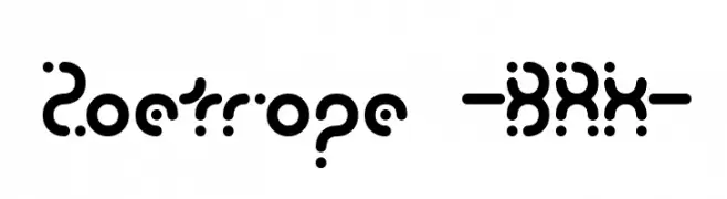
( Fonts by www.aenigmafonts.com )
A bold, decorative font with rounded shapes and dot accents, offering a playful and futuristic look.
![Zoetrope -BRK- Frei Schriftart Herunterladen]() Herunterladen 483 Downloads@WebFont
Herunterladen 483 Downloads@WebFont -
( Fonts by MadeType - Personal-use only. For commercial use please contact owner. )
A modern, geometric sans-serif font with clean lines and balanced proportions.
![MADEOuterSansAlt-Light Frei Schriftart Herunterladen]() Herunterladen 483 Downloads@WebFont
Herunterladen 483 Downloads@WebFont -
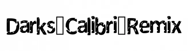
( Fonts by DarkX ShadowX21 )
A bold, distressed font with a rugged, grungy texture.
![Darks_Calibri_Remix Frei Schriftart Herunterladen]() Herunterladen 483 Downloads@WebFont
Herunterladen 483 Downloads@WebFont -
( Fonts by HyFont Studio - www.hyfont.com - Personal-use only. For commercial use please contact owner. )
A playful and modern font with rounded edges and consistent stroke width.
![HFBone Frei Schriftart Herunterladen]() Herunterladen 483 Downloads@WebFont
Herunterladen 483 Downloads@WebFont -
( Fonts by HansCo )
A playful and whimsical script font with decorative swirls and interconnected letters.
![Baby Bunny Script Frei Schriftart Herunterladen]() Herunterladen 483 Downloads@WebFont
Herunterladen 483 Downloads@WebFont -
( Fonts by Perspectype Studio - Letterena.com - Personal-use only. For commercial use please contact owner. )
A bold, hand-drawn font with a textured, dynamic style.
![SKY BRIDGE Frei Schriftart Herunterladen]() Herunterladen 483 Downloads@WebFont
Herunterladen 483 Downloads@WebFont -
( Fonts by Riyadh Rahman - Personal-use only. For commercial use please contact owner. )
A tall, narrow, and modern font with a sleek, minimalistic design.
![Summer Sans Frei Schriftart Herunterladen]() Herunterladen 483 Downloads@WebFont
Herunterladen 483 Downloads@WebFont -
( Fonts by Hubert & Fischer - Personal-use only. For commercial use please contact owner. )
A bold, italicized font with a modern and dynamic style.
![Hezaedrus Bold Italic Frei Schriftart Herunterladen]() Herunterladen 483 Downloads@WebFont
Herunterladen 483 Downloads@WebFont -
( - new.myfonts.com/foundry/Intellecta_Design/?refby=paulow )
Ornate Victorian-inspired ornamental glyphs.
![Victorian Free Ornaments Frei Schriftart Herunterladen]() Herunterladen 483 Downloads@WebFont
Herunterladen 483 Downloads@WebFont -
( Fonts by Graham Meade - GemFonts )
A modern, oblique font with a sleek, futuristic design.
![Aunchanted Bold Oblique Frei Schriftart Herunterladen]() Herunterladen 483 Downloads@WebFont
Herunterladen 483 Downloads@WebFont -
( Fonts by Khurasan )
A bold, playful font with rounded, comic-style characters.
![Say Comic Frei Schriftart Herunterladen]() Herunterladen 483 Downloads@WebFont
Herunterladen 483 Downloads@WebFont -
( Fonts by weknow - Wino S Kadir )
A modern, geometric font with consistent stroke width and clean design.
![LIFE IS FINAL Frei Schriftart Herunterladen]() Herunterladen 483 Downloads@WebFont
Herunterladen 483 Downloads@WebFont -
![Lazy Frei Schriftart Herunterladen]() Herunterladen 483 Downloads@WebFont
Herunterladen 483 Downloads@WebFont


Welche Schriften sind gerade am populärsten?
Poppins, Roboto, Montserrat, Open Sans und Lato sind wegen ihrer klaren Formen und breiten Einsetzbarkeit sehr gefragt – von Markenauftritt über Landingpages bis hin zu Postern.
Welche Fonts eignen sich für Logos?
Geometrische Sans‑Serifs (z. B. Poppins, Familien im Gotham‑Stil) sind ein häufiger Griff für sauberes, skalierbares Branding. Für eine persönlichere Note bleiben Scripts und Handschrift‑Stile beliebt. Kombinieren Sie einen prägnanten Headline‑Font mit einer neutralen Brotschrift für Wiedererkennung und Harmonie.
Wie oft wird die Top‑Liste aktualisiert?
Regelmäßig – basierend auf realen Downloads und Interaktionen. Schauen Sie öfter vorbei, um aufstrebende Favoriten früh zu entdecken.
💡 Tipp: Seite bookmarken – Trends wechseln schnell, und heutige Top‑Schriften inspirieren morgen vielleicht das Rebranding.