Willkommen bei den Top‑Schriften – hier treffen Beliebtheit und Qualität aufeinander. Das sind die in diesem Jahr am häufigsten heruntergeladenen und genutzten Fonts. Wenn Sie sichere Optionen für Logo, Web oder Social suchen, starten Sie hier.
Jeder Top‑Font überzeugt durch Balance, Lesbarkeit und Vielseitigkeit. Sie finden moderne Sans‑Serifs, elegante Scripts, Vintage‑Serifs und minimalistische Displays.
-
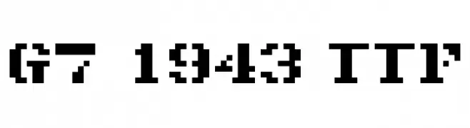
( Genshichi Yasui - www.jttk.zaq.ne.jp/babwp701/hpfont/font.html )
A bold, pixelated font with a retro digital style.
 Herunterladen 93 Downloads@WebFont
 -
( Fonts by Jorge Morón )
A bold, dynamic font with slanted characters and strong visual impact.
![JMHPulpPaperback-Bold Frei Schriftart Herunterladen]() Herunterladen 93 Downloads@WebFont
Herunterladen 93 Downloads@WebFont -
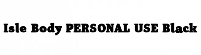
( Fonts by Mans Greback - Personal-use only. For commercial use please contact owner. )
A bold, impactful font with thick strokes and a slightly condensed style.
![Isle Body PERSONAL USE Black Frei Schriftart Herunterladen]() Herunterladen 93 Downloads@WebFont
Herunterladen 93 Downloads@WebFont -
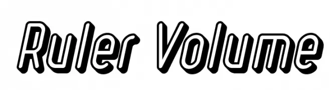
( Levi Szekeres - www.loremipsum.ro )
A bold, italicized font with a 3D shadow effect, perfect for dynamic and modern designs.
![Ruler Volume Frei Schriftart Herunterladen]() Herunterladen 93 Downloads@WebFont
Herunterladen 93 Downloads@WebFont -
( Fonts by Good Java Studio - www.creativefabrica.com/designer/goodjavastudio/ref/236564 - Personal-use only. For commercial use please contact owner. )
A bold, hand-drawn font with a playful, brush-lettering style.
![SlowlyTwo Frei Schriftart Herunterladen]() Herunterladen 93 Downloads@WebFont
Herunterladen 93 Downloads@WebFont -
-
( Fonts by Apol Sta Maria )
A playful, hand-drawn font with bold outlines and a whimsical style.
![kalansayetika Frei Schriftart Herunterladen]() Herunterladen 93 Downloads@WebFont
Herunterladen 93 Downloads@WebFont -
( Fonts by Biham Santoso - Personal-use only. For commercial use please contact owner. )
A classic serif font with elegant, elongated strokes and high contrast.
![Gellaghan Frei Schriftart Herunterladen]() Herunterladen 93 Downloads@WebFont
Herunterladen 93 Downloads@WebFont -
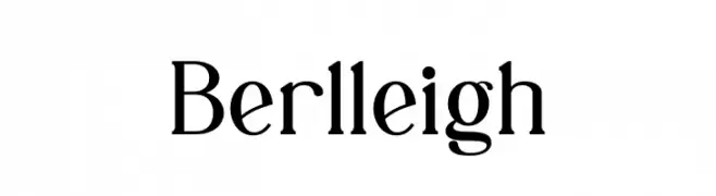
( Fonts by Biham Santoso - Personal-use only. For commercial use please contact owner. )
A classic serif font with elegant strokes and sharp serifs.
![Berlleigh Frei Schriftart Herunterladen]() Herunterladen 93 Downloads@WebFont
Herunterladen 93 Downloads@WebFont -
( Fonts by Manfred Klein. Free for private and charity use. Free for commercial with donation to organizations )
A surreal, illustrative display font with playful, abstract character designs.
![PhantasticSketches Frei Schriftart Herunterladen]() Herunterladen 93 Downloads@WebFont
Herunterladen 93 Downloads@WebFont -
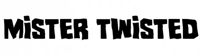
( Iconian Fonts - Daniel Zadorozny - www.iconian.com )
A bold, playful font with irregular, jagged edges and a dynamic appearance.
![Mister Twisted Frei Schriftart Herunterladen]() Herunterladen 93 Downloads@WebFont
Herunterladen 93 Downloads@WebFont


Welche Schriften sind gerade am populärsten?
Poppins, Roboto, Montserrat, Open Sans und Lato sind wegen ihrer klaren Formen und breiten Einsetzbarkeit sehr gefragt – von Markenauftritt über Landingpages bis hin zu Postern.
Welche Fonts eignen sich für Logos?
Geometrische Sans‑Serifs (z. B. Poppins, Familien im Gotham‑Stil) sind ein häufiger Griff für sauberes, skalierbares Branding. Für eine persönlichere Note bleiben Scripts und Handschrift‑Stile beliebt. Kombinieren Sie einen prägnanten Headline‑Font mit einer neutralen Brotschrift für Wiedererkennung und Harmonie.
Wie oft wird die Top‑Liste aktualisiert?
Regelmäßig – basierend auf realen Downloads und Interaktionen. Schauen Sie öfter vorbei, um aufstrebende Favoriten früh zu entdecken.
💡 Tipp: Seite bookmarken – Trends wechseln schnell, und heutige Top‑Schriften inspirieren morgen vielleicht das Rebranding.