Willkommen bei den Top‑Schriften – hier treffen Beliebtheit und Qualität aufeinander. Das sind die in diesem Jahr am häufigsten heruntergeladenen und genutzten Fonts. Wenn Sie sichere Optionen für Logo, Web oder Social suchen, starten Sie hier.
Jeder Top‑Font überzeugt durch Balance, Lesbarkeit und Vielseitigkeit. Sie finden moderne Sans‑Serifs, elegante Scripts, Vintage‑Serifs und minimalistische Displays.
-
( Fonts by Pizzadude )
A playful, bold, hand-drawn style font with thick strokes and a whimsical feel.
 Herunterladen 92 Downloads@WebFont
 -
( Fonts by Md Shohail Bhuian - Personal-use only. For commercial use please contact owner. )
A playful, modern font with tall, narrow letters and a handwritten feel.
![New Year Frei Schriftart Herunterladen]() Herunterladen 92 Downloads@WebFont
Herunterladen 92 Downloads@WebFont -
( Fonts by a Galdino Otten - galdinootten.com . Personal-use only. For commercial use please contact owner. )
A whimsical, hand-drawn font with irregular strokes and a playful style.
![Magical Cord Frei Schriftart Herunterladen]() Herunterladen 92 Downloads@WebFont
Herunterladen 92 Downloads@WebFont -
![Cobalt Alien Leftalic Frei Schriftart Herunterladen]() Herunterladen 92 Downloads@WebFont
Herunterladen 92 Downloads@WebFont -
( Fonts by Masato Shimojima - Personal-use only. For commercial use please contact owner. )
A pixelated, retro-style font inspired by early digital displays.
![Cheese10bit Frei Schriftart Herunterladen]() Herunterladen 92 Downloads@WebFont
Herunterladen 92 Downloads@WebFont -
-
( Fonts by K_IN Studio - Personal-use only. For commercial use please contact owner. )
A bold, brush-style font with dynamic and lively strokes.
![Hello Pinky Frei Schriftart Herunterladen]() Herunterladen 92 Downloads@WebFont
Herunterladen 92 Downloads@WebFont -
( Emylia Maratta )
A decorative, Western-inspired font with playful embellishments.
![Weztern Frei Schriftart Herunterladen]() Herunterladen 92 Downloads@WebFont
Herunterladen 92 Downloads@WebFont -
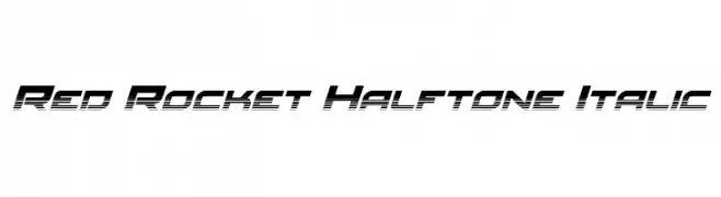
( Iconian Fonts - Daniel Zadorozny - www.iconian.com )
A dynamic, italicized font with a halftone effect, perfect for modern and energetic designs.
![Red Rocket Halftone Italic Frei Schriftart Herunterladen]() Herunterladen 92 Downloads@WebFont
Herunterladen 92 Downloads@WebFont -
![Proton Bold Italic Frei Schriftart Herunterladen]() Herunterladen 92 Downloads@WebFont
Herunterladen 92 Downloads@WebFont -
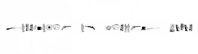
![Cornucopia of Dingbats Seven Frei Schriftart Herunterladen]() Herunterladen 92 Downloads@WebFont
Herunterladen 92 Downloads@WebFont


Welche Schriften sind gerade am populärsten?
Poppins, Roboto, Montserrat, Open Sans und Lato sind wegen ihrer klaren Formen und breiten Einsetzbarkeit sehr gefragt – von Markenauftritt über Landingpages bis hin zu Postern.
Welche Fonts eignen sich für Logos?
Geometrische Sans‑Serifs (z. B. Poppins, Familien im Gotham‑Stil) sind ein häufiger Griff für sauberes, skalierbares Branding. Für eine persönlichere Note bleiben Scripts und Handschrift‑Stile beliebt. Kombinieren Sie einen prägnanten Headline‑Font mit einer neutralen Brotschrift für Wiedererkennung und Harmonie.
Wie oft wird die Top‑Liste aktualisiert?
Regelmäßig – basierend auf realen Downloads und Interaktionen. Schauen Sie öfter vorbei, um aufstrebende Favoriten früh zu entdecken.
💡 Tipp: Seite bookmarken – Trends wechseln schnell, und heutige Top‑Schriften inspirieren morgen vielleicht das Rebranding.