Willkommen bei den Top‑Schriften – hier treffen Beliebtheit und Qualität aufeinander. Das sind die in diesem Jahr am häufigsten heruntergeladenen und genutzten Fonts. Wenn Sie sichere Optionen für Logo, Web oder Social suchen, starten Sie hier.
Jeder Top‑Font überzeugt durch Balance, Lesbarkeit und Vielseitigkeit. Sie finden moderne Sans‑Serifs, elegante Scripts, Vintage‑Serifs und minimalistische Displays.
-
( Fonts by Spork Thug Typography - Josh Wilhelm - www.lifewithouttaffy.com/taffy/blog )
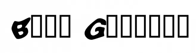
A playful, bold font with wavy, distorted characters for a whimsical look.
 Herunterladen 494 Downloads@WebFont
 -
( Fonts by Galdino Otten - galdinootten.com )
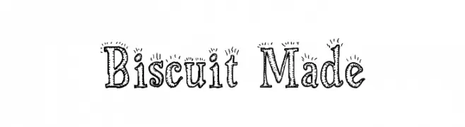
A playful, hand-drawn font with decorative, textured details.
![Biscuit Made Frei Schriftart Herunterladen]() Herunterladen 494 Downloads@WebFont
Herunterladen 494 Downloads@WebFont -
( Fonts by Ramli Setiadi - Personal-use only. For commercial use please contact owner. )
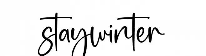
A playful, casual handwritten font with flowing, irregular letterforms.
![stay winter Frei Schriftart Herunterladen]() Herunterladen 494 Downloads@WebFont
Herunterladen 494 Downloads@WebFont -
( Fonts by Nick Curtis - www.nicksfonts.com )
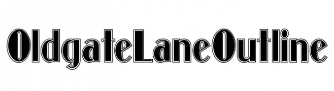
A bold, outlined font with a modern yet vintage style.
![OldgateLaneOutline Frei Schriftart Herunterladen]() Herunterladen 494 Downloads@WebFont
Herunterladen 494 Downloads@WebFont -
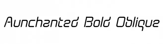
( Fonts by Graham Meade - GemFonts )
A modern, oblique font with a sleek, futuristic design.
![Aunchanted Bold Oblique Frei Schriftart Herunterladen]() Herunterladen 494 Downloads@WebFont
Herunterladen 494 Downloads@WebFont -
( Fonts by Krunoslav Sokic - model850.deviantart.com - Personal-use only. For commercial use please contact owner. )
An elegant script font with intricate curls and flourishes.
![Curlings Frei Schriftart Herunterladen]() Herunterladen 494 Downloads@WebFont
Herunterladen 494 Downloads@WebFont -
( Fonts by www.paintblackeditions.org )
A bold, playful, hand-drawn font with irregular, artistic characteristics.
![No Color Frei Schriftart Herunterladen]() Herunterladen 494 Downloads@WebFont
Herunterladen 494 Downloads@WebFont -
( Arterfak Project - Ahmad Ramzi Fahruddin - creativemarket.com/Arterfak )
A bold, blackletter-inspired font with sharp, angular forms and a gothic appearance.
![Sirugino-Clean Frei Schriftart Herunterladen]() Herunterladen 494 Downloads@WebFont
Herunterladen 494 Downloads@WebFont -
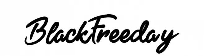
![Black Freeday Frei Schriftart Herunterladen]() Herunterladen 494 Downloads@WebFont
Herunterladen 494 Downloads@WebFont -
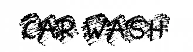
( Fonts by Jonathan S. Harris - www.tattoowoo.com. Personal-use only. For commercial use please contact owner. )
A bold, grungy font with a distressed, textured appearance.
![Car Wash Frei Schriftart Herunterladen]() Herunterladen 494 Downloads@WebFont
Herunterladen 494 Downloads@WebFont -
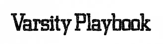
( Fonts by Kevin Christopher - www.kcfonts.com )
A bold, textured font with a vintage sports and collegiate theme.
![Varsity Playbook Frei Schriftart Herunterladen]() Herunterladen 494 Downloads@WebFont
Herunterladen 494 Downloads@WebFont -
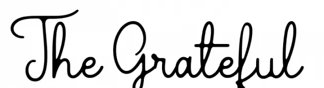
( Sronstudio - Yusron Billah )
A playful and elegant script font with fluid, connected letterforms.
![The Grateful 2 Frei Schriftart Herunterladen]() Herunterladen 494 Downloads@WebFont
Herunterladen 494 Downloads@WebFont -
( Fonts by Graham Meade - GemFonts )
A sleek, modern oblique sans-serif font with semi-bold weight.
![Walkway Oblique SemiBold Frei Schriftart Herunterladen]() Herunterladen 494 Downloads@WebFont
Herunterladen 494 Downloads@WebFont -
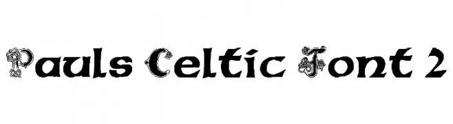
( Fonts by Paul - viciousink.net )
A Celtic-inspired font with ornate uppercase and bold lowercase letters.
![Pauls Celtic Font 2 Frei Schriftart Herunterladen]() Herunterladen 494 Downloads@WebFont
Herunterladen 494 Downloads@WebFont -
( Fonts by a www.fontfabric.com. Personal-use only. For commercial use please contact owner. )
A condensed, tall, and playful font with a modern aesthetic.
![PH 100 Cond Caps Frei Schriftart Herunterladen]() Herunterladen 494 Downloads@WebFont
Herunterladen 494 Downloads@WebFont -
( Fonts by Kurdz - vividbluezz.weebly.com )
A bold, energetic handwritten font with expressive strokes and a playful vibe.
![Rodi de Asis Frei Schriftart Herunterladen]() Herunterladen 494 Downloads@WebFont
Herunterladen 494 Downloads@WebFont -
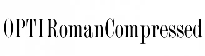
( Fonts by Castcraft Software - OPTI Fonts Archive - opti.netii.net - Personal-use only. For commercial use please contact owner. )
A classic serif font with a compressed, elegant style and medium contrast.
![OPTIRomanCompressed Frei Schriftart Herunterladen]() Herunterladen 494 Downloads@WebFont
Herunterladen 494 Downloads@WebFont -
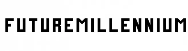
( Fonts by Zdenek Gromnica - www.futuremillennium.com )
A bold, geometric font with a futuristic, digital aesthetic.
![FutureMillennium Frei Schriftart Herunterladen]() Herunterladen 494 Downloads@WebFont
Herunterladen 494 Downloads@WebFont -
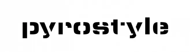
( Marley Did It - www.marleydidit.com )
A bold, geometric font with a modern, stencil-like design.
![pyrostyle Frei Schriftart Herunterladen]() Herunterladen 494 Downloads@WebFont
Herunterladen 494 Downloads@WebFont -
( Fonts by LeFly Fonts - lefly.vepar.nl )
A modern, geometric sans-serif font with clean lines and uniform stroke widths.
![KentekenSmitsNegentienEenenvijftig Frei Schriftart Herunterladen]() Herunterladen 494 Downloads@WebFont
Herunterladen 494 Downloads@WebFont -
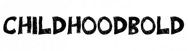
( Fonts by Flo Crusher )
A bold, hand-drawn font with a playful, textured appearance.
![Childhood Bold Frei Schriftart Herunterladen]() Herunterladen 494 Downloads@WebFont
Herunterladen 494 Downloads@WebFont -
( MirBSD )
A bold, monospaced font with a clean, modern design and medium contrast.
![Inconsolata zi4[varl,varqu] Bold Frei Schriftart Herunterladen]() Herunterladen 494 Downloads@WebFont
Herunterladen 494 Downloads@WebFont -
( Fonts by TarmSaft Font Factory - http://www.aska.nu/tarmsaft/ )
A playful, handwritten font with rounded, informal letterforms.
![Galla Frei Schriftart Herunterladen]() Herunterladen 494 Downloads@WebFont
Herunterladen 494 Downloads@WebFont -
![Fabliaux Regular Frei Schriftart Herunterladen]() Herunterladen 494 Downloads@WebFont
Herunterladen 494 Downloads@WebFont -
![natalia colleen Frei Schriftart Herunterladen]() Herunterladen 494 Downloads@WebFont
Herunterladen 494 Downloads@WebFont -
( Fonts by www.lifewithouttaffy.com )
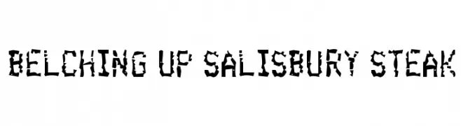
A fragmented, edgy font with a chaotic and dramatic appearance.
![Belching Up Salisbury Steak Frei Schriftart Herunterladen]() Herunterladen 494 Downloads@WebFont
Herunterladen 494 Downloads@WebFont -
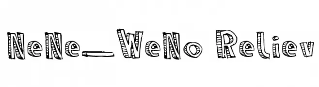
![NeNe_WeNo Reliev Frei Schriftart Herunterladen]() Herunterladen 493 Downloads@WebFont
Herunterladen 493 Downloads@WebFont -
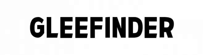
![Glee Finder Frei Schriftart Herunterladen]() Herunterladen 493 Downloads@WebFont
Herunterladen 493 Downloads@WebFont -
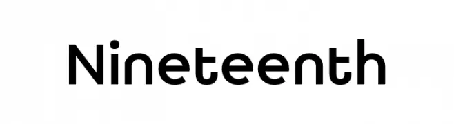
( Fonts by Igor Kosinsky - Personal-use only. For commercial use please contact owner. )
A modern, geometric sans-serif font with clean lines and uniform strokes.
![Nineteenth Frei Schriftart Herunterladen]() Herunterladen 493 Downloads@WebFont
Herunterladen 493 Downloads@WebFont -
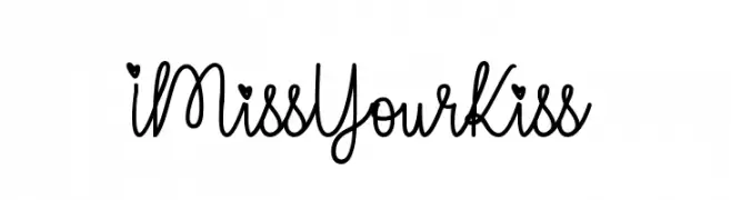
( Fonts by Misti`s Fonts - mistifonts.com - Personal-use only. For commercial use please contact owner. )
A playful, handwritten script font with charming, romantic details.
![IMissYourKiss Frei Schriftart Herunterladen]() Herunterladen 493 Downloads@WebFont
Herunterladen 493 Downloads@WebFont -
( Fonts by Manfred Klein Fonteria )
A modern sans-serif font with smooth curves and uniform strokes.
![Folks-Normal Frei Schriftart Herunterladen]() Herunterladen 493 Downloads@WebFont
Herunterladen 493 Downloads@WebFont -
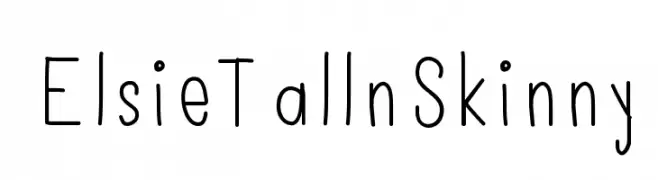
( Font by ElsieLarson - www.abeautifulmess.com )
A playful, hand-drawn font with tall, slender characters and a modern look.
![ElsieTallnSkinny Frei Schriftart Herunterladen]() Herunterladen 493 Downloads@WebFont
Herunterladen 493 Downloads@WebFont -
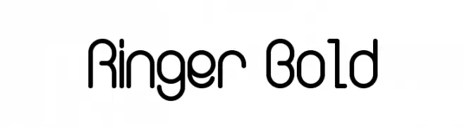
( Fonts by Mans Greback - www.mawns.com )
A modern, geometric font with rounded edges and a bold, minimalist style.
![Ringer Bold Frei Schriftart Herunterladen]() Herunterladen 493 Downloads@WebFont
Herunterladen 493 Downloads@WebFont -
( Fonts by Graham Meade - GemFonts )
A bold, geometric font with strong, wide letterforms and a modern aesthetic.
![PanAmTextCaps Frei Schriftart Herunterladen]() Herunterladen 493 Downloads@WebFont
Herunterladen 493 Downloads@WebFont -
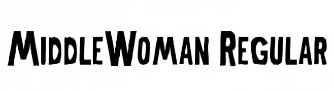
( Fonts by Alex Squack - http://twitter.com/NoGoodToMe )
A bold, hand-drawn font with an expressive and playful style.
![MiddleWoman-Regular Frei Schriftart Herunterladen]() Herunterladen 493 Downloads@WebFont
Herunterladen 493 Downloads@WebFont


![Inconsolata zi4[varl,varqu] Bold Frei Schriftart Herunterladen](https://d144mzi0q5mijx.cloudfront.net/img/I/N/Inconsolata-zi4-varlvarqu-Bold.webp)


Welche Schriften sind gerade am populärsten?
Poppins, Roboto, Montserrat, Open Sans und Lato sind wegen ihrer klaren Formen und breiten Einsetzbarkeit sehr gefragt – von Markenauftritt über Landingpages bis hin zu Postern.
Welche Fonts eignen sich für Logos?
Geometrische Sans‑Serifs (z. B. Poppins, Familien im Gotham‑Stil) sind ein häufiger Griff für sauberes, skalierbares Branding. Für eine persönlichere Note bleiben Scripts und Handschrift‑Stile beliebt. Kombinieren Sie einen prägnanten Headline‑Font mit einer neutralen Brotschrift für Wiedererkennung und Harmonie.
Wie oft wird die Top‑Liste aktualisiert?
Regelmäßig – basierend auf realen Downloads und Interaktionen. Schauen Sie öfter vorbei, um aufstrebende Favoriten früh zu entdecken.
💡 Tipp: Seite bookmarken – Trends wechseln schnell, und heutige Top‑Schriften inspirieren morgen vielleicht das Rebranding.