Willkommen bei den Top‑Schriften – hier treffen Beliebtheit und Qualität aufeinander. Das sind die in diesem Jahr am häufigsten heruntergeladenen und genutzten Fonts. Wenn Sie sichere Optionen für Logo, Web oder Social suchen, starten Sie hier.
Jeder Top‑Font überzeugt durch Balance, Lesbarkeit und Vielseitigkeit. Sie finden moderne Sans‑Serifs, elegante Scripts, Vintage‑Serifs und minimalistische Displays.
-
 Herunterladen 493 Downloads@WebFont
 -
![PersianNaskhSSK Frei Schriftart Herunterladen]() Herunterladen 493 Downloads@WebFont
Herunterladen 493 Downloads@WebFont -
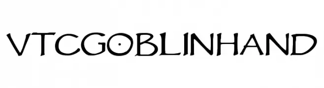
![VTCGoblinHand Frei Schriftart Herunterladen]() Herunterladen 493 Downloads@WebFont
Herunterladen 493 Downloads@WebFont -
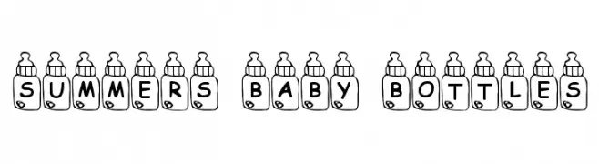
![Summers Baby Bottles Frei Schriftart Herunterladen]() Herunterladen 493 Downloads@WebFont
Herunterladen 493 Downloads@WebFont -
( Fonts by www.dcoxy.com )
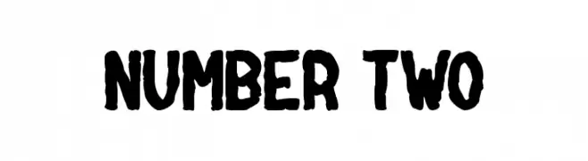
A bold, hand-drawn font with rugged, irregular strokes.
![NUMBER two Frei Schriftart Herunterladen]() Herunterladen 493 Downloads@WebFont
Herunterladen 493 Downloads@WebFont -
( Fonts by Haksen Letters )
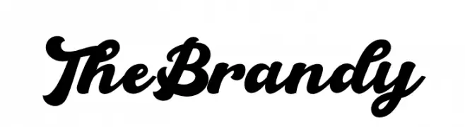
A bold, cursive font with interconnected characters and elegant curves.
![The Brandy Frei Schriftart Herunterladen]() Herunterladen 493 Downloads@WebFont
Herunterladen 493 Downloads@WebFont -
( Fonts by Hendra Pratama - HPTypework - https://hptypework.com - Personal-use only. For commercial use please contact owner. )
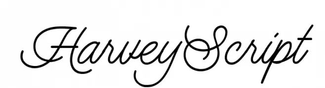
A sophisticated script font with elegant, flowing cursive characters.
![HarveyScript Frei Schriftart Herunterladen]() Herunterladen 493 Downloads@WebFont
Herunterladen 493 Downloads@WebFont -
( Font by Jayvee D. Enaguas - grandchaos9000.deviantart.com )
A bold, modern sans-serif font with a clean and uniform design.
![Bimbo JVE Frei Schriftart Herunterladen]() Herunterladen 493 Downloads@WebFont
Herunterladen 493 Downloads@WebFont -
( Font by Jayvee D. Enaguas - grandchaos9000.deviantart.com )
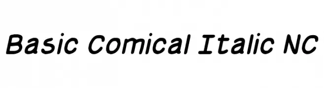
A playful, italicized font with smooth, rounded strokes and moderate contrast.
![Basic Comical Italic NC Frei Schriftart Herunterladen]() Herunterladen 493 Downloads@WebFont
Herunterladen 493 Downloads@WebFont -
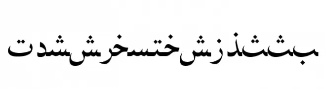
( گالری فانت فارسی پژوهش آريانا - only compatible with Farsi and Arabic )
A modern, geometric font with clean lines and uniform proportions.
![Ajib Frei Schriftart Herunterladen]() Herunterladen 493 Downloads@WebFont
Herunterladen 493 Downloads@WebFont -
( Copyright (c) 2015 Indian Type Foundry (info@indiantypefoundry.com) )
A clean, modern sans-serif font with balanced spacing and consistent stroke width.
![Hind Mysuru Frei Schriftart Herunterladen]() Herunterladen 493 Downloads@WebFont
Herunterladen 493 Downloads@WebFont -
![American Star Regular Frei Schriftart Herunterladen]() Herunterladen 493 Downloads@WebFont
Herunterladen 493 Downloads@WebFont -
( Fonts by Iconian Fonts )
A bold, condensed, and italic font with a dynamic and modern style.
![1st Enterprises Condensed Super-Italic Frei Schriftart Herunterladen]() Herunterladen 493 Downloads@WebFont
Herunterladen 493 Downloads@WebFont -
![Agnesa Kyoto Frei Schriftart Herunterladen]() Herunterladen 493 Downloads@WebFont
Herunterladen 493 Downloads@WebFont -
( www.teacherspayteachers.com/Store/Khrys-Bosland )
A bold, playful font with thick, rounded strokes and a whimsical style.
![KBStickToThePlan Frei Schriftart Herunterladen]() Herunterladen 493 Downloads@WebFont
Herunterladen 493 Downloads@WebFont -
( Fonts by Iconian Fonts )
A bold, condensed font with a quirky, hand-drawn style.
![Ghoulish Intent Condensed Frei Schriftart Herunterladen]() Herunterladen 493 Downloads@WebFont
Herunterladen 493 Downloads@WebFont -
( Fonts by Nico Muslib )
A playful, rounded font with smooth curves and a friendly appearance.
![Malvinas Regular Frei Schriftart Herunterladen]() Herunterladen 493 Downloads@WebFont
Herunterladen 493 Downloads@WebFont -
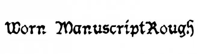
![Worn ManuscriptRough Frei Schriftart Herunterladen]() Herunterladen 493 Downloads@WebFont
Herunterladen 493 Downloads@WebFont -
( Typodermic Fonts - Ray Larabie - www.typodermicfonts.com/ )
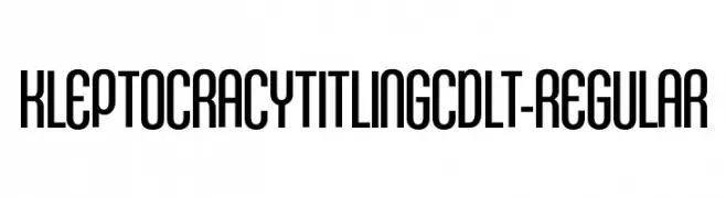
A tall, condensed font with a modern and sleek appearance.
![KleptocracyTitlingCdLt-Regular Frei Schriftart Herunterladen]() Herunterladen 493 Downloads@WebFont
Herunterladen 493 Downloads@WebFont -
( Fonts by Ratcage Records - Personal-use only. For commercial use please contact owner. )
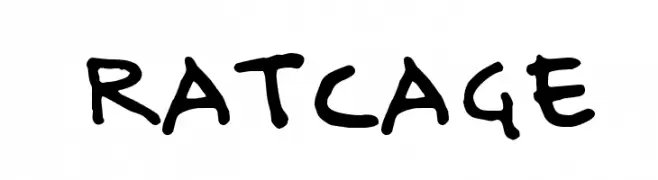
A playful, casual handwritten font with dynamic strokes.
![Ratcage Frei Schriftart Herunterladen]() Herunterladen 493 Downloads@WebFont
Herunterladen 493 Downloads@WebFont -
( Fonts by Fran Fernandez - Personal-use only. For commercial use please contact owner. )
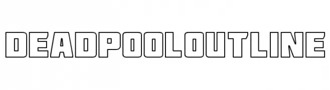
A bold, geometric outline font with sharp angles and clean lines.
![Deadpool Outline Frei Schriftart Herunterladen]() Herunterladen 493 Downloads@WebFont
Herunterladen 493 Downloads@WebFont -
![Whimsy Frei Schriftart Herunterladen]() Herunterladen 493 Downloads@WebFont
Herunterladen 493 Downloads@WebFont -
( Fonts by Typearound )
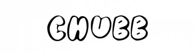
A playful, bold font with thick, rounded, outlined letters.
![Chubb Frei Schriftart Herunterladen]() Herunterladen 493 Downloads@WebFont
Herunterladen 493 Downloads@WebFont -
![Handa Frei Schriftart Herunterladen]() Herunterladen 493 Downloads@WebFont
Herunterladen 493 Downloads@WebFont -
( Fonts by douglas vitkauskas - Personal-use only. For commercial use please contact owner. )
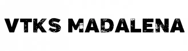
A bold, distressed font with a textured, vintage appearance.
![Vtks Madalena Frei Schriftart Herunterladen]() Herunterladen 493 Downloads@WebFont
Herunterladen 493 Downloads@WebFont -
( Fonts by www.chequered.ink - Chequered Ink - Personal-use only. For commercial use please contact owner. )
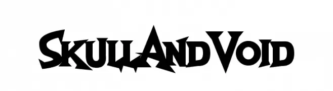
A bold, gothic-inspired font with sharp, angular edges and dramatic serifs.
![Skull And Void Frei Schriftart Herunterladen]() Herunterladen 493 Downloads@WebFont
Herunterladen 493 Downloads@WebFont -
( Fonts by Rodrigo German - RASDESIGN )
Cartoon mascot font with bold outlines and playful characters.
![HELLO CONDORITO Frei Schriftart Herunterladen]() Herunterladen 493 Downloads@WebFont
Herunterladen 493 Downloads@WebFont -
![Dyane Regular Frei Schriftart Herunterladen]() Herunterladen 493 Downloads@WebFont
Herunterladen 493 Downloads@WebFont -
![Sweet Dessert Frei Schriftart Herunterladen]() Herunterladen 493 Downloads@WebFont
Herunterladen 493 Downloads@WebFont -
![Monitorica-Bold Frei Schriftart Herunterladen]() Herunterladen 493 Downloads@WebFont
Herunterladen 493 Downloads@WebFont -
![Clearblock circular - 3DFX Frei Schriftart Herunterladen]() Herunterladen 493 Downloads@WebFont
Herunterladen 493 Downloads@WebFont -
( Fonts by Andreas Hofeld - www.fontgrube.de )
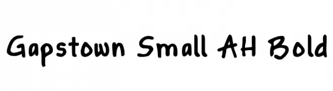
A bold, playful handwritten font with rounded, consistent letterforms.
![Gapstown Small AH Bold Frei Schriftart Herunterladen]() Herunterladen 493 Downloads@WebFont
Herunterladen 493 Downloads@WebFont -
( Fonts by Daniel Zadorozny - www.iconian.com )
A bold, italicized font with a modern, three-dimensional outline.
![Soldier Academy Italic Frei Schriftart Herunterladen]() Herunterladen 493 Downloads@WebFont
Herunterladen 493 Downloads@WebFont -
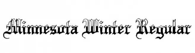
( www.ghostsofbigfoot.com )
A classic blackletter font with intricate, ornate letterforms and historical elegance.
![Minnesota Winter Regular Frei Schriftart Herunterladen]() Herunterladen 493 Downloads@WebFont
Herunterladen 493 Downloads@WebFont -
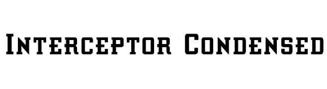
( Fonts by Daniel Zadorozny - www.iconian.com )
A bold, condensed font with geometric shapes and a strong, impactful presence.
![Interceptor Condensed Frei Schriftart Herunterladen]() Herunterladen 493 Downloads@WebFont
Herunterladen 493 Downloads@WebFont


Welche Schriften sind gerade am populärsten?
Poppins, Roboto, Montserrat, Open Sans und Lato sind wegen ihrer klaren Formen und breiten Einsetzbarkeit sehr gefragt – von Markenauftritt über Landingpages bis hin zu Postern.
Welche Fonts eignen sich für Logos?
Geometrische Sans‑Serifs (z. B. Poppins, Familien im Gotham‑Stil) sind ein häufiger Griff für sauberes, skalierbares Branding. Für eine persönlichere Note bleiben Scripts und Handschrift‑Stile beliebt. Kombinieren Sie einen prägnanten Headline‑Font mit einer neutralen Brotschrift für Wiedererkennung und Harmonie.
Wie oft wird die Top‑Liste aktualisiert?
Regelmäßig – basierend auf realen Downloads und Interaktionen. Schauen Sie öfter vorbei, um aufstrebende Favoriten früh zu entdecken.
💡 Tipp: Seite bookmarken – Trends wechseln schnell, und heutige Top‑Schriften inspirieren morgen vielleicht das Rebranding.