Willkommen bei den Top‑Schriften – hier treffen Beliebtheit und Qualität aufeinander. Das sind die in diesem Jahr am häufigsten heruntergeladenen und genutzten Fonts. Wenn Sie sichere Optionen für Logo, Web oder Social suchen, starten Sie hier.
Jeder Top‑Font überzeugt durch Balance, Lesbarkeit und Vielseitigkeit. Sie finden moderne Sans‑Serifs, elegante Scripts, Vintage‑Serifs und minimalistische Displays.
-
( Fonts by typeformerstudio.com - Personal-use only. For commercial use please contact owner. )
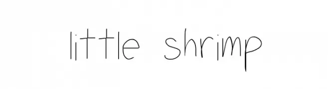
A modern sans-serif font with rounded edges and balanced character spacing.
 Herunterladen 91 Downloads@WebFont
 -
![little shrimp Frei Schriftart Herunterladen]() Herunterladen 91 Downloads@WebFont
Herunterladen 91 Downloads@WebFont -
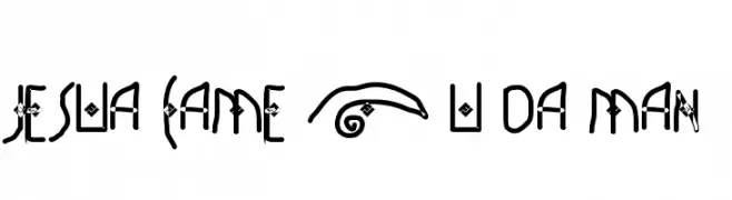
![JESUA CAME 2 U DA MAN Frei Schriftart Herunterladen]() Herunterladen 91 Downloads@WebFont
Herunterladen 91 Downloads@WebFont -
( Fonts by Sizimon.id - Personal-use only. For commercial use please contact owner. )
A lively and elegant cursive script font with fluid connections.
![Aurothesia Frei Schriftart Herunterladen]() Herunterladen 91 Downloads@WebFont
Herunterladen 91 Downloads@WebFont -
( Fonts by Md Shohail Bhuian )
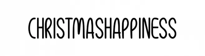
Playful and rounded handwritten font.
![Christmas Happiness Frei Schriftart Herunterladen]() Herunterladen 91 Downloads@WebFont
Herunterladen 91 Downloads@WebFont -
-
( Fonts by Daniel Zadorozny - www.iconian.com )
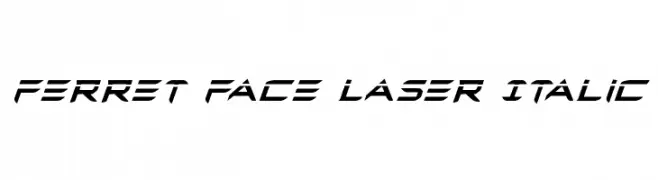
A futuristic, angular font with bold strokes and a dynamic slant.
![Ferret Face Laser Italic Frei Schriftart Herunterladen]() Herunterladen 91 Downloads@WebFont
Herunterladen 91 Downloads@WebFont -
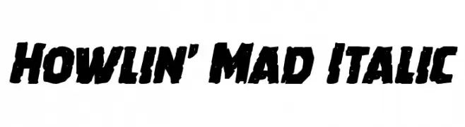
( Iconian Fonts - Daniel Zadorozny - www.iconian.com )
A bold, italicized font with a rugged, distressed style.
![Howlin' Mad Italic Frei Schriftart Herunterladen]() Herunterladen 91 Downloads@WebFont
Herunterladen 91 Downloads@WebFont -
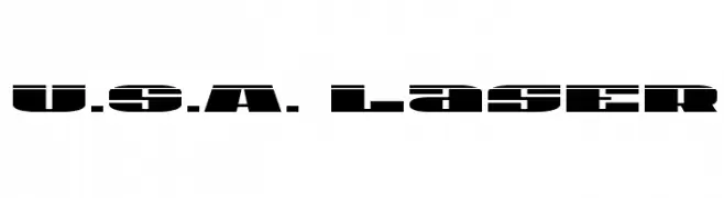
( Iconian Fonts - Daniel Zadorozny - www.iconian.com )
A bold, futuristic stencil-style font with wide, blocky characters.
![U.S.A. Laser Frei Schriftart Herunterladen]() Herunterladen 91 Downloads@WebFont
Herunterladen 91 Downloads@WebFont -
( Fonts by Daniel Zadorozny - www.iconian.com )
A bold, 3D geometric font with outlined characters and a futuristic style.
![Viking Squad 3D Frei Schriftart Herunterladen]() Herunterladen 91 Downloads@WebFont
Herunterladen 91 Downloads@WebFont -
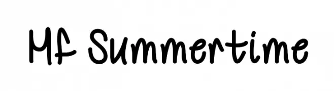
( Fonts by Misti`s Fonts - mistifonts.com - Personal-use only. For commercial use please contact owner. )
A playful, handwritten font with a friendly and casual style.
![Mf Summertime Frei Schriftart Herunterladen]() Herunterladen 91 Downloads@WebFont
Herunterladen 91 Downloads@WebFont


Welche Schriften sind gerade am populärsten?
Poppins, Roboto, Montserrat, Open Sans und Lato sind wegen ihrer klaren Formen und breiten Einsetzbarkeit sehr gefragt – von Markenauftritt über Landingpages bis hin zu Postern.
Welche Fonts eignen sich für Logos?
Geometrische Sans‑Serifs (z. B. Poppins, Familien im Gotham‑Stil) sind ein häufiger Griff für sauberes, skalierbares Branding. Für eine persönlichere Note bleiben Scripts und Handschrift‑Stile beliebt. Kombinieren Sie einen prägnanten Headline‑Font mit einer neutralen Brotschrift für Wiedererkennung und Harmonie.
Wie oft wird die Top‑Liste aktualisiert?
Regelmäßig – basierend auf realen Downloads und Interaktionen. Schauen Sie öfter vorbei, um aufstrebende Favoriten früh zu entdecken.
💡 Tipp: Seite bookmarken – Trends wechseln schnell, und heutige Top‑Schriften inspirieren morgen vielleicht das Rebranding.