Willkommen bei den Top‑Schriften – hier treffen Beliebtheit und Qualität aufeinander. Das sind die in diesem Jahr am häufigsten heruntergeladenen und genutzten Fonts. Wenn Sie sichere Optionen für Logo, Web oder Social suchen, starten Sie hier.
Jeder Top‑Font überzeugt durch Balance, Lesbarkeit und Vielseitigkeit. Sie finden moderne Sans‑Serifs, elegante Scripts, Vintage‑Serifs und minimalistische Displays.
-
( Fonts by a Neale Davidson - www.pixelsagas.com. Personal-use only. For commercial use please contact owner. )
A bold, geometric font with a futuristic and abstract style.
 Herunterladen 91 Downloads@WebFont
 -
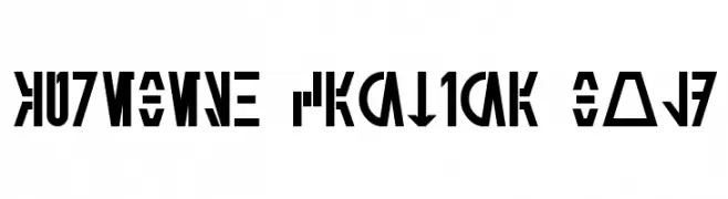
( Fonts by Mekaila Stefano - Personal-use only. For commercial use please contact owner. )
A playful, handwritten font with rounded, consistent strokes.
![Meka Regular Frei Schriftart Herunterladen]() Herunterladen 91 Downloads@WebFont
Herunterladen 91 Downloads@WebFont -
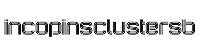
( Fonts by Peter Wiegel - www.peter-wiegel.de - Personal-use only. For commercial use please contact owner. )
A futuristic, multi-line font with a geometric and technological style.
![IncopinsClustersB Frei Schriftart Herunterladen]() Herunterladen 91 Downloads@WebFont
Herunterladen 91 Downloads@WebFont -
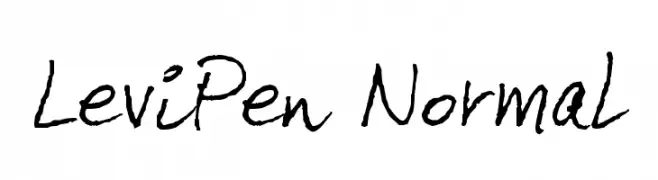
( Fonts by Levi Szekeres - Personal-use only. For commercial use please contact owner. )
A casual, handwritten font with a natural, flowing style.
![LeviPen Normal Frei Schriftart Herunterladen]() Herunterladen 91 Downloads@WebFont
Herunterladen 91 Downloads@WebFont -
( Fonts by Almarkhatype - Abdul Malik Wisnu - Personal-use only. For commercial use please contact owner. )
A bold, blocky font with a vintage sports feel.
![Empirez Frei Schriftart Herunterladen]() Herunterladen 91 Downloads@WebFont
Herunterladen 91 Downloads@WebFont -
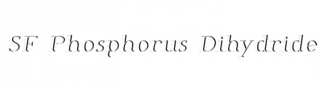
-
![SF Phosphorus Dihydride Frei Schriftart Herunterladen]() Herunterladen 91 Downloads@WebFont
Herunterladen 91 Downloads@WebFont -
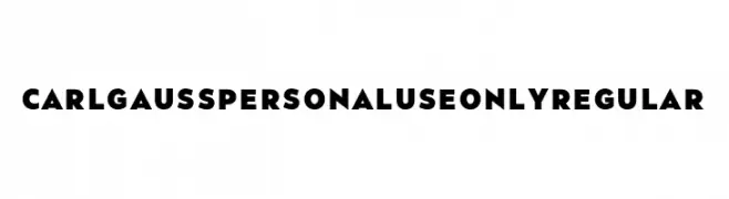
( Fonts by Mans Greback - www.mansgreback.com - Personal-use only. For commercial use please contact owner. )
A bold, geometric font with strong, modern letterforms.
![Carl Gauss PERSONAL USE ONLY Regular Frei Schriftart Herunterladen]() Herunterladen 91 Downloads@WebFont
Herunterladen 91 Downloads@WebFont -
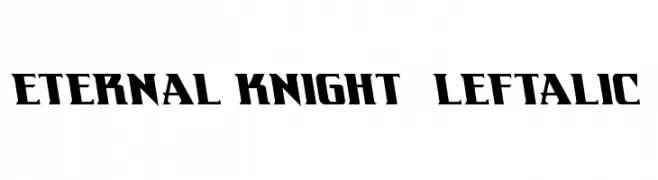
( Fonts by Daniel Zadorozny - www.iconian.com )
A bold, angular font with a dynamic, medieval-inspired style.
![Eternal Knight Leftalic Frei Schriftart Herunterladen]() Herunterladen 91 Downloads@WebFont
Herunterladen 91 Downloads@WebFont -
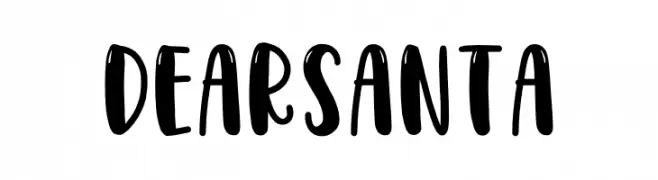
( Fonts by Mozatype - Personal-use only. For commercial use please contact owner. )
A playful, bold, and hand-drawn style font with rounded strokes.
![DEARSANTA Frei Schriftart Herunterladen]() Herunterladen 91 Downloads@WebFont
Herunterladen 91 Downloads@WebFont -
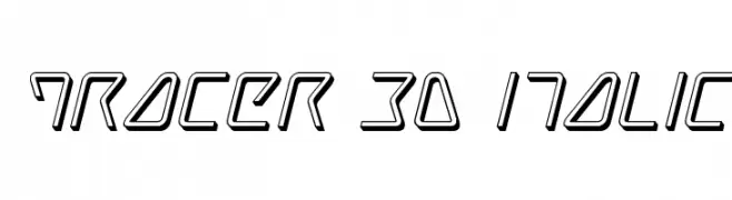
( Fonts by Iconian Fonts )
A futuristic 3D italic font with angular, geometric shapes and a dynamic style.
![Tracer 3D Italic Frei Schriftart Herunterladen]() Herunterladen 91 Downloads@WebFont
Herunterladen 91 Downloads@WebFont


Welche Schriften sind gerade am populärsten?
Poppins, Roboto, Montserrat, Open Sans und Lato sind wegen ihrer klaren Formen und breiten Einsetzbarkeit sehr gefragt – von Markenauftritt über Landingpages bis hin zu Postern.
Welche Fonts eignen sich für Logos?
Geometrische Sans‑Serifs (z. B. Poppins, Familien im Gotham‑Stil) sind ein häufiger Griff für sauberes, skalierbares Branding. Für eine persönlichere Note bleiben Scripts und Handschrift‑Stile beliebt. Kombinieren Sie einen prägnanten Headline‑Font mit einer neutralen Brotschrift für Wiedererkennung und Harmonie.
Wie oft wird die Top‑Liste aktualisiert?
Regelmäßig – basierend auf realen Downloads und Interaktionen. Schauen Sie öfter vorbei, um aufstrebende Favoriten früh zu entdecken.
💡 Tipp: Seite bookmarken – Trends wechseln schnell, und heutige Top‑Schriften inspirieren morgen vielleicht das Rebranding.