Willkommen bei den Top‑Schriften – hier treffen Beliebtheit und Qualität aufeinander. Das sind die in diesem Jahr am häufigsten heruntergeladenen und genutzten Fonts. Wenn Sie sichere Optionen für Logo, Web oder Social suchen, starten Sie hier.
Jeder Top‑Font überzeugt durch Balance, Lesbarkeit und Vielseitigkeit. Sie finden moderne Sans‑Serifs, elegante Scripts, Vintage‑Serifs und minimalistische Displays.
-
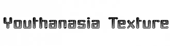
( Fonts by Apostrophic Lab )
A bold, textured font with a striped pattern and geometric style.
 Herunterladen 488 Downloads@WebFont
 -
( Fonts by junkohanhero )
A bold, playful font with a hand-drawn, whimsical style.
![Killing me softly Frei Schriftart Herunterladen]() Herunterladen 488 Downloads@WebFont
Herunterladen 488 Downloads@WebFont -
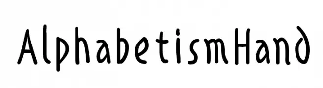
( Fonts by Manfred Klein. Free for private and charity use. Free for commercial with donation to organizations )
A playful, handwritten font with an organic, casual style.
![AlphabetismHand Frei Schriftart Herunterladen]() Herunterladen 488 Downloads@WebFont
Herunterladen 488 Downloads@WebFont -
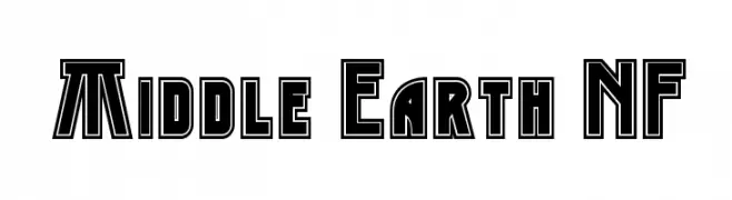
( Fonts by Nick Curtis - www.nicksfonts.com )
A bold, outlined font with a fantasy-inspired, geometric style.
![Middle Earth NF Frei Schriftart Herunterladen]() Herunterladen 488 Downloads@WebFont
Herunterladen 488 Downloads@WebFont -
( Fonts by Display Studio )
A playful, bold font with rounded characters and a whimsical style.
![Cheesel Frei Schriftart Herunterladen]() Herunterladen 488 Downloads@WebFont
Herunterladen 488 Downloads@WebFont -
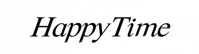
( Fonts by CannotIntoSpaceFonts - KineticPlasma Fonts - Personal-use only. For commercial use please contact owner. )
An elegant serif font with a classic italic style and smooth, flowing lines.
![Happy Time Frei Schriftart Herunterladen]() Herunterladen 488 Downloads@WebFont
Herunterladen 488 Downloads@WebFont -
( Fonts by Daniel Zadorozny - www.iconian.com )
A bold, italicized font with a futuristic and dynamic style.
![Space Ranger Bold Italic Frei Schriftart Herunterladen]() Herunterladen 488 Downloads@WebFont
Herunterladen 488 Downloads@WebFont -
( Fonts by Gassstype )
A bold, modern font with thick strokes and rounded edges, perfect for impactful headlines.
![Mighty Sans Frei Schriftart Herunterladen]() Herunterladen 488 Downloads@WebFont
Herunterladen 488 Downloads@WebFont -
![flamez by marioz Frei Schriftart Herunterladen]() Herunterladen 488 Downloads@WebFont
Herunterladen 488 Downloads@WebFont -
( Free for a personal use. For a commercial use please visit www.kevinandamanda.com )
A playful, casual handwritten font with an organic and informal style.
![Pea Kar Kar Frei Schriftart Herunterladen]() Herunterladen 488 Downloads@WebFont
Herunterladen 488 Downloads@WebFont -
( Fonts by weknow - Wino S Kadir )
A modern, rounded font with consistent line thickness and playful style.
![Merpati Putih Frei Schriftart Herunterladen]() Herunterladen 488 Downloads@WebFont
Herunterladen 488 Downloads@WebFont -
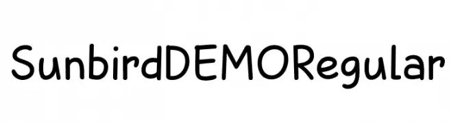
![Sunbird DEMO Regular Frei Schriftart Herunterladen]() Herunterladen 488 Downloads@WebFont
Herunterladen 488 Downloads@WebFont -
( Fonts by www.peter-wiegel.de. Personal-use only. For commercial use please contact owner. )
A futuristic, geometric font with sharp angles and clean lines.
![Casa Sans Frei Schriftart Herunterladen]() Herunterladen 488 Downloads@WebFont
Herunterladen 488 Downloads@WebFont -
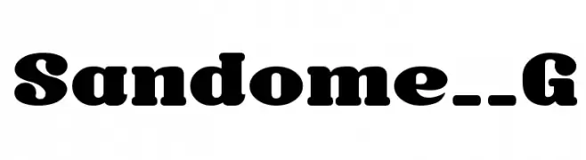
( Fonts by Goma Shin - Shintarou Nakayama www.geocities.jp/gomarice_font/ )
A bold, rounded font with a playful and robust style.
![Sandome__G Frei Schriftart Herunterladen]() Herunterladen 488 Downloads@WebFont
Herunterladen 488 Downloads@WebFont -
( Fonts by Nurf Designs - Personal-use only. For commercial use please contact owner. )
A bold, flowing script font with elegant cursive letterforms.
![Cipthayasa Frei Schriftart Herunterladen]() Herunterladen 488 Downloads@WebFont
Herunterladen 488 Downloads@WebFont -
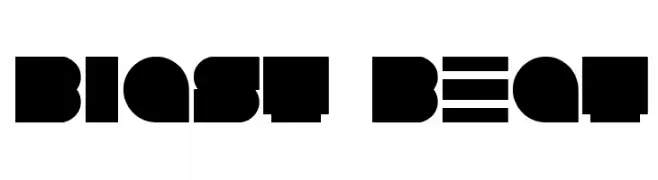
( Fonts by Andrew Hart - dirt2.com )
A bold, geometric font with blocky, angular letterforms for a strong visual impact.
![Blast Beat Frei Schriftart Herunterladen]() Herunterladen 488 Downloads@WebFont
Herunterladen 488 Downloads@WebFont -
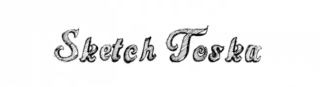
( Fonts by Galdino Otten - galdinootten.com )
A sketch-style font with hand-drawn, textured characters.
![Sketch Toska Frei Schriftart Herunterladen]() Herunterladen 488 Downloads@WebFont
Herunterladen 488 Downloads@WebFont -
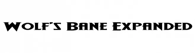
( Fonts by Iconian Fonts - Daniel Zadorozny )
A bold, angular font with a gothic-inspired style, perfect for dramatic headlines.
![Wolf's Bane Expanded Frei Schriftart Herunterladen]() Herunterladen 488 Downloads@WebFont
Herunterladen 488 Downloads@WebFont -
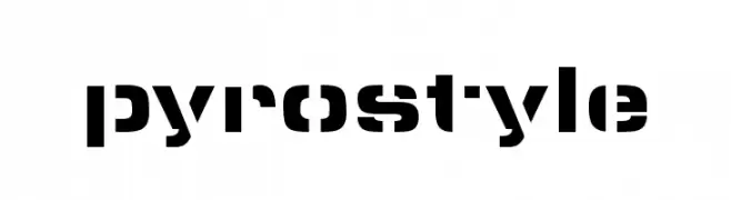
( Marley Did It - www.marleydidit.com )
A bold, geometric font with a modern, stencil-like design.
![pyrostyle Frei Schriftart Herunterladen]() Herunterladen 488 Downloads@WebFont
Herunterladen 488 Downloads@WebFont -
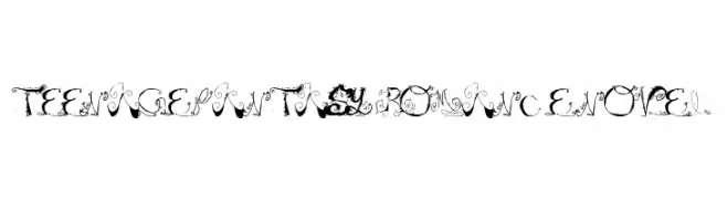
![Teenage Fantasy Romance Novel Frei Schriftart Herunterladen]() Herunterladen 488 Downloads@WebFont
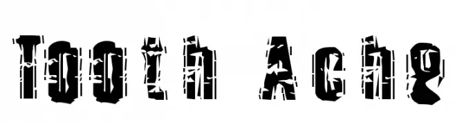
Herunterladen 488 Downloads@WebFont -
![Tooth Ache Frei Schriftart Herunterladen]() Herunterladen 488 Downloads@WebFont
Herunterladen 488 Downloads@WebFont -
( mlkwsn - Malik Wisnu )
A dynamic, expressive handwritten font with fluid, cursive strokes.
![Dellamonde Frei Schriftart Herunterladen]() Herunterladen 488 Downloads@WebFont
Herunterladen 488 Downloads@WebFont -
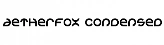
( Fonts by Daniel Zadorozny - www.iconian.com - Free for personal use )
A futuristic, geometric font with a condensed and modern design.
![Aetherfox Condensed Frei Schriftart Herunterladen]() Herunterladen 488 Downloads@WebFont
Herunterladen 488 Downloads@WebFont -
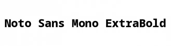
( Noto is a trademark of Google Inc. Noto fonts are open source. All Noto fonts are published under the SIL Open Font License, Version 1.1 )
A bold, monospaced font with uniform spacing and clear, robust characters.
![Noto Sans Mono ExtraBold Frei Schriftart Herunterladen]() Herunterladen 488 Downloads@WebFont
Herunterladen 488 Downloads@WebFont -
( Marwah Store - Alexe Crisna - fontbundles.net/art-design )
A graceful script font with smooth, connected strokes and a handwritten appearance.
![Melinda art design Frei Schriftart Herunterladen]() Herunterladen 488 Downloads@WebFont
Herunterladen 488 Downloads@WebFont -
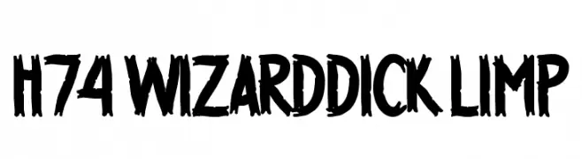
( Fonts by www.legacyofdefeat.com )
A bold, brush-style font with a raw, hand-drawn appearance.
![H74 WizardDick Limp Frei Schriftart Herunterladen]() Herunterladen 488 Downloads@WebFont
Herunterladen 488 Downloads@WebFont -
( Fonts by Douglas Vitkauskas - www.vtksdesign.com. Personal-use only. For commercial use please contact owner. )
A bold, decorative font with vintage, ornate detailing.
![Vtks Black Label Frei Schriftart Herunterladen]() Herunterladen 488 Downloads@WebFont
Herunterladen 488 Downloads@WebFont -
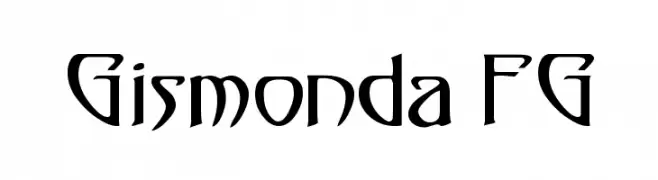
( Fonts by Andreas Hofeld - www.fontgrube.de )
An artistic and dynamic font with sharp angles and smooth curves.
![Gismonda FG Frei Schriftart Herunterladen]() Herunterladen 488 Downloads@WebFont
Herunterladen 488 Downloads@WebFont -
( fey design - Fey Design - www.creativemarket.com/feydesign )
A charming script font with smooth, flowing lines and elegant curves.
![HometownScriptFree Frei Schriftart Herunterladen]() Herunterladen 488 Downloads@WebFont
Herunterladen 488 Downloads@WebFont -
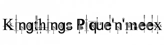
( Font by kingthingsfonts.co.uk )
A decorative and artistic font with intricate patterns and embellishments.
![Kingthings Pique'n'meex Frei Schriftart Herunterladen]() Herunterladen 488 Downloads@WebFont
Herunterladen 488 Downloads@WebFont -
( Fonts by Andrew McCluskey - nalgames.com. Personal-use only. For commercial use please contact owner. )
A glitch-inspired font with bold, digital distortion effects.
![DEADCRT Regular Frei Schriftart Herunterladen]() Herunterladen 488 Downloads@WebFont
Herunterladen 488 Downloads@WebFont -
![Tolkien-Dwarf-Runes Frei Schriftart Herunterladen]() Herunterladen 487 Downloads@WebFont
Herunterladen 487 Downloads@WebFont -
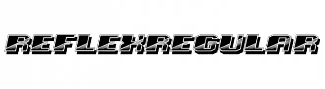
( Fonts by Vladimir Nikolic - www.creativefabrica.com/designer/vladimirnikolic/ - Personal-use only. For commercial use please contact owner. )
A bold, 3D-effect font with a retro, geometric style.
![Reflex Regular Frei Schriftart Herunterladen]() Herunterladen 487 Downloads@WebFont
Herunterladen 487 Downloads@WebFont -
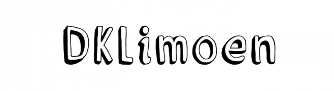
( Fonts by David Kerkhoff - www.hanodedphotography.com )
A playful, hand-drawn font with a bold, three-dimensional effect.
![DKLimoen Frei Schriftart Herunterladen]() Herunterladen 487 Downloads@WebFont
Herunterladen 487 Downloads@WebFont -
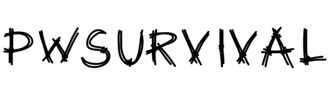
( Fonts by Peax Webdesign - www.peax-webdesign.com. Personal-use only. For commercial use please contact owner. )
A rugged, hand-drawn font with a bold, dynamic style and rough texture.
![PWSurvival Frei Schriftart Herunterladen]() Herunterladen 487 Downloads@WebFont
Herunterladen 487 Downloads@WebFont


Welche Schriften sind gerade am populärsten?
Poppins, Roboto, Montserrat, Open Sans und Lato sind wegen ihrer klaren Formen und breiten Einsetzbarkeit sehr gefragt – von Markenauftritt über Landingpages bis hin zu Postern.
Welche Fonts eignen sich für Logos?
Geometrische Sans‑Serifs (z. B. Poppins, Familien im Gotham‑Stil) sind ein häufiger Griff für sauberes, skalierbares Branding. Für eine persönlichere Note bleiben Scripts und Handschrift‑Stile beliebt. Kombinieren Sie einen prägnanten Headline‑Font mit einer neutralen Brotschrift für Wiedererkennung und Harmonie.
Wie oft wird die Top‑Liste aktualisiert?
Regelmäßig – basierend auf realen Downloads und Interaktionen. Schauen Sie öfter vorbei, um aufstrebende Favoriten früh zu entdecken.
💡 Tipp: Seite bookmarken – Trends wechseln schnell, und heutige Top‑Schriften inspirieren morgen vielleicht das Rebranding.