Willkommen bei den Top‑Schriften – hier treffen Beliebtheit und Qualität aufeinander. Das sind die in diesem Jahr am häufigsten heruntergeladenen und genutzten Fonts. Wenn Sie sichere Optionen für Logo, Web oder Social suchen, starten Sie hier.
Jeder Top‑Font überzeugt durch Balance, Lesbarkeit und Vielseitigkeit. Sie finden moderne Sans‑Serifs, elegante Scripts, Vintage‑Serifs und minimalistische Displays.
-
( Fonts by Samuel Park - Personal-use only. For commercial use please contact owner. )
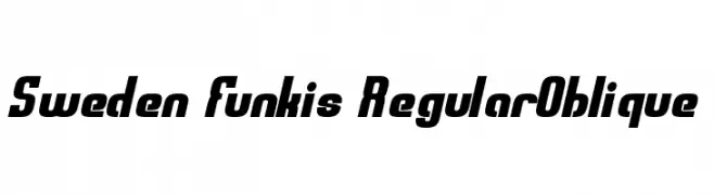
A bold, oblique font with a modern and dynamic style.
 Herunterladen 90 Downloads@WebFont
 -
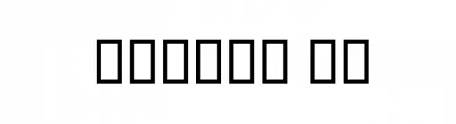
( گالری فانت فارسی پژوهش آريانا - only compatible with Farsi and Arabic )
A modern, geometric font with clean lines and a minimalistic design.
![Modern II Frei Schriftart Herunterladen]() Herunterladen 90 Downloads@WebFont
Herunterladen 90 Downloads@WebFont -
( Fonts by a Max Infeld - XEROGRAPHER FONTS - xerographer.blogspot.com . Personal-use only. For commercial use please contact owner. )
A dynamic handwritten font with fluid, interconnected strokes and a playful style.
![OvenBread Frei Schriftart Herunterladen]() Herunterladen 90 Downloads@WebFont
Herunterladen 90 Downloads@WebFont -
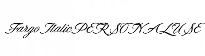
( Fonts by Mans Greback - Personal-use only. For commercial use please contact owner. )
A sophisticated script font with elegant, flowing cursive letters.
![FargoItalicPERSONALUSE Frei Schriftart Herunterladen]() Herunterladen 90 Downloads@WebFont
Herunterladen 90 Downloads@WebFont -
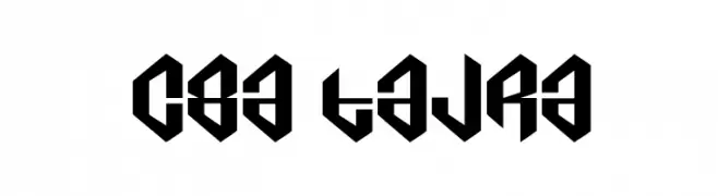
( Cre8or Artwork - Lukas Kohler )
A bold, geometric font with sharp angles and a futuristic style.
![c8a tajra Frei Schriftart Herunterladen]() Herunterladen 90 Downloads@WebFont
Herunterladen 90 Downloads@WebFont -
-
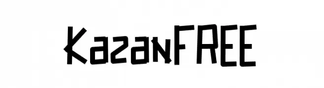
( Fonts by Vunira Design )
A bold, angular, hand-drawn font with a dynamic and energetic style.
![KazanFREE Frei Schriftart Herunterladen]() Herunterladen 90 Downloads@WebFont
Herunterladen 90 Downloads@WebFont -
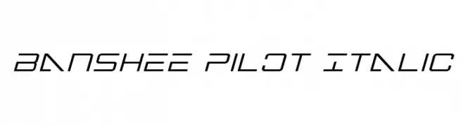
( Fonts by Iconian Fonts )
A sleek, futuristic italic font with sharp angles and a streamlined design.
![Banshee Pilot Italic Frei Schriftart Herunterladen]() Herunterladen 90 Downloads@WebFont
Herunterladen 90 Downloads@WebFont -
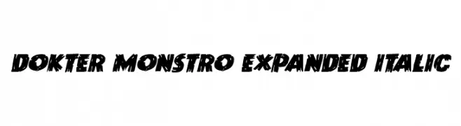
( Iconian Fonts - Daniel Zadorozny - www.iconian.com )
A bold, jagged, and dynamic font with an energetic and modern style.
![Dokter Monstro Expanded Italic Frei Schriftart Herunterladen]() Herunterladen 90 Downloads@WebFont
Herunterladen 90 Downloads@WebFont -
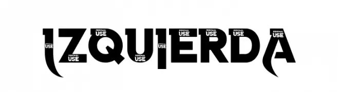
( LJ Design Studios - www.ljdesignstudios.com )
A bold, angular font with a modern and striking design.
![Izquierda Frei Schriftart Herunterladen]() Herunterladen 90 Downloads@WebFont
Herunterladen 90 Downloads@WebFont -
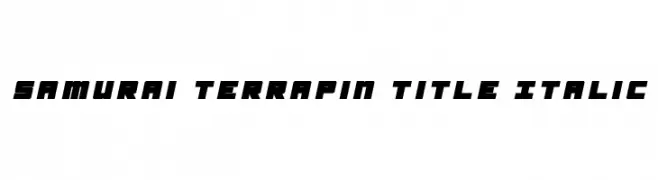
![Samurai Terrapin Title Italic Frei Schriftart Herunterladen]() Herunterladen 90 Downloads@WebFont
Herunterladen 90 Downloads@WebFont

Welche Schriften sind gerade am populärsten?
Poppins, Roboto, Montserrat, Open Sans und Lato sind wegen ihrer klaren Formen und breiten Einsetzbarkeit sehr gefragt – von Markenauftritt über Landingpages bis hin zu Postern.
Welche Fonts eignen sich für Logos?
Geometrische Sans‑Serifs (z. B. Poppins, Familien im Gotham‑Stil) sind ein häufiger Griff für sauberes, skalierbares Branding. Für eine persönlichere Note bleiben Scripts und Handschrift‑Stile beliebt. Kombinieren Sie einen prägnanten Headline‑Font mit einer neutralen Brotschrift für Wiedererkennung und Harmonie.
Wie oft wird die Top‑Liste aktualisiert?
Regelmäßig – basierend auf realen Downloads und Interaktionen. Schauen Sie öfter vorbei, um aufstrebende Favoriten früh zu entdecken.
💡 Tipp: Seite bookmarken – Trends wechseln schnell, und heutige Top‑Schriften inspirieren morgen vielleicht das Rebranding.