Willkommen bei den Top‑Schriften – hier treffen Beliebtheit und Qualität aufeinander. Das sind die in diesem Jahr am häufigsten heruntergeladenen und genutzten Fonts. Wenn Sie sichere Optionen für Logo, Web oder Social suchen, starten Sie hier.
Jeder Top‑Font überzeugt durch Balance, Lesbarkeit und Vielseitigkeit. Sie finden moderne Sans‑Serifs, elegante Scripts, Vintage‑Serifs und minimalistische Displays.
-
( Fonts by Ef Studio - Personal-use only. For commercial use please contact owner. )
An elegant script font with flowing, interconnected letters and ornate details.
 Herunterladen 89 Downloads@WebFont
 -
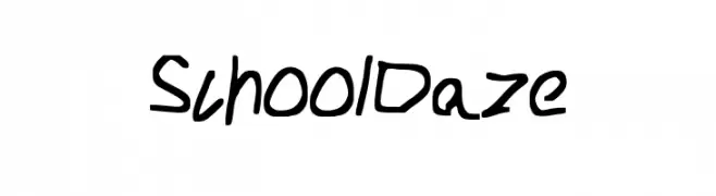
![School_Daze Frei Schriftart Herunterladen]() Herunterladen 89 Downloads@WebFont
Herunterladen 89 Downloads@WebFont -
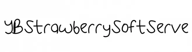
![YBStrawberrySoftServe Frei Schriftart Herunterladen]() Herunterladen 89 Downloads@WebFont
Herunterladen 89 Downloads@WebFont -
( Fonts by Billy Argel )
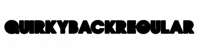
A bold, playful font with thick, rounded characters and a retro vibe.
![QUIRKY BACK Regular Frei Schriftart Herunterladen]() Herunterladen 89 Downloads@WebFont
Herunterladen 89 Downloads@WebFont -
( Fonts by wep - Wahyu Eka Prasetya - Personal-use only. For commercial use please contact owner. )
A bold, decorative font with a gothic flair and unique serifs.
![Aidilfitri Frei Schriftart Herunterladen]() Herunterladen 89 Downloads@WebFont
Herunterladen 89 Downloads@WebFont -
-
( Fonts by The Docallisme )
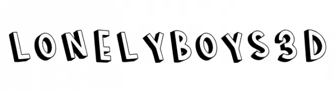
A bold, playful 3D font with thick, shadowed letters.
![LONELY BOYS 3D Frei Schriftart Herunterladen]() Herunterladen 89 Downloads@WebFont
Herunterladen 89 Downloads@WebFont -
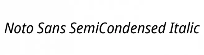
( Fonts by Google )
A modern, semi-condensed sans-serif italic font with a clean and professional look.
![Noto Sans SemiCondensed Italic Frei Schriftart Herunterladen]() Herunterladen 89 Downloads@WebFont
Herunterladen 89 Downloads@WebFont -
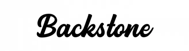
( Fonts by Ahwe Project - Dida Ahluddin - Personal-use only. For commercial use please contact owner. )
A bold, cursive font with fluid, elegant strokes.
![Backstone Frei Schriftart Herunterladen]() Herunterladen 89 Downloads@WebFont
Herunterladen 89 Downloads@WebFont -
( Fonts by Fontry )
A bold, shadowed font with strong serifs and a three-dimensional effect.
![FHA Sign DeVinne Shade25NC Frei Schriftart Herunterladen]() Herunterladen 89 Downloads@WebFont
Herunterladen 89 Downloads@WebFont -
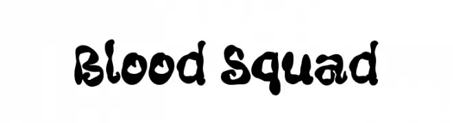
( Fonts by Masa Aska Sanurumi )
A bold, organic font with a dripping, hand-drawn style.
![Blood Squad Frei Schriftart Herunterladen]() Herunterladen 89 Downloads@WebFont
Herunterladen 89 Downloads@WebFont


Welche Schriften sind gerade am populärsten?
Poppins, Roboto, Montserrat, Open Sans und Lato sind wegen ihrer klaren Formen und breiten Einsetzbarkeit sehr gefragt – von Markenauftritt über Landingpages bis hin zu Postern.
Welche Fonts eignen sich für Logos?
Geometrische Sans‑Serifs (z. B. Poppins, Familien im Gotham‑Stil) sind ein häufiger Griff für sauberes, skalierbares Branding. Für eine persönlichere Note bleiben Scripts und Handschrift‑Stile beliebt. Kombinieren Sie einen prägnanten Headline‑Font mit einer neutralen Brotschrift für Wiedererkennung und Harmonie.
Wie oft wird die Top‑Liste aktualisiert?
Regelmäßig – basierend auf realen Downloads und Interaktionen. Schauen Sie öfter vorbei, um aufstrebende Favoriten früh zu entdecken.
💡 Tipp: Seite bookmarken – Trends wechseln schnell, und heutige Top‑Schriften inspirieren morgen vielleicht das Rebranding.