Willkommen bei den Top‑Schriften – hier treffen Beliebtheit und Qualität aufeinander. Das sind die in diesem Jahr am häufigsten heruntergeladenen und genutzten Fonts. Wenn Sie sichere Optionen für Logo, Web oder Social suchen, starten Sie hier.
Jeder Top‑Font überzeugt durch Balance, Lesbarkeit und Vielseitigkeit. Sie finden moderne Sans‑Serifs, elegante Scripts, Vintage‑Serifs und minimalistische Displays.
-
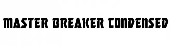
( Fonts by Iconian Fonts )
A bold, condensed font with sharp angles and a modern, assertive style.
 Herunterladen 89 Downloads@WebFont
 -
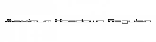
![Maximum Hoedown Regular Frei Schriftart Herunterladen]() Herunterladen 89 Downloads@WebFont
Herunterladen 89 Downloads@WebFont -
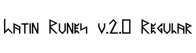
( Kiedra )
A bold, angular font inspired by ancient runic alphabets.
![Latin Runes v.2.0 Regular Frei Schriftart Herunterladen]() Herunterladen 89 Downloads@WebFont
Herunterladen 89 Downloads@WebFont -
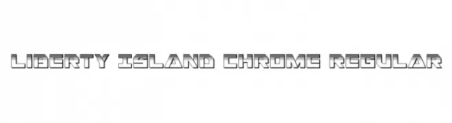
( Fonts by Daniel Zadorozny - www.iconian.com - Free for personal use )
A bold, geometric font with a three-dimensional, industrial look.
![Liberty Island Chrome Regular Frei Schriftart Herunterladen]() Herunterladen 89 Downloads@WebFont
Herunterladen 89 Downloads@WebFont -
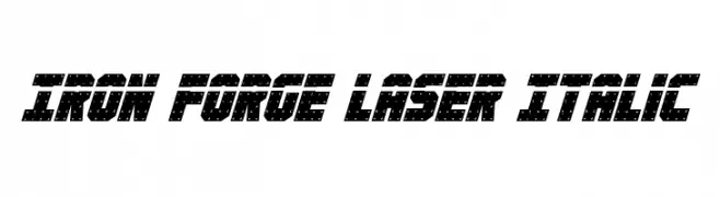
( Fonts by Daniel Zadorozny - www.iconian.com )
A bold, italicized font with a futuristic, laser-cut design.
![Iron Forge Laser Italic Frei Schriftart Herunterladen]() Herunterladen 89 Downloads@WebFont
Herunterladen 89 Downloads@WebFont -
-
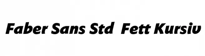
( Fonts by ingoFonts - Ingo Zimmermann - Personal-use only. For commercial use please contact owner. )
Bold, italic sans-serif font with a modern and dynamic style.
![Faber Sans Std 96 Fett Kursiv Frei Schriftart Herunterladen]() Herunterladen 89 Downloads@WebFont
Herunterladen 89 Downloads@WebFont -
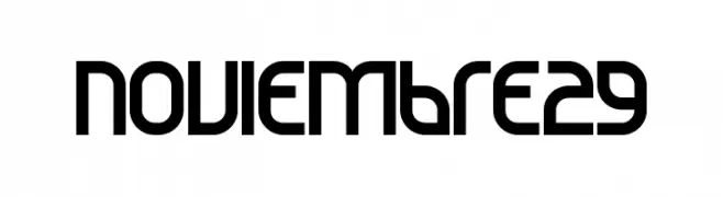
( Sergio Blanco )
A modern, geometric font with bold, clean lines and unique character shapes.
![Noviembre29 Frei Schriftart Herunterladen]() Herunterladen 89 Downloads@WebFont
Herunterladen 89 Downloads@WebFont -
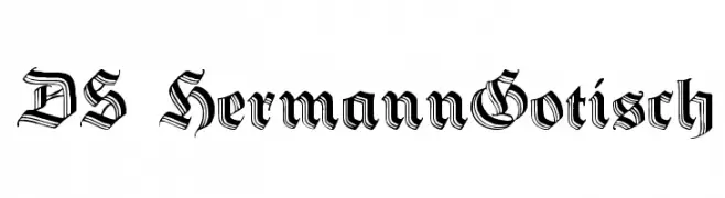
( Fonts by Typographer Mediengestaltung - Personal-use only. For commercial use please contact owner. )
A bold, gothic blackletter font with intricate, angular designs.
![DS HermannGotisch Frei Schriftart Herunterladen]() Herunterladen 89 Downloads@WebFont
Herunterladen 89 Downloads@WebFont -
![Spartaco Halftone Frei Schriftart Herunterladen]() Herunterladen 89 Downloads@WebFont
Herunterladen 89 Downloads@WebFont -
( Fonts by Harry Blakeman )
A geometric, angular font with a futuristic and modern aesthetic.
![Boxed Frei Schriftart Herunterladen]() Herunterladen 89 Downloads@WebFont
Herunterladen 89 Downloads@WebFont

Welche Schriften sind gerade am populärsten?
Poppins, Roboto, Montserrat, Open Sans und Lato sind wegen ihrer klaren Formen und breiten Einsetzbarkeit sehr gefragt – von Markenauftritt über Landingpages bis hin zu Postern.
Welche Fonts eignen sich für Logos?
Geometrische Sans‑Serifs (z. B. Poppins, Familien im Gotham‑Stil) sind ein häufiger Griff für sauberes, skalierbares Branding. Für eine persönlichere Note bleiben Scripts und Handschrift‑Stile beliebt. Kombinieren Sie einen prägnanten Headline‑Font mit einer neutralen Brotschrift für Wiedererkennung und Harmonie.
Wie oft wird die Top‑Liste aktualisiert?
Regelmäßig – basierend auf realen Downloads und Interaktionen. Schauen Sie öfter vorbei, um aufstrebende Favoriten früh zu entdecken.
💡 Tipp: Seite bookmarken – Trends wechseln schnell, und heutige Top‑Schriften inspirieren morgen vielleicht das Rebranding.