Willkommen bei den Top‑Schriften – hier treffen Beliebtheit und Qualität aufeinander. Das sind die in diesem Jahr am häufigsten heruntergeladenen und genutzten Fonts. Wenn Sie sichere Optionen für Logo, Web oder Social suchen, starten Sie hier.
Jeder Top‑Font überzeugt durch Balance, Lesbarkeit und Vielseitigkeit. Sie finden moderne Sans‑Serifs, elegante Scripts, Vintage‑Serifs und minimalistische Displays.
-
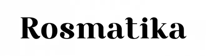
( Fonts by Ali Hamidi - Personal-use only. For commercial use please contact owner. )
A bold and elegant serif font with high contrast and classic styling.
 Herunterladen 480 Downloads@WebFont
 -
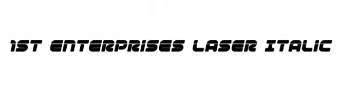
( Fonts by Iconian Fonts )
A bold, italic, futuristic font with rounded, geometric shapes.
![1st Enterprises Laser Italic Frei Schriftart Herunterladen]() Herunterladen 480 Downloads@WebFont
Herunterladen 480 Downloads@WebFont -
Schriftart von danny91194. For commercial use please contact the owner.
( mm )
A bold, playful font with exaggerated, cartoonish characters.
![Laff Riot Frei Schriftart Herunterladen]() Herunterladen 480 Downloads@WebFont
Herunterladen 480 Downloads@WebFont -
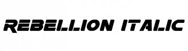
( Fonts by a Neale Davidson - www.pixelsagas.com. Personal-use only. For commercial use please contact owner. )
A bold, italic font with geometric shapes and high contrast, ideal for dynamic designs.
![Rebellion Italic Frei Schriftart Herunterladen]() Herunterladen 480 Downloads@WebFont
Herunterladen 480 Downloads@WebFont -
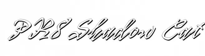
![PR8 Shadow Cat Frei Schriftart Herunterladen]() Herunterladen 480 Downloads@WebFont
Herunterladen 480 Downloads@WebFont -
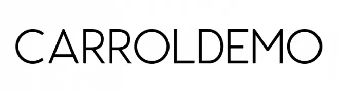
( Fonts by Saridezra - Personal-use only. For commercial use please contact owner. )
A modern, clean sans-serif font with uniform strokes and excellent readability.
![CarrolDEMO Frei Schriftart Herunterladen]() Herunterladen 480 Downloads@WebFont
Herunterladen 480 Downloads@WebFont -
( Fonts by Mr. Jamil-ur-Rehman - Personal-use only. For commercial use please contact owner. )
A modern, clean sans-serif font with consistent stroke width and balanced spacing.
![Hussaini Nastaleeq Frei Schriftart Herunterladen]() Herunterladen 480 Downloads@WebFont
Herunterladen 480 Downloads@WebFont -
( Fonts by www.aenigmafonts.com )
A bold, circular font with high contrast and playful style.
![Circulate [BRK] Frei Schriftart Herunterladen]() Herunterladen 480 Downloads@WebFont
Herunterladen 480 Downloads@WebFont -
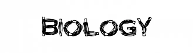
( Fonts by a Max Infeld - XEROGRAPHER FONTS - xerographer.blogspot.com . Personal-use only. For commercial use please contact owner. )
A bold, organic font with intricate, nature-inspired patterns.
![Biology Frei Schriftart Herunterladen]() Herunterladen 480 Downloads@WebFont
Herunterladen 480 Downloads@WebFont -
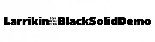
( Fonts by headfirst - Morice Kastoun - Personal-use only. For commercial use please contact owner. )
A bold, playful font with thick, rounded strokes and high contrast.
![Larrikin-BlackSolidDemo Frei Schriftart Herunterladen]() Herunterladen 480 Downloads@WebFont
Herunterladen 480 Downloads@WebFont -
( Fonts by Agathe M.Joyce - www.foundmyfont.com - Personal-use only. For commercial use please contact owner. )
A dynamic, brush-style font with fluid, hand-painted strokes.
![Refreshen and Softening Frei Schriftart Herunterladen]() Herunterladen 480 Downloads@WebFont
Herunterladen 480 Downloads@WebFont -
![Novello Pro Bold Frei Schriftart Herunterladen]() Herunterladen 480 Downloads@WebFont
Herunterladen 480 Downloads@WebFont -
![Shohl Regular Frei Schriftart Herunterladen]() Herunterladen 480 Downloads@WebFont
Herunterladen 480 Downloads@WebFont -
( Copyright (c) 2011, Eduardo Tunni (http://www.tipo.net.ar) )
A bold, slab serif font with strong, impactful characters.
![Unlock Regular Frei Schriftart Herunterladen]() Herunterladen 480 Downloads@WebFont
Herunterladen 480 Downloads@WebFont -
( Font by Jonathan Harris - www.tattoowoo.com )
A bold, spiky, ink-splattered decorative font with a raw, expressive style.
![Ink Studio Frei Schriftart Herunterladen]() Herunterladen 480 Downloads@WebFont
Herunterladen 480 Downloads@WebFont -
![DeadlyHeat Frei Schriftart Herunterladen]() Herunterladen 480 Downloads@WebFont
Herunterladen 480 Downloads@WebFont -
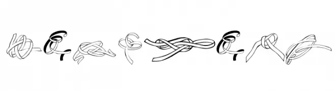
![Zoeknots Frei Schriftart Herunterladen]() Herunterladen 480 Downloads@WebFont
Herunterladen 480 Downloads@WebFont -
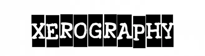
( Fonts by www.vicfieger.com )
A playful, hand-drawn font with thick, uneven strokes and a whimsical style.
![Xerography Frei Schriftart Herunterladen]() Herunterladen 480 Downloads@WebFont
Herunterladen 480 Downloads@WebFont -
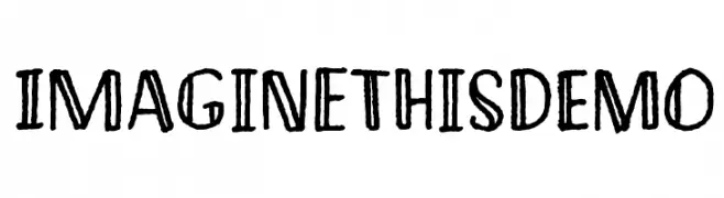
( Fonts by Pizzadude - Personal-use only. For commercial use please contact owner. )
A bold, hand-drawn font with a playful and artistic style.
![ImaginethisDEMO Frei Schriftart Herunterladen]() Herunterladen 480 Downloads@WebFont
Herunterladen 480 Downloads@WebFont -
( Fonts by Kong Font - https://fontkong.com/ - Personal-use only. For commercial use please contact owner. )
A bold, expressive script font with a playful, handwritten style.
![Moonday Frei Schriftart Herunterladen]() Herunterladen 480 Downloads@WebFont
Herunterladen 480 Downloads@WebFont -
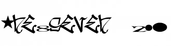
( Fonts by or from www.graffitifonts.net )
A bold, graffiti-inspired font with sharp, angular lines and an urban aesthetic.
![one8seven 2.0 Frei Schriftart Herunterladen]() Herunterladen 480 Downloads@WebFont
Herunterladen 480 Downloads@WebFont -
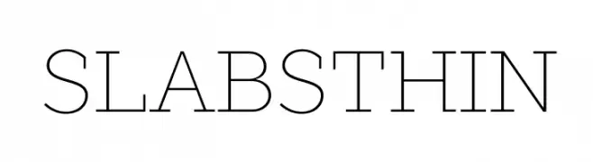
( Fonts by Jovanny Lemonad - typetype.ru - Personal-use only. For commercial use please contact owner. )
A modern, thin, and geometric font with clean lines and a sophisticated style.
![SLABSTHIN Frei Schriftart Herunterladen]() Herunterladen 480 Downloads@WebFont
Herunterladen 480 Downloads@WebFont -
( Pixel Sagas - Neale and Shayna Davidson - www.pixelsagas.com )
A bold, geometric font with a modern, industrial style.
![Norfolk Frei Schriftart Herunterladen]() Herunterladen 480 Downloads@WebFont
Herunterladen 480 Downloads@WebFont -
( Fonts by Accademia di Belle Arti di Urbino and others - Personal-use only. For commercial use please contact owner. )
A modern, semi-bold sans-serif font with clean lines and excellent readability.
![Storia Sans SemiBold Frei Schriftart Herunterladen]() Herunterladen 480 Downloads@WebFont
Herunterladen 480 Downloads@WebFont -
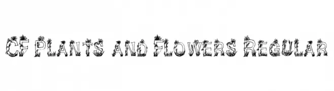
( Fonts by Steve Cloutier - www.cloutierfontes.ca )
A decorative font with letters entwined in plant and flower motifs.
![CF Plants and Flowers Regular Frei Schriftart Herunterladen]() Herunterladen 480 Downloads@WebFont
Herunterladen 480 Downloads@WebFont -
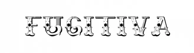
( Fonts by Type Sailor. Personal-use only. For commercial use please contact owner. )
An ornate and decorative font with vintage flair and intricate details.
![Fugitiva Frei Schriftart Herunterladen]() Herunterladen 480 Downloads@WebFont
Herunterladen 480 Downloads@WebFont -
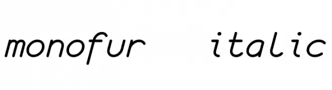
( Fonts by Tobias Benjamin Kohler - www.uncia.de )
A monospaced, italic font with a playful and informal style.
![monofur italic Frei Schriftart Herunterladen]() Herunterladen 480 Downloads@WebFont
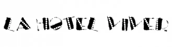
Herunterladen 480 Downloads@WebFont -
![la hotel viver Frei Schriftart Herunterladen]() Herunterladen 480 Downloads@WebFont
Herunterladen 480 Downloads@WebFont -
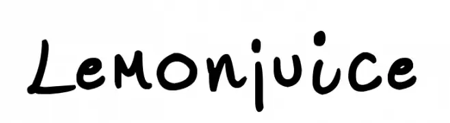
( Fonts by www.fontpanda.com. Personal-use only. For commercial use please contact owner. )
A bold, handwritten font with a playful and dynamic style.
![Lemonjuice Frei Schriftart Herunterladen]() Herunterladen 480 Downloads@WebFont
Herunterladen 480 Downloads@WebFont -
( Fonts by Jason Arthur - JibbaJabba Fonts - www.myspace.com/jasonarthurloaded )
A playful, cartoonish font with irregular, hand-drawn letterforms.
![Tooney Loons Frei Schriftart Herunterladen]() Herunterladen 480 Downloads@WebFont
Herunterladen 480 Downloads@WebFont -
( Fonts by Daniel Zadorozny - www.iconian.com - Personal-use only. For commercial use please contact owner. )
A futuristic, geometric font with clean lines and a modern aesthetic.
![Earth Orbiter Title Frei Schriftart Herunterladen]() Herunterladen 480 Downloads@WebFont
Herunterladen 480 Downloads@WebFont -
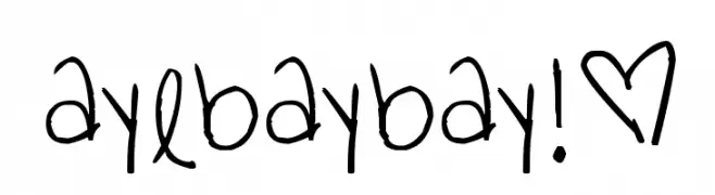
( Fonts by www.fontpanda.com. Personal-use only. For commercial use please contact owner. )
A playful, casual handwritten font with irregular strokes and an organic flow.
![ayebaybay!® Frei Schriftart Herunterladen]() Herunterladen 480 Downloads@WebFont
Herunterladen 480 Downloads@WebFont -
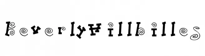
Schriftart von danny91194. For commercial use please contact the owner.
( a )
A whimsical, hand-drawn font with playful, irregular characters.
![BeverlyHillbilles Frei Schriftart Herunterladen]() Herunterladen 480 Downloads@WebFont
Herunterladen 480 Downloads@WebFont -
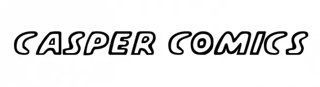
( Fonts by Daniel Zadorozny - www.iconian.com - Free for personal use )
A bold, comic-style font with rounded outlines and a playful appearance.
![Casper Comics Frei Schriftart Herunterladen]() Herunterladen 480 Downloads
Herunterladen 480 Downloads -
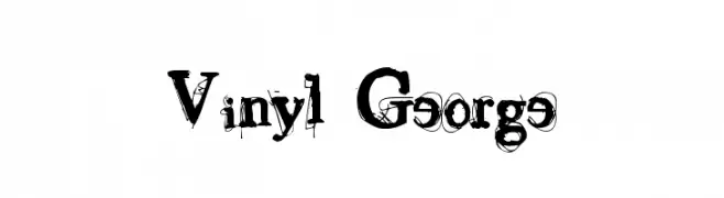
( Fonts by Gyom Seguin - last-soundtrack.daportfolio.com )
A bold, decorative font with a distressed, grunge-like appearance.
![Vinyl George Frei Schriftart Herunterladen]() Herunterladen 480 Downloads@WebFont
Herunterladen 480 Downloads@WebFont

![Circulate [BRK] Frei Schriftart Herunterladen](https://d144mzi0q5mijx.cloudfront.net/img/C/I/Circulate-BRK.webp)


Welche Schriften sind gerade am populärsten?
Poppins, Roboto, Montserrat, Open Sans und Lato sind wegen ihrer klaren Formen und breiten Einsetzbarkeit sehr gefragt – von Markenauftritt über Landingpages bis hin zu Postern.
Welche Fonts eignen sich für Logos?
Geometrische Sans‑Serifs (z. B. Poppins, Familien im Gotham‑Stil) sind ein häufiger Griff für sauberes, skalierbares Branding. Für eine persönlichere Note bleiben Scripts und Handschrift‑Stile beliebt. Kombinieren Sie einen prägnanten Headline‑Font mit einer neutralen Brotschrift für Wiedererkennung und Harmonie.
Wie oft wird die Top‑Liste aktualisiert?
Regelmäßig – basierend auf realen Downloads und Interaktionen. Schauen Sie öfter vorbei, um aufstrebende Favoriten früh zu entdecken.
💡 Tipp: Seite bookmarken – Trends wechseln schnell, und heutige Top‑Schriften inspirieren morgen vielleicht das Rebranding.