Willkommen bei den Top‑Schriften – hier treffen Beliebtheit und Qualität aufeinander. Das sind die in diesem Jahr am häufigsten heruntergeladenen und genutzten Fonts. Wenn Sie sichere Optionen für Logo, Web oder Social suchen, starten Sie hier.
Jeder Top‑Font überzeugt durch Balance, Lesbarkeit und Vielseitigkeit. Sie finden moderne Sans‑Serifs, elegante Scripts, Vintage‑Serifs und minimalistische Displays.
-
( Fonts by Matthew Dwayne - Personal-use only. For commercial use please contact owner. )
A dynamic, futuristic font with sharp angles and a forward-leaning slant.
 Herunterladen 86 Downloads@WebFont
 -
( Fonts by Chequered Ink )
A bold, geometric font with sharp angles and a modern aesthetic.
![Tempter Frei Schriftart Herunterladen]() Herunterladen 86 Downloads@WebFont
Herunterladen 86 Downloads@WebFont -
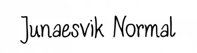
( Fonts by Yves Michel - Personal-use only. For commercial use please contact owner. )
A playful, casual handwritten font with smooth, organic strokes.
![Junaesvik Normal Frei Schriftart Herunterladen]() Herunterladen 86 Downloads@WebFont
Herunterladen 86 Downloads@WebFont -
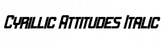
( Fonts by Vladimir Nikolic - www.creativefabrica.com/designer/vladimirnikolic/ - Personal-use only. For commercial use please contact owner. )
A bold, italic font with sharp, angular edges and a dynamic style.
![Cyrillic Attitudes Italic Frei Schriftart Herunterladen]() Herunterladen 86 Downloads@WebFont
Herunterladen 86 Downloads@WebFont -
( Fonts by Subectype & Orenari - Rangga Subekti & Ari - Personal-use only. For commercial use please contact owner. )
A playful and bold font with unique character shapes and a modern twist.
![Omiwa Frei Schriftart Herunterladen]() Herunterladen 86 Downloads@WebFont
Herunterladen 86 Downloads@WebFont -
-
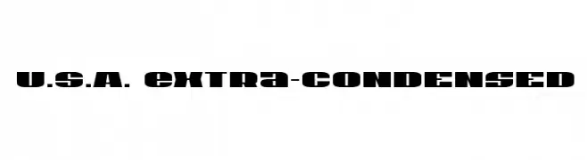
( Iconian Fonts - Daniel Zadorozny - www.iconian.com )
A bold, extra-condensed font with a strong, geometric style.
![U.S.A. Extra-Condensed Frei Schriftart Herunterladen]() Herunterladen 86 Downloads@WebFont
Herunterladen 86 Downloads@WebFont -
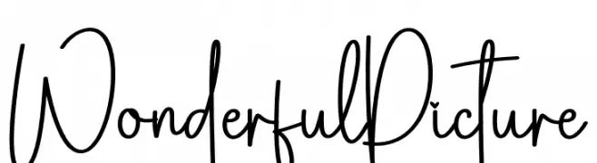
( Fonts by Scratchones )
Playful handwritten font with tall, narrow letters.
![Wonderful Picture Frei Schriftart Herunterladen]() Herunterladen 86 Downloads@WebFont
Herunterladen 86 Downloads@WebFont -
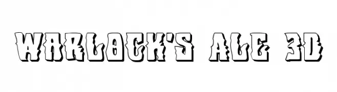
( Fonts by Daniel Zadorozny - www.iconian.com - Free for personal use )
A bold, 3D effect font with sharp angles and a dramatic presence.
![Warlock's Ale 3D Frei Schriftart Herunterladen]() Herunterladen 86 Downloads@WebFont
Herunterladen 86 Downloads@WebFont -
![Kasih Dan Sayang Frei Schriftart Herunterladen]() Herunterladen 86 Downloads@WebFont
Herunterladen 86 Downloads@WebFont -
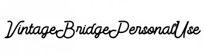
( Fonts by Din Studio - Donis Miftahudin - Personal-use only. For commercial use please contact owner. )
A vintage cursive font with elegant loops and a handwritten feel.
![Vintage Bridge Personal Use Frei Schriftart Herunterladen]() Herunterladen 86 Downloads@WebFont
Herunterladen 86 Downloads@WebFont


Welche Schriften sind gerade am populärsten?
Poppins, Roboto, Montserrat, Open Sans und Lato sind wegen ihrer klaren Formen und breiten Einsetzbarkeit sehr gefragt – von Markenauftritt über Landingpages bis hin zu Postern.
Welche Fonts eignen sich für Logos?
Geometrische Sans‑Serifs (z. B. Poppins, Familien im Gotham‑Stil) sind ein häufiger Griff für sauberes, skalierbares Branding. Für eine persönlichere Note bleiben Scripts und Handschrift‑Stile beliebt. Kombinieren Sie einen prägnanten Headline‑Font mit einer neutralen Brotschrift für Wiedererkennung und Harmonie.
Wie oft wird die Top‑Liste aktualisiert?
Regelmäßig – basierend auf realen Downloads und Interaktionen. Schauen Sie öfter vorbei, um aufstrebende Favoriten früh zu entdecken.
💡 Tipp: Seite bookmarken – Trends wechseln schnell, und heutige Top‑Schriften inspirieren morgen vielleicht das Rebranding.