Willkommen bei den Top‑Schriften – hier treffen Beliebtheit und Qualität aufeinander. Das sind die in diesem Jahr am häufigsten heruntergeladenen und genutzten Fonts. Wenn Sie sichere Optionen für Logo, Web oder Social suchen, starten Sie hier.
Jeder Top‑Font überzeugt durch Balance, Lesbarkeit und Vielseitigkeit. Sie finden moderne Sans‑Serifs, elegante Scripts, Vintage‑Serifs und minimalistische Displays.
-
 Herunterladen 476 Downloads@WebFont
 -
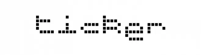
![ticker Frei Schriftart Herunterladen]() Herunterladen 476 Downloads@WebFont
Herunterladen 476 Downloads@WebFont -
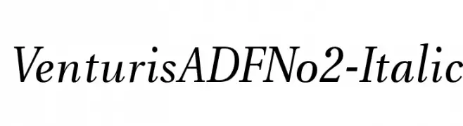
( Fonts by Arkandis Digital Foundry )
A classic serif font with an elegant italic slant, offering sophistication and readability.
![VenturisADFNo2-Italic Frei Schriftart Herunterladen]() Herunterladen 476 Downloads@WebFont
Herunterladen 476 Downloads@WebFont -
![ThinMinty Frei Schriftart Herunterladen]() Herunterladen 476 Downloads@WebFont
Herunterladen 476 Downloads@WebFont -
( Måns Grebäck - www.mansgreback.com )
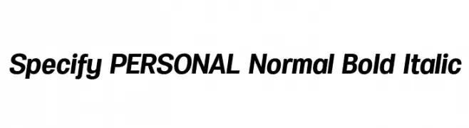
A bold, italicized font with a modern and dynamic style.
![Specify PERSONAL Normal Bold Italic Frei Schriftart Herunterladen]() Herunterladen 476 Downloads@WebFont
Herunterladen 476 Downloads@WebFont -
( Fonts by Manuel Ramos - www.infinitismo.com - Personal-use only. For commercial use please contact owner. )
A geometric, minimalist font with thin, angular strokes and a futuristic look.
![REGARD Frei Schriftart Herunterladen]() Herunterladen 476 Downloads@WebFont
Herunterladen 476 Downloads@WebFont -
( Fonts by Wahyu Eka Prasetya - wepfont.com - Personal-use only. For commercial use please contact owner. )
A bold, hand-drawn font with a playful and energetic style.
![Goal Frei Schriftart Herunterladen]() Herunterladen 476 Downloads@WebFont
Herunterladen 476 Downloads@WebFont -
( Fonts by GreyWolf Webworks - www.greywolfwebworks.com - Personal-use only. For commercial use please contact owner. )
A bold, hypnotic font with concentric circular patterns creating a dynamic and decorative style.
![Hypmotizin Frei Schriftart Herunterladen]() Herunterladen 475 Downloads@WebFont
Herunterladen 475 Downloads@WebFont -
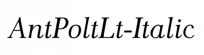
![AntPoltLt-Italic Frei Schriftart Herunterladen]() Herunterladen 475 Downloads@WebFont
Herunterladen 475 Downloads@WebFont -
![Vassallo Regular Frei Schriftart Herunterladen]() Herunterladen 475 Downloads@WebFont
Herunterladen 475 Downloads@WebFont -
( Free for personal use - austiebost.net )
A whimsical, floral-themed decorative font with hollow letters.
![Austie Bost You Wear Flowers Hollow Frei Schriftart Herunterladen]() Herunterladen 475 Downloads@WebFont
Herunterladen 475 Downloads@WebFont -
( Fonts by Situjuh Nazara - 7ntypes.com - Personal-use only. For commercial use please contact owner. )
A playful, rounded font with smooth curves and a friendly appearance.
![Anticed Frei Schriftart Herunterladen]() Herunterladen 475 Downloads@WebFont
Herunterladen 475 Downloads@WebFont -
( Fonts by Castcraft Software - OPTI Fonts Archive - opti.netii.net - Personal-use only. For commercial use please contact owner. )
An elegant script font with graceful loops and swashes, perfect for decorative use.
![OPTIStoyer-Script Frei Schriftart Herunterladen]() Herunterladen 475 Downloads@WebFont
Herunterladen 475 Downloads@WebFont -
( Fonts by Daniel Zadorozny - www.iconian.com - Free for personal use )
A futuristic, geometric font with bold, expanded characters and unique cutouts.
![Planet S Expanded Frei Schriftart Herunterladen]() Herunterladen 475 Downloads@WebFont
Herunterladen 475 Downloads@WebFont -
![area OUTLINEe Frei Schriftart Herunterladen]() Herunterladen 475 Downloads@WebFont
Herunterladen 475 Downloads@WebFont -
( Fonts by Nick Curtis - www.nicksfonts.com )
A bold, dynamic font with sharp angles and smooth curves.
![Laconick-NormalA Frei Schriftart Herunterladen]() Herunterladen 475 Downloads
Herunterladen 475 Downloads -
( Fonts by Hendra Pratama - HPTypework - https://hptypework.com - Personal-use only. For commercial use please contact owner. )
A cursive, handwritten font with elegant, flowing strokes.
![RighthandSignature Frei Schriftart Herunterladen]() Herunterladen 475 Downloads@WebFont
Herunterladen 475 Downloads@WebFont -
( Fonts by Alex Slobzheninov - Personal-use only. For commercial use please contact owner. )
A bold, modern sans-serif font with clean lines and a strong presence.
![Subjectivity-Bold Frei Schriftart Herunterladen]() Herunterladen 475 Downloads@WebFont
Herunterladen 475 Downloads@WebFont -
( Fonts by Aditya Rezki Apriyadi )
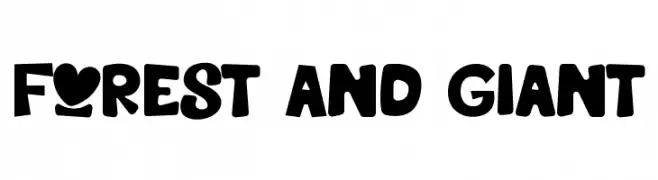
A bold, playful font with rounded, whimsical characters.
![Forest And Giant Frei Schriftart Herunterladen]() Herunterladen 475 Downloads@WebFont
Herunterladen 475 Downloads@WebFont -
( Fonts by MadeType - Personal-use only. For commercial use please contact owner. )
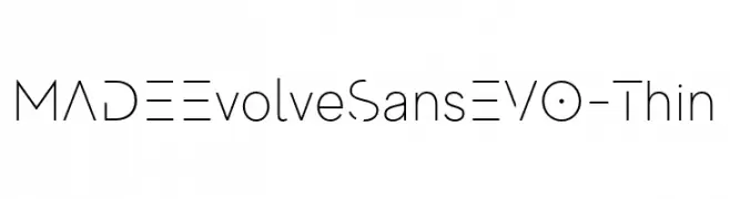
A sleek, modern font with geometric lines and a minimalist aesthetic.
![MADEEvolveSansEVO-Thin Frei Schriftart Herunterladen]() Herunterladen 475 Downloads@WebFont
Herunterladen 475 Downloads@WebFont -
![FrailBold Frei Schriftart Herunterladen]() Herunterladen 475 Downloads@WebFont
Herunterladen 475 Downloads@WebFont -
![Fonty_McFonterson Frei Schriftart Herunterladen]() Herunterladen 475 Downloads@WebFont
Herunterladen 475 Downloads@WebFont -
( Fonts by David Kerkhoff - www.hanodedphotography.com )
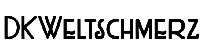
A playful and whimsical font with unique decorative elements.
![DKWeltschmerz Frei Schriftart Herunterladen]() Herunterladen 475 Downloads@WebFont
Herunterladen 475 Downloads@WebFont -
( Fonts by Khurasan )
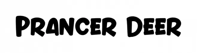
A playful, bold font with rounded, thick strokes and a whimsical style.
![Prancer Deer Frei Schriftart Herunterladen]() Herunterladen 475 Downloads@WebFont
Herunterladen 475 Downloads@WebFont -
![Citaro Voor [Enkele hoogte, Breed] Regular Frei Schriftart Herunterladen]() Herunterladen 475 Downloads@WebFont
Herunterladen 475 Downloads@WebFont -
( Fonts by BLKBK - https://blkbk.ink - Personal-use only. For commercial use please contact owner. Sponsoren Schriftart )
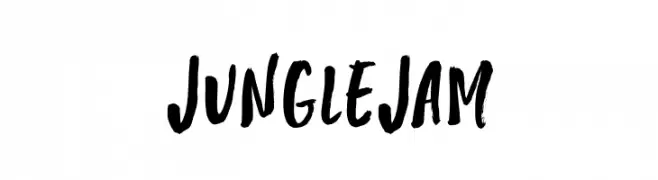
A bold, brush-style font with a hand-painted, energetic appearance.
![Jungle Jam Frei Schriftart Herunterladen]() Herunterladen 475 Downloads
Herunterladen 475 Downloads -
( Fonts by Daniel Zadorozny - www.iconian.com )
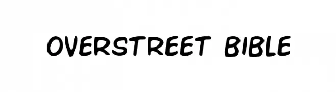
A playful, bold, and handwritten-style font with rounded edges.
![Overstreet Bible Frei Schriftart Herunterladen]() Herunterladen 475 Downloads@WebFont
Herunterladen 475 Downloads@WebFont -
( Fonts by www.aenigmafonts.com )
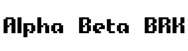
A bold, pixelated font with a retro digital aesthetic.
![Alpha Beta BRK Frei Schriftart Herunterladen]() Herunterladen 475 Downloads@WebFont
Herunterladen 475 Downloads@WebFont -
![TF2 Professor Frei Schriftart Herunterladen]() Herunterladen 475 Downloads@WebFont
Herunterladen 475 Downloads@WebFont -
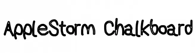
![AppleStorm Chalkboard Frei Schriftart Herunterladen]() Herunterladen 475 Downloads@WebFont
Herunterladen 475 Downloads@WebFont -
( Fonts by Jacob Fisher - www.pizzadude.dk )
A bold, geometric font with a modern, industrial feel.
![Motorcycle Emptiness Frei Schriftart Herunterladen]() Herunterladen 475 Downloads@WebFont
Herunterladen 475 Downloads@WebFont -
( Fonts by www.fenotype.com )
A bold, geometric font with a futuristic and modern design.
![Mama Frei Schriftart Herunterladen]() Herunterladen 475 Downloads@WebFont
Herunterladen 475 Downloads@WebFont -
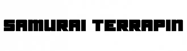
![Samurai Terrapin Frei Schriftart Herunterladen]() Herunterladen 475 Downloads@WebFont
Herunterladen 475 Downloads@WebFont -
( Fonts by Graham Meade - GemFonts )
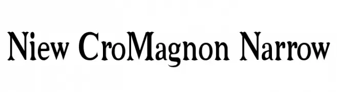
A bold, narrow serif font with a classic and authoritative style.
![Niew CroMagnon Narrow Frei Schriftart Herunterladen]() Herunterladen 475 Downloads@WebFont
Herunterladen 475 Downloads@WebFont -
( Fonts by Goma Shin - Shintarou Nakayama www.geocities.jp/gomarice_font/ )
A bold, playful font with rounded edges and a bubbly appearance.
![Milk Chocolate__G Frei Schriftart Herunterladen]() Herunterladen 475 Downloads@WebFont
Herunterladen 475 Downloads@WebFont


![Citaro Voor [Enkele hoogte, Breed] Regular Frei Schriftart Herunterladen](https://d144mzi0q5mijx.cloudfront.net/img/C/I/Citaro-Voor-Enkele-hoogte-Breed-Regular.webp)


Welche Schriften sind gerade am populärsten?
Poppins, Roboto, Montserrat, Open Sans und Lato sind wegen ihrer klaren Formen und breiten Einsetzbarkeit sehr gefragt – von Markenauftritt über Landingpages bis hin zu Postern.
Welche Fonts eignen sich für Logos?
Geometrische Sans‑Serifs (z. B. Poppins, Familien im Gotham‑Stil) sind ein häufiger Griff für sauberes, skalierbares Branding. Für eine persönlichere Note bleiben Scripts und Handschrift‑Stile beliebt. Kombinieren Sie einen prägnanten Headline‑Font mit einer neutralen Brotschrift für Wiedererkennung und Harmonie.
Wie oft wird die Top‑Liste aktualisiert?
Regelmäßig – basierend auf realen Downloads und Interaktionen. Schauen Sie öfter vorbei, um aufstrebende Favoriten früh zu entdecken.
💡 Tipp: Seite bookmarken – Trends wechseln schnell, und heutige Top‑Schriften inspirieren morgen vielleicht das Rebranding.