Willkommen bei den Top‑Schriften – hier treffen Beliebtheit und Qualität aufeinander. Das sind die in diesem Jahr am häufigsten heruntergeladenen und genutzten Fonts. Wenn Sie sichere Optionen für Logo, Web oder Social suchen, starten Sie hier.
Jeder Top‑Font überzeugt durch Balance, Lesbarkeit und Vielseitigkeit. Sie finden moderne Sans‑Serifs, elegante Scripts, Vintage‑Serifs und minimalistische Displays.
-
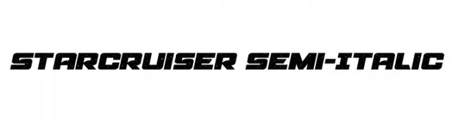
( Fonts by Daniel Zadorozny - www.iconian.com - Personal-use only. For commercial use please contact owner. )
A bold, semi-italic font with a starry, futuristic design.
 Herunterladen 87 Downloads@WebFont
 -
( Fonts by Manfred Klein. Free for private and charity use. Free for commercial with donation to organizations )
Cartoonish superhero-themed decorative font with illustrated character glyphs.
![Protectors Frei Schriftart Herunterladen]() Herunterladen 87 Downloads@WebFont
Herunterladen 87 Downloads@WebFont -
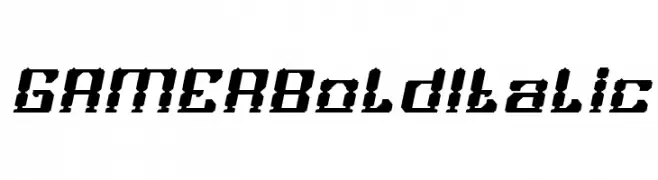
( weknow - Wino S Kadir - www.creativefabrica.com/designer/weknow/ )
A bold, italicized font with a pixelated, digital style ideal for modern designs.
![GAMER Bold Italic Frei Schriftart Herunterladen]() Herunterladen 87 Downloads@WebFont
Herunterladen 87 Downloads@WebFont -
( گالری فانت فارسی پژوهش آريانا - only compatible with Farsi and Arabic )
A bold, dripping font with a graffiti-inspired style.
![Sinaa Drip Frei Schriftart Herunterladen]() Herunterladen 87 Downloads@WebFont
Herunterladen 87 Downloads@WebFont -
( Fonts by Kong Font - https://fontkong.com/ - Personal-use only. For commercial use please contact owner. )
A bold and expressive script font with dynamic, flowing letterforms.
![Beastic Frei Schriftart Herunterladen]() Herunterladen 87 Downloads@WebFont
Herunterladen 87 Downloads@WebFont -
-
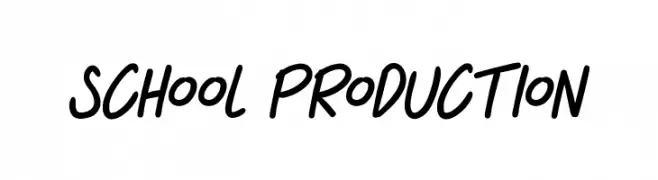
( Fonts by Octotype - www.foundmyfont.com - Personal-use only. For commercial use please contact owner. )
A bold, handwritten font with fluid strokes and a casual, energetic style.
![SCHOOL PRODUCTION Frei Schriftart Herunterladen]() Herunterladen 87 Downloads@WebFont
Herunterladen 87 Downloads@WebFont -
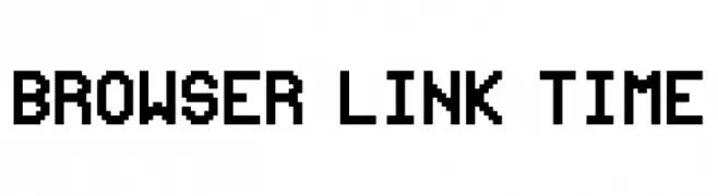
( Fonts by Xavier Haag - Personal-use only. For commercial use please contact owner. )
A bold, pixelated font with a retro, digital aesthetic.
![Browser link time Frei Schriftart Herunterladen]() Herunterladen 87 Downloads@WebFont
Herunterladen 87 Downloads@WebFont -
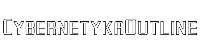
( ATRAX - antraxja-fonts.iweb.pl/en/ )
A futuristic, geometric outline font with a digital, cybernetic style.
![Cybernetyka Outline Frei Schriftart Herunterladen]() Herunterladen 87 Downloads@WebFont
Herunterladen 87 Downloads@WebFont -
( Fonts by Darcy Baldwin - darcybaldwin.com. Free for personal use only )
A playful, handwritten font with a whimsical and friendly style.
![DJB Pookie Doo Frei Schriftart Herunterladen]() Herunterladen 87 Downloads@WebFont
Herunterladen 87 Downloads@WebFont -
( Fonts by Iconian Fonts )
A bold, condensed, and italicized font with a dynamic and angular style.
![Master Breaker Condensed Italic Frei Schriftart Herunterladen]() Herunterladen 87 Downloads@WebFont
Herunterladen 87 Downloads@WebFont


Welche Schriften sind gerade am populärsten?
Poppins, Roboto, Montserrat, Open Sans und Lato sind wegen ihrer klaren Formen und breiten Einsetzbarkeit sehr gefragt – von Markenauftritt über Landingpages bis hin zu Postern.
Welche Fonts eignen sich für Logos?
Geometrische Sans‑Serifs (z. B. Poppins, Familien im Gotham‑Stil) sind ein häufiger Griff für sauberes, skalierbares Branding. Für eine persönlichere Note bleiben Scripts und Handschrift‑Stile beliebt. Kombinieren Sie einen prägnanten Headline‑Font mit einer neutralen Brotschrift für Wiedererkennung und Harmonie.
Wie oft wird die Top‑Liste aktualisiert?
Regelmäßig – basierend auf realen Downloads und Interaktionen. Schauen Sie öfter vorbei, um aufstrebende Favoriten früh zu entdecken.
💡 Tipp: Seite bookmarken – Trends wechseln schnell, und heutige Top‑Schriften inspirieren morgen vielleicht das Rebranding.