Willkommen bei den Top‑Schriften – hier treffen Beliebtheit und Qualität aufeinander. Das sind die in diesem Jahr am häufigsten heruntergeladenen und genutzten Fonts. Wenn Sie sichere Optionen für Logo, Web oder Social suchen, starten Sie hier.
Jeder Top‑Font überzeugt durch Balance, Lesbarkeit und Vielseitigkeit. Sie finden moderne Sans‑Serifs, elegante Scripts, Vintage‑Serifs und minimalistische Displays.
-
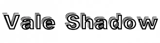
( Fonts by Graham Meade - GemFonts )
A bold, shadowed font with a three-dimensional effect, ideal for impactful designs.
 Herunterladen 472 Downloads@WebFont
 -
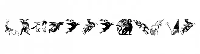
( Fonts by Manfred Klein - manfred-klein.ina-mar.com )
Ornate pictogram font with mythological and fantasy motifs.
![Mythological Frei Schriftart Herunterladen]() Herunterladen 472 Downloads@WebFont
Herunterladen 472 Downloads@WebFont -
Schriftart von NicholasJudy456. For commercial use please contact the owner.
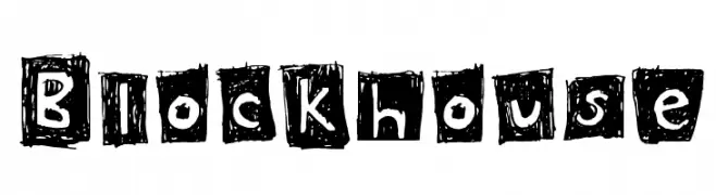
( Here's More of the House Fonts )
A bold, hand-drawn font with a textured, block-like appearance.
![Blockhouse Frei Schriftart Herunterladen]() Herunterladen 472 Downloads@WebFont
Herunterladen 472 Downloads@WebFont -
( ingoFonts - Ingo Zimmermann - www.ingofonts.com )
A bold, modern sans-serif font with clean lines and strong legibility.
![August Sans Reduced 75 Bold Frei Schriftart Herunterladen]() Herunterladen 472 Downloads@WebFont
Herunterladen 472 Downloads@WebFont -
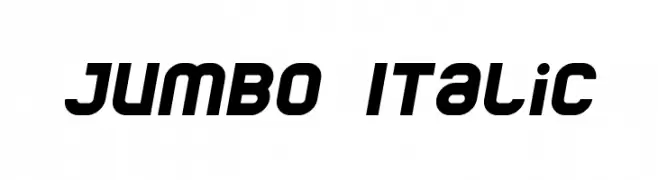
( Fonts by dustBUST - Andreas Nylin )
A bold, italicized font with a modern and dynamic style.
![Jumbo Italic Frei Schriftart Herunterladen]() Herunterladen 472 Downloads@WebFont
Herunterladen 472 Downloads@WebFont -
( Fonts by Press Gang Studios - Andeh Pinkard - www.pressgang-studios.com )
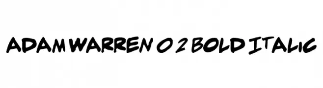
A bold, italic font with a dynamic, handwritten style.
![adam warren 0.2 Bold Italic Frei Schriftart Herunterladen]() Herunterladen 472 Downloads@WebFont
Herunterladen 472 Downloads@WebFont -
( Fonts by Manfred Klein. Free for private and charity use. Free for commercial with donation to organizations )
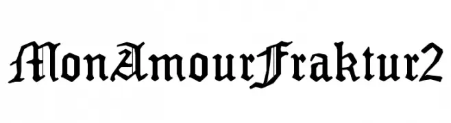
A bold, ornate blackletter font with a medieval aesthetic.
![MonAmourFraktur2 Frei Schriftart Herunterladen]() Herunterladen 472 Downloads@WebFont
Herunterladen 472 Downloads@WebFont -
( Fonts by Cadson Demak - Personal-use only. For commercial use please contact owner. )
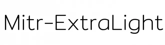
A modern, geometric sans-serif font with clean lines and balanced spacing.
![Mitr-ExtraLight Frei Schriftart Herunterladen]() Herunterladen 472 Downloads@WebFont
Herunterladen 472 Downloads@WebFont -
( Jonhson Subianto )
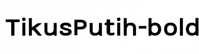
A bold, modern sans-serif font with clean lines and uniform strokes.
![TikusPutih-bold Frei Schriftart Herunterladen]() Herunterladen 472 Downloads@WebFont
Herunterladen 472 Downloads@WebFont -
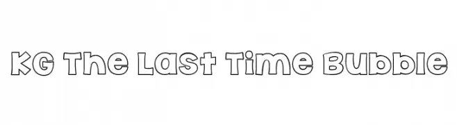
( Fonts by www.kimberlygeswein.com - Kimberly Geswein )
A playful, bold font with bubble-like, rounded outlines.
![KG The Last Time Bubble Frei Schriftart Herunterladen]() Herunterladen 472 Downloads@WebFont
Herunterladen 472 Downloads@WebFont -
( Fonts by scratchones )
A bold, playful script font with a handwritten style.
![Roomboy Frei Schriftart Herunterladen]() Herunterladen 472 Downloads@WebFont
Herunterladen 472 Downloads@WebFont -
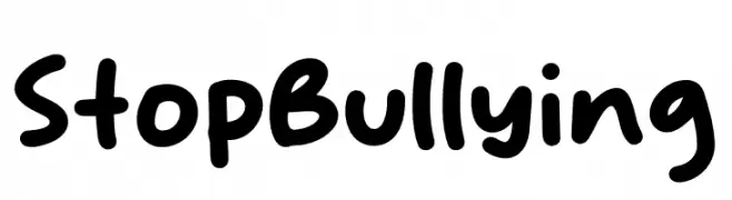
( Fonts by Khurasan )
A playful, bold font with rounded, hand-drawn characters.
![Stop Bullying Frei Schriftart Herunterladen]() Herunterladen 472 Downloads@WebFont
Herunterladen 472 Downloads@WebFont -
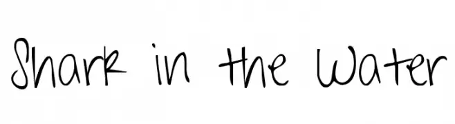
( Fonts by Kimberly Geswein - kimberlygeswein.com )
A playful, casual handwritten font with flowing, organic letterforms.
![Shark in the Water Frei Schriftart Herunterladen]() Herunterladen 472 Downloads@WebFont
Herunterladen 472 Downloads@WebFont -
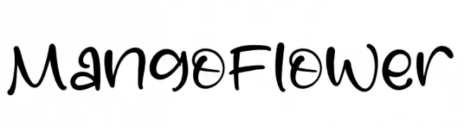
( Fonts by Perspectype Studio - Letterena.com - Personal-use only. For commercial use please contact owner. )
A playful, handwritten font with a casual and friendly style.
![Mango Flower Frei Schriftart Herunterladen]() Herunterladen 472 Downloads@WebFont
Herunterladen 472 Downloads@WebFont -
( Fonts by Zdenek Gromnica - www.futuremillennium.com )
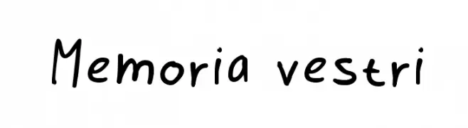
A playful, handwritten font with a casual and friendly style.
![Memoria vestri Frei Schriftart Herunterladen]() Herunterladen 472 Downloads@WebFont
Herunterladen 472 Downloads@WebFont -
( Fonts by Zetafonts - Personal-use only. For commercial use please contact owner. )
A bold, compressed, and italicized font with a modern and dynamic style.
![Cocogoose Compressed Trial Italic Frei Schriftart Herunterladen]() Herunterladen 472 Downloads@WebFont
Herunterladen 472 Downloads@WebFont -
( Fonts by Galdino Otten - galdinootten.com )
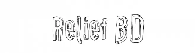
A playful, hand-drawn 3D font with bold, outlined characters.
![Relief BD Frei Schriftart Herunterladen]() Herunterladen 472 Downloads@WebFont
Herunterladen 472 Downloads@WebFont -
( Fonts by The Scriptorium - Dave Nalle )
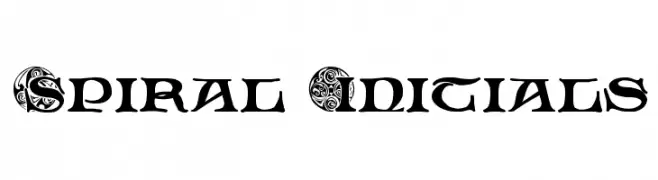
An ornate and decorative font with intricate spirals and flourishes.
![Spiral Initials Frei Schriftart Herunterladen]() Herunterladen 472 Downloads@WebFont
Herunterladen 472 Downloads@WebFont -
( be.net/vikaskumar )
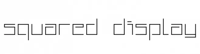
A geometric, squared font with a modern and minimalist design.
![Squared Display Frei Schriftart Herunterladen]() Herunterladen 472 Downloads@WebFont
Herunterladen 472 Downloads@WebFont -
( Fonts by U.S. Web Design System )
A modern, extra light sans-serif font with an elegant italic style.
![Public Sans ExtraLight Italic Frei Schriftart Herunterladen]() Herunterladen 472 Downloads@WebFont
Herunterladen 472 Downloads@WebFont -
![Pixel Josh 6 Frei Schriftart Herunterladen]() Herunterladen 472 Downloads@WebFont
Herunterladen 472 Downloads@WebFont -
( Fonts by Yadhie Setiawan - typelinestudio.com - Personal-use only. For commercial use please contact owner. )
An elegant script font with flowing, ornate characters and graceful flourishes.
![Ballegra Frei Schriftart Herunterladen]() Herunterladen 472 Downloads@WebFont
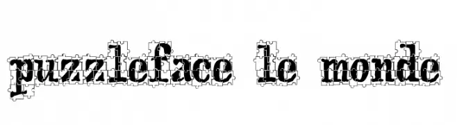
Herunterladen 472 Downloads@WebFont -
![puzzleface le monde Frei Schriftart Herunterladen]() Herunterladen 472 Downloads@WebFont
Herunterladen 472 Downloads@WebFont -
( Fonts by Cpr.Sparhelt )
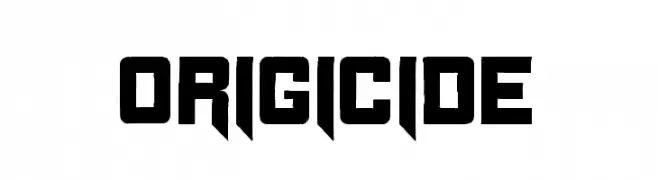
A bold, angular font with geometric forms and a modern aesthetic.
![Origicide Frei Schriftart Herunterladen]() Herunterladen 472 Downloads@WebFont
Herunterladen 472 Downloads@WebFont -
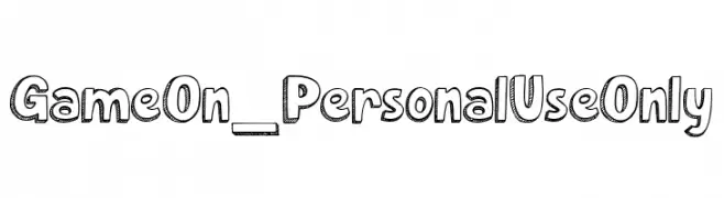
( Fonts by dcoxy )
A playful, hand-drawn font with bold outlines and sketch-like texture.
![Game On_PersonalUseOnly Frei Schriftart Herunterladen]() Herunterladen 472 Downloads@WebFont
Herunterladen 472 Downloads@WebFont -
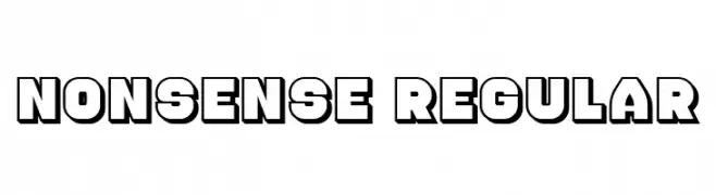
( Fonts by Vladimir Nikolic - https://www.creativefabrica.com/product/educated-deers/ref/144265/ - Personal-use only. For commercial use please contact owner. )
A bold, three-dimensional font with a strong, impactful presence.
![Nonsense Regular Frei Schriftart Herunterladen]() Herunterladen 472 Downloads@WebFont
Herunterladen 472 Downloads@WebFont -
![Aine Frei Schriftart Herunterladen]() Herunterladen 472 Downloads@WebFont
Herunterladen 472 Downloads@WebFont -
( Fonts by billyargel.blogspot.com - Billy Argel )
A hand-drawn, textured font with a rustic and artistic style.
![PEIXEFRITO Frei Schriftart Herunterladen]() Herunterladen 472 Downloads@WebFont
Herunterladen 472 Downloads@WebFont -
( Fonts by Daniel Zadorozny - www.iconian.com )
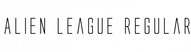
A futuristic, sleek font with tall, narrow letterforms and a modern aesthetic.
![Alien League Regular Frei Schriftart Herunterladen]() Herunterladen 472 Downloads@WebFont
Herunterladen 472 Downloads@WebFont -
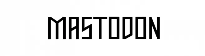
( Fonts by Apostrophic Lab )
A bold, geometric font with sharp angles and a modern aesthetic.
![Mastodon Frei Schriftart Herunterladen]() Herunterladen 472 Downloads@WebFont
Herunterladen 472 Downloads@WebFont -
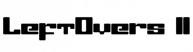
( Fonts by www.fenotype.com )
A bold, geometric font with a modern and structured design.
![LeftOvers II Frei Schriftart Herunterladen]() Herunterladen 472 Downloads@WebFont
Herunterladen 472 Downloads@WebFont -
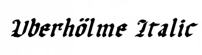
( Fonts by Daniel Zadorozny - www.iconian.com - Free for personal use )
A bold, italicized blackletter font with a medieval aesthetic.
![Uberhölme Italic Frei Schriftart Herunterladen]() Herunterladen 472 Downloads@WebFont
Herunterladen 472 Downloads@WebFont -
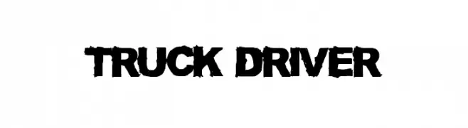
![TRUCK DRIVER Frei Schriftart Herunterladen]() Herunterladen 472 Downloads@WebFont
Herunterladen 472 Downloads@WebFont -
( Fonts by a Neale Davidson - www.pixelsagas.com. Personal-use only. For commercial use please contact owner. )
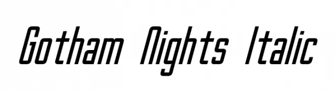
A modern, italic font with tall, narrow characters and consistent stroke width.
![Gotham Nights Italic Frei Schriftart Herunterladen]() Herunterladen 472 Downloads@WebFont
Herunterladen 472 Downloads@WebFont -
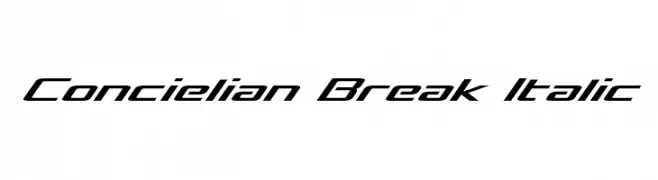
( Fonts by Daniel Zadorozny - www.iconian.com - Free for personal use )
A sleek, italicized font with a futuristic and dynamic design.
![Concielian Break Italic Frei Schriftart Herunterladen]() Herunterladen 472 Downloads@WebFont
Herunterladen 472 Downloads@WebFont


Welche Schriften sind gerade am populärsten?
Poppins, Roboto, Montserrat, Open Sans und Lato sind wegen ihrer klaren Formen und breiten Einsetzbarkeit sehr gefragt – von Markenauftritt über Landingpages bis hin zu Postern.
Welche Fonts eignen sich für Logos?
Geometrische Sans‑Serifs (z. B. Poppins, Familien im Gotham‑Stil) sind ein häufiger Griff für sauberes, skalierbares Branding. Für eine persönlichere Note bleiben Scripts und Handschrift‑Stile beliebt. Kombinieren Sie einen prägnanten Headline‑Font mit einer neutralen Brotschrift für Wiedererkennung und Harmonie.
Wie oft wird die Top‑Liste aktualisiert?
Regelmäßig – basierend auf realen Downloads und Interaktionen. Schauen Sie öfter vorbei, um aufstrebende Favoriten früh zu entdecken.
💡 Tipp: Seite bookmarken – Trends wechseln schnell, und heutige Top‑Schriften inspirieren morgen vielleicht das Rebranding.