Willkommen bei den Top‑Schriften – hier treffen Beliebtheit und Qualität aufeinander. Das sind die in diesem Jahr am häufigsten heruntergeladenen und genutzten Fonts. Wenn Sie sichere Optionen für Logo, Web oder Social suchen, starten Sie hier.
Jeder Top‑Font überzeugt durch Balance, Lesbarkeit und Vielseitigkeit. Sie finden moderne Sans‑Serifs, elegante Scripts, Vintage‑Serifs und minimalistische Displays.
-
( Fonts by Katatrad Team - Personal-use only. For commercial use please contact owner. )
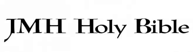
A bold, italic font with a strong, dynamic presence.
 Herunterladen 468 Downloads@WebFont
 -
![JMH Holy Bible Frei Schriftart Herunterladen]() Herunterladen 468 Downloads@WebFont
Herunterladen 468 Downloads@WebFont -
( Fonts by Haksen Studio - Sarwo Edhi Prayitno - Personal-use only. For commercial use please contact owner. )
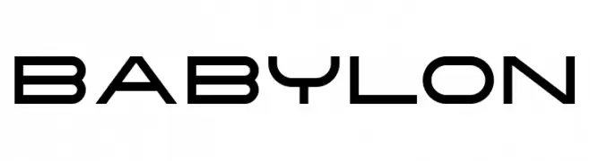
A modern, geometric font with a futuristic and sleek design.
![Babylon Frei Schriftart Herunterladen]() Herunterladen 468 Downloads@WebFont
Herunterladen 468 Downloads@WebFont -
![Sixties MF Frei Schriftart Herunterladen]() Herunterladen 468 Downloads@WebFont
Herunterladen 468 Downloads@WebFont -
( Fonts by Wahyu Eka Prasetya - wepfont.com - Personal-use only. For commercial use please contact owner. )
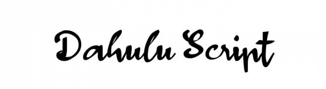
A bold, expressive script font with dynamic calligraphic flair.
![Dahulu Script Frei Schriftart Herunterladen]() Herunterladen 468 Downloads@WebFont
Herunterladen 468 Downloads@WebFont -
( Fonts by Daniel Zadorozny - www.iconian.com )
A bold, italicized font with a futuristic and dynamic style.
![Outrider Bold Italic Frei Schriftart Herunterladen]() Herunterladen 468 Downloads@WebFont
Herunterladen 468 Downloads@WebFont -
( Fonts by a Max Infeld - XEROGRAPHER FONTS - xerographer.blogspot.com . Personal-use only. For commercial use please contact owner. )
A bold, distressed font with a cracked texture for an edgy look.
![ElectricalNeue Frei Schriftart Herunterladen]() Herunterladen 468 Downloads@WebFont
Herunterladen 468 Downloads@WebFont -
( Swistblnk - creativemarket.com/swistblnk )
A bold, decorative font with high contrast and intricate details.
![Swistblnk Moalang Melintang Frei Schriftart Herunterladen]() Herunterladen 468 Downloads@WebFont
Herunterladen 468 Downloads@WebFont -
( Fonts by www.urbanhookupz.com )
A bold graffiti-style font with dynamic, energetic characters.
![MESTIZOS UNIDOS -URBAN HOOKUPZ Frei Schriftart Herunterladen]() Herunterladen 468 Downloads@WebFont
Herunterladen 468 Downloads@WebFont -
( Fonts by Galdino Otten Fonts - www.galdinootten.com - Personal-use only. For commercial use please contact owner. )
A bold, playful font with a hand-crafted, dynamic appearance.
![Cordel Groteska Frei Schriftart Herunterladen]() Herunterladen 468 Downloads@WebFont
Herunterladen 468 Downloads@WebFont -
( Fonts by Tlatous Type )
A playful, handwritten font with a casual and friendly appearance.
![DonutCandy-Regular Frei Schriftart Herunterladen]() Herunterladen 468 Downloads@WebFont
Herunterladen 468 Downloads@WebFont -
![Hubbard Demo Frei Schriftart Herunterladen]() Herunterladen 468 Downloads@WebFont
Herunterladen 468 Downloads@WebFont -
![Spork Thug Frei Schriftart Herunterladen]() Herunterladen 468 Downloads@WebFont
Herunterladen 468 Downloads@WebFont -
( Fonts by Fajar Abdul Fattah - https://fontbundles.net/sibelumpagi-studio - Personal-use only. For commercial use please contact owner. )
A graceful and fluid script font with elegant cursive lines.
![Smithrose Frei Schriftart Herunterladen]() Herunterladen 468 Downloads@WebFont
Herunterladen 468 Downloads@WebFont -
( Fonts by Daniel Zadorozny - www.iconian.com )
A sleek, modern font with a futuristic and italicized design.
![911 Porscha Leftalic Frei Schriftart Herunterladen]() Herunterladen 468 Downloads@WebFont
Herunterladen 468 Downloads@WebFont -
( Fonts by www.typodermicfonts.com - Ray Larabie )
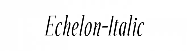
An elegant italic font with graceful curves and balanced contrast.
![Echelon-Italic Frei Schriftart Herunterladen]() Herunterladen 468 Downloads@WebFont
Herunterladen 468 Downloads@WebFont -
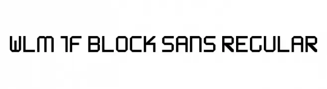
![WLM 1F Block Sans Regular Frei Schriftart Herunterladen]() Herunterladen 468 Downloads@WebFont
Herunterladen 468 Downloads@WebFont -
( Fonts by Misti`s Fonts - mistifonts.com - Personal-use only. For commercial use please contact owner. )
An elegant calligraphic font with ornate flourishes and a graceful flow.
![CongratsCalligraphy Frei Schriftart Herunterladen]() Herunterladen 467 Downloads@WebFont
Herunterladen 467 Downloads@WebFont -
![ChateauxdesOlives Frei Schriftart Herunterladen]() Herunterladen 467 Downloads@WebFont
Herunterladen 467 Downloads@WebFont -
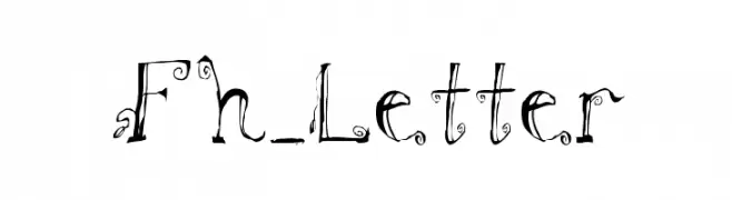
![Fh_Letter Frei Schriftart Herunterladen]() Herunterladen 467 Downloads@WebFont
Herunterladen 467 Downloads@WebFont -
( Fonts by or from www.graffitifonts.net )
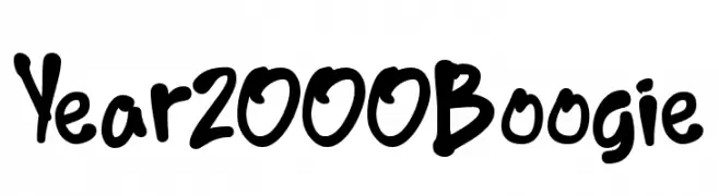
A bold, hand-drawn font with a playful and energetic style.
![Year2000Boogie Frei Schriftart Herunterladen]() Herunterladen 467 Downloads@WebFont
Herunterladen 467 Downloads@WebFont -
![Daze Frei Schriftart Herunterladen]() Herunterladen 467 Downloads@WebFont
Herunterladen 467 Downloads@WebFont -
( Fonts by Duane Richard Sponsoren Schriftart )
A bold, geometric uppercase font with a modern and timeless design.
![Blair Caps Frei Schriftart Herunterladen]() Herunterladen 467 Downloads
Herunterladen 467 Downloads -
![BertaDrug Frei Schriftart Herunterladen]() Herunterladen 467 Downloads@WebFont
Herunterladen 467 Downloads@WebFont -
( Fonts by imagex )
A bold, playful font with rounded, hand-drawn characters.
![Baby Party Frei Schriftart Herunterladen]() Herunterladen 467 Downloads@WebFont
Herunterladen 467 Downloads@WebFont -
( aqr typeface - Azra Qaireen - bit.ly/2M2eb7C )
An elegant, high-contrast script font with flowing, cursive strokes.
![SydneeDemo Frei Schriftart Herunterladen]() Herunterladen 467 Downloads@WebFont
Herunterladen 467 Downloads@WebFont -
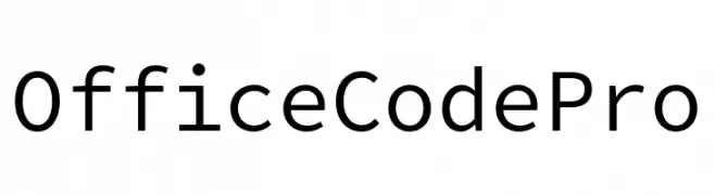
( Fonts by Nathan Rutzky )
A modern, monospaced typeface with clean lines and uniform spacing.
![Office Code Pro Frei Schriftart Herunterladen]() Herunterladen 467 Downloads@WebFont
Herunterladen 467 Downloads@WebFont -
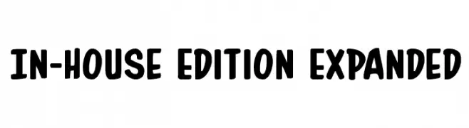
( Fonts by Daniel Zadorozny - www.iconian.com )
A bold, rounded font with a playful and friendly style.
![In-House Edition Expanded Frei Schriftart Herunterladen]() Herunterladen 467 Downloads@WebFont
Herunterladen 467 Downloads@WebFont -
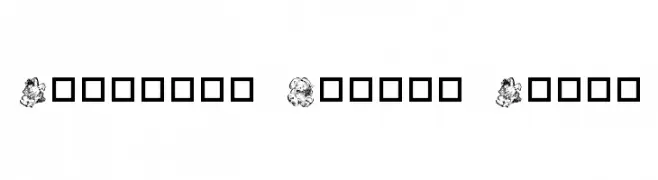
![Destinys Easter Dings Frei Schriftart Herunterladen]() Herunterladen 467 Downloads@WebFont
Herunterladen 467 Downloads@WebFont -
Schriftart von NicholasJudy456. For commercial use please contact the owner.
( Here's More of the House Fonts )
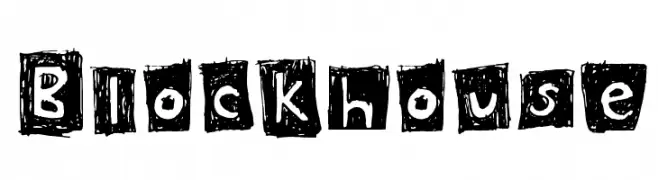
A bold, hand-drawn font with a textured, block-like appearance.
![Blockhouse Frei Schriftart Herunterladen]() Herunterladen 467 Downloads@WebFont
Herunterladen 467 Downloads@WebFont -
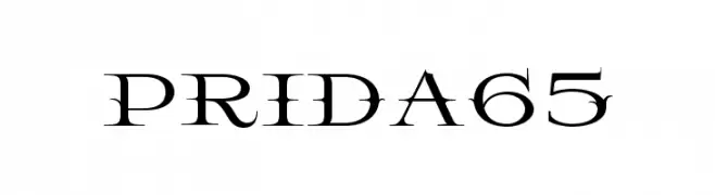
![Prida65 Frei Schriftart Herunterladen]() Herunterladen 467 Downloads@WebFont
Herunterladen 467 Downloads@WebFont -
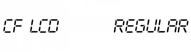
( www.cloutierfontes.ca/ )
A digital-inspired, segmented font resembling LCD displays.
![CF LCD 521 Regular Frei Schriftart Herunterladen]() Herunterladen 467 Downloads@WebFont
Herunterladen 467 Downloads@WebFont -
( Fonts by Billy Argel - Personal-use only. For commercial use please contact owner. )
A bold, vintage-style font with thick, angular letters.
![BEARDBONE PERSONAL USE Frei Schriftart Herunterladen]() Herunterladen 467 Downloads@WebFont
Herunterladen 467 Downloads@WebFont -
( Fonts by Khurasan )
A bold, rounded font with a playful and energetic style.
![Best Curry Frei Schriftart Herunterladen]() Herunterladen 467 Downloads@WebFont
Herunterladen 467 Downloads@WebFont -
Schriftart von defharo. For commercial use please contact the owner.
![TheBlackBox Frei Schriftart Herunterladen]() Herunterladen 467 Downloads@WebFont
Herunterladen 467 Downloads@WebFont


Welche Schriften sind gerade am populärsten?
Poppins, Roboto, Montserrat, Open Sans und Lato sind wegen ihrer klaren Formen und breiten Einsetzbarkeit sehr gefragt – von Markenauftritt über Landingpages bis hin zu Postern.
Welche Fonts eignen sich für Logos?
Geometrische Sans‑Serifs (z. B. Poppins, Familien im Gotham‑Stil) sind ein häufiger Griff für sauberes, skalierbares Branding. Für eine persönlichere Note bleiben Scripts und Handschrift‑Stile beliebt. Kombinieren Sie einen prägnanten Headline‑Font mit einer neutralen Brotschrift für Wiedererkennung und Harmonie.
Wie oft wird die Top‑Liste aktualisiert?
Regelmäßig – basierend auf realen Downloads und Interaktionen. Schauen Sie öfter vorbei, um aufstrebende Favoriten früh zu entdecken.
💡 Tipp: Seite bookmarken – Trends wechseln schnell, und heutige Top‑Schriften inspirieren morgen vielleicht das Rebranding.