Willkommen bei den Top‑Schriften – hier treffen Beliebtheit und Qualität aufeinander. Das sind die in diesem Jahr am häufigsten heruntergeladenen und genutzten Fonts. Wenn Sie sichere Optionen für Logo, Web oder Social suchen, starten Sie hier.
Jeder Top‑Font überzeugt durch Balance, Lesbarkeit und Vielseitigkeit. Sie finden moderne Sans‑Serifs, elegante Scripts, Vintage‑Serifs und minimalistische Displays.
-
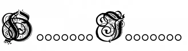
( Fonts by Paul Lloyd )
An ornate and intricate decorative font with elaborate swirls and flourishes.
 Herunterladen 469 Downloads@WebFont
 -
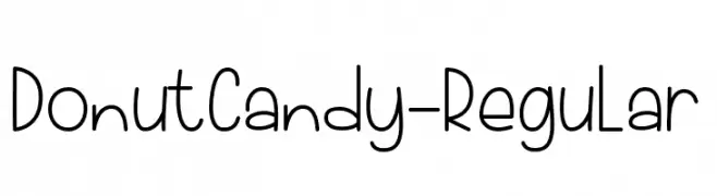
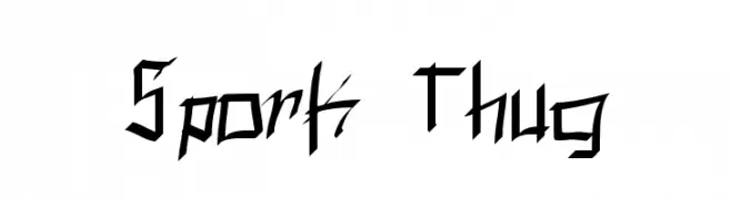
( Fonts by Tlatous Type )
A playful, handwritten font with a casual and friendly appearance.
![DonutCandy-Regular Frei Schriftart Herunterladen]() Herunterladen 469 Downloads@WebFont
Herunterladen 469 Downloads@WebFont -
![BAM It's Andrea! Frei Schriftart Herunterladen]() Herunterladen 469 Downloads@WebFont
Herunterladen 469 Downloads@WebFont -
![Fantique Four Shareware Frei Schriftart Herunterladen]() Herunterladen 469 Downloads@WebFont
Herunterladen 469 Downloads@WebFont -
![Spork Thug Frei Schriftart Herunterladen]() Herunterladen 469 Downloads@WebFont
Herunterladen 469 Downloads@WebFont -
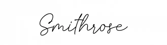
( Fonts by Fajar Abdul Fattah - https://fontbundles.net/sibelumpagi-studio - Personal-use only. For commercial use please contact owner. )
A graceful and fluid script font with elegant cursive lines.
![Smithrose Frei Schriftart Herunterladen]() Herunterladen 469 Downloads@WebFont
Herunterladen 469 Downloads@WebFont -
![Defactica Frei Schriftart Herunterladen]() Herunterladen 469 Downloads@WebFont
Herunterladen 469 Downloads@WebFont -
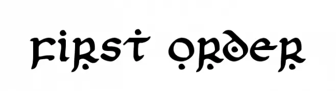
( Fonts by Daniel Zadorozny - www.iconian.com - Free for personal use )
A bold, artistic font with flowing strokes and decorative elements.
![First Order Frei Schriftart Herunterladen]() Herunterladen 469 Downloads@WebFont
Herunterladen 469 Downloads@WebFont -
( Fonts by Daniel Zadorozny - www.iconian.com )
A sleek, modern font with a futuristic and italicized design.
![911 Porscha Leftalic Frei Schriftart Herunterladen]() Herunterladen 469 Downloads@WebFont
Herunterladen 469 Downloads@WebFont -
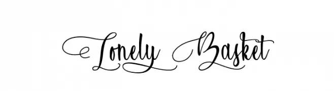
( Typhoon Type - Suthi Srisopha - www.typhoontype.net )
An elegant and ornate script font with intricate swirls and flourishes.
![Lonely Basket Frei Schriftart Herunterladen]() Herunterladen 469 Downloads@WebFont
Herunterladen 469 Downloads@WebFont -
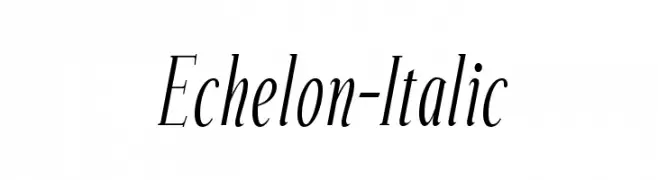
( Fonts by www.typodermicfonts.com - Ray Larabie )
An elegant italic font with graceful curves and balanced contrast.
![Echelon-Italic Frei Schriftart Herunterladen]() Herunterladen 469 Downloads@WebFont
Herunterladen 469 Downloads@WebFont -
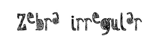
![Zebra irregular Frei Schriftart Herunterladen]() Herunterladen 469 Downloads@WebFont
Herunterladen 469 Downloads@WebFont -
![Reject Frei Schriftart Herunterladen]() Herunterladen 468 Downloads@WebFont
Herunterladen 468 Downloads@WebFont -
( Fonts by NubeFonts - nubefonts.blogspot.com - Personal-use only. For commercial use please contact owner. )
A playful, hand-drawn font with a whimsical and informal style.
![Soul Frei Schriftart Herunterladen]() Herunterladen 468 Downloads@WebFont
Herunterladen 468 Downloads@WebFont -
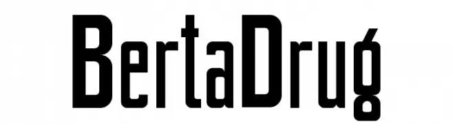
![BertaDrug Frei Schriftart Herunterladen]() Herunterladen 468 Downloads@WebFont
Herunterladen 468 Downloads@WebFont -
![Coolio Frei Schriftart Herunterladen]() Herunterladen 468 Downloads@WebFont
Herunterladen 468 Downloads@WebFont -
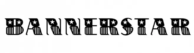
( Fonts by a Claude Pelletier . Personal-use only. For commercial use please contact owner. )
A bold, decorative font with stars and stripes, ideal for patriotic themes.
![BannerStar Frei Schriftart Herunterladen]() Herunterladen 468 Downloads@WebFont
Herunterladen 468 Downloads@WebFont -
( Fonts by Daniel Zadorozny - www.iconian.com - Free for personal use )
A bold, italicized font with smooth, rounded strokes and an extended form.
![Action Man Extended Italic Frei Schriftart Herunterladen]() Herunterladen 468 Downloads@WebFont
Herunterladen 468 Downloads@WebFont -
( Fonts by Billy Argel - Personal-use only. For commercial use please contact owner. )
A bold, vintage-style font with thick, angular letters.
![BEARDBONE PERSONAL USE Frei Schriftart Herunterladen]() Herunterladen 468 Downloads@WebFont
Herunterladen 468 Downloads@WebFont -
( Fonts by imagex )
A bold, distressed font with a cracked effect, perfect for impactful designs.
![Crunchy Time Frei Schriftart Herunterladen]() Herunterladen 468 Downloads@WebFont
Herunterladen 468 Downloads@WebFont -
( Fonts by a Situjuh Nazara - c7n1.wordpress.com. Personal-use only. For commercial use please contact owner. )
A modern, thin sans-serif font with clean lines and a minimalist design.
![Smoolthan Thin Frei Schriftart Herunterladen]() Herunterladen 468 Downloads@WebFont
Herunterladen 468 Downloads@WebFont -
( Fonts by Nick Curtis - www.nicksfonts.com )
A futuristic, circuit-inspired font with bold geometric shapes and mechanical aesthetics.
![CircuitBoredNF Frei Schriftart Herunterladen]() Herunterladen 468 Downloads@WebFont
Herunterladen 468 Downloads@WebFont -
( Fonts by Mocha Frappuccino - Personal-use only. For commercial use please contact owner. )
A bold, high-contrast font with dramatic serifs and elegant curves.
![Langita Personal Used Frei Schriftart Herunterladen]() Herunterladen 468 Downloads@WebFont
Herunterladen 468 Downloads@WebFont -
( Fonts by www.blambot.com )
A bold, italicized font with a playful, cartoonish style.
![ToonaciousBB-Italic Frei Schriftart Herunterladen]() Herunterladen 468 Downloads@WebFont
Herunterladen 468 Downloads@WebFont -
( Fonts by or from www.graffitifonts.net )
A playful, informal handwritten font with a whimsical style.
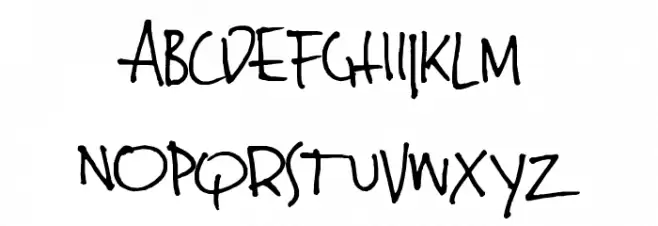
![JinkyA Frei Schriftart Herunterladen]() Herunterladen 468 Downloads@WebFont
Herunterladen 468 Downloads@WebFont -
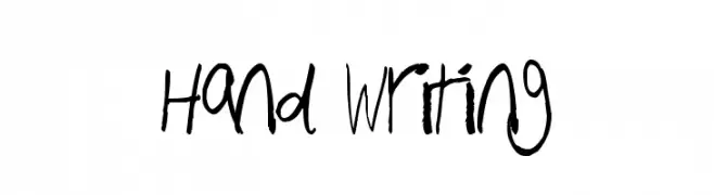
![Hand Writing Frei Schriftart Herunterladen]() Herunterladen 468 Downloads@WebFont
Herunterladen 468 Downloads@WebFont -
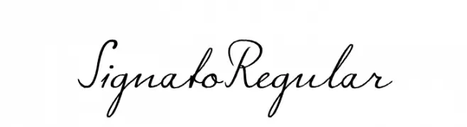
![Signato Regular Frei Schriftart Herunterladen]() Herunterladen 468 Downloads@WebFont
Herunterladen 468 Downloads@WebFont -
( Fonts by David Kerkhoff - www.hanodedphotography.com )
A bold, expressive handwritten font with fluid strokes and a playful style.
![Same Same But Different Frei Schriftart Herunterladen]() Herunterladen 468 Downloads@WebFont
Herunterladen 468 Downloads@WebFont -
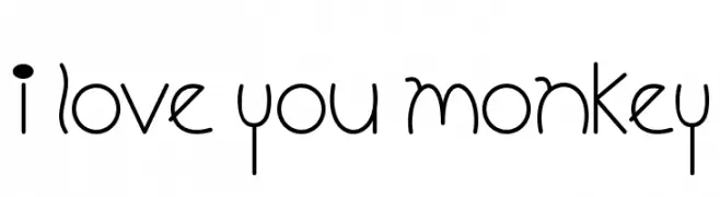
![I Love You Monkey Frei Schriftart Herunterladen]() Herunterladen 468 Downloads@WebFont
Herunterladen 468 Downloads@WebFont -
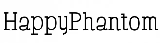
( Free for Personal Use. To use commercially please visit the http://www.nymFont.com )
A modern serif font with clean lines and balanced proportions.
![HappyPhantom Frei Schriftart Herunterladen]() Herunterladen 468 Downloads@WebFont
Herunterladen 468 Downloads@WebFont -
( Fonts by www.sweeep.fr - Damien Gosset )
A bold, playful handwritten font with rounded edges and a casual style.
![Sweeep Frei Schriftart Herunterladen]() Herunterladen 468 Downloads@WebFont
Herunterladen 468 Downloads@WebFont -
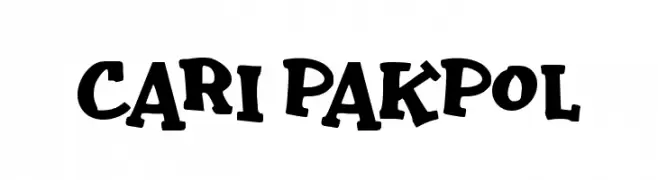
( Fonts by wep )
A playful, bold font with a hand-drawn, cartoon-like style.
![Cari Pakpol Frei Schriftart Herunterladen]() Herunterladen 468 Downloads@WebFont
Herunterladen 468 Downloads@WebFont -
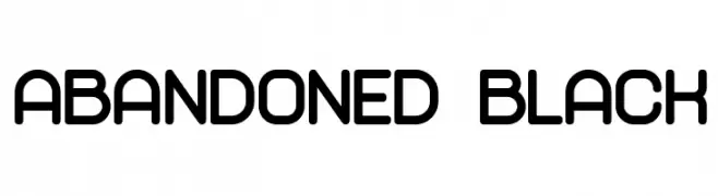
( Vladimir Nikolic - www.coroflot.com/vladimirnikolic )
A bold, rounded font with a modern and clean aesthetic.
![Abandoned Black Frei Schriftart Herunterladen]() Herunterladen 468 Downloads@WebFont
Herunterladen 468 Downloads@WebFont -
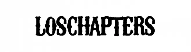
( Fonts by Woodcutter Manero - www.woodcutter.es - Personal-use only. For commercial use please contact owner. )
A bold, textured font with a vintage, distressed style.
![Los Chapters Frei Schriftart Herunterladen]() Herunterladen 468 Downloads@WebFont
Herunterladen 468 Downloads@WebFont -
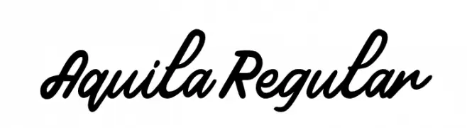
Schriftart von typotopia. For commercial use please contact the owner.
( Fonts by Typotopia - Typotopia.co - Personal Use Only, for Commercial Use, please contact us )
A bold, flowing script font with a natural handwriting style.
![Aquila Regular Frei Schriftart Herunterladen]() Herunterladen 468 Downloads@WebFont
Herunterladen 468 Downloads@WebFont


Welche Schriften sind gerade am populärsten?
Poppins, Roboto, Montserrat, Open Sans und Lato sind wegen ihrer klaren Formen und breiten Einsetzbarkeit sehr gefragt – von Markenauftritt über Landingpages bis hin zu Postern.
Welche Fonts eignen sich für Logos?
Geometrische Sans‑Serifs (z. B. Poppins, Familien im Gotham‑Stil) sind ein häufiger Griff für sauberes, skalierbares Branding. Für eine persönlichere Note bleiben Scripts und Handschrift‑Stile beliebt. Kombinieren Sie einen prägnanten Headline‑Font mit einer neutralen Brotschrift für Wiedererkennung und Harmonie.
Wie oft wird die Top‑Liste aktualisiert?
Regelmäßig – basierend auf realen Downloads und Interaktionen. Schauen Sie öfter vorbei, um aufstrebende Favoriten früh zu entdecken.
💡 Tipp: Seite bookmarken – Trends wechseln schnell, und heutige Top‑Schriften inspirieren morgen vielleicht das Rebranding.